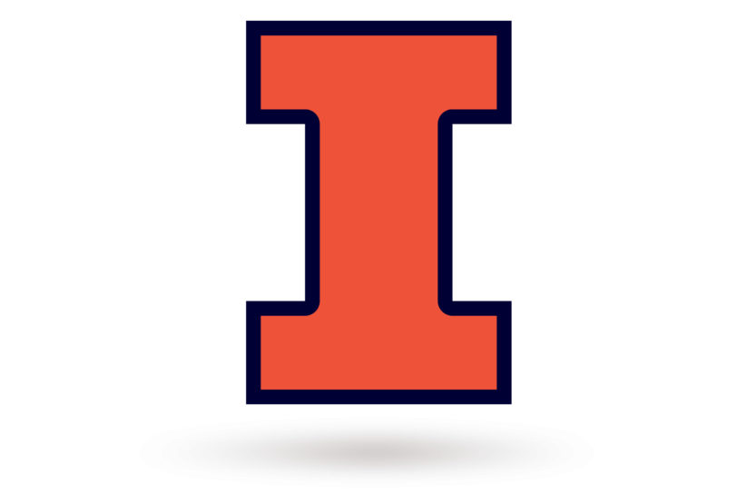
But our number helmet is not Alabama. Ours has stars also.
You are using an out of date browser. It may not display this or other websites correctly.
You should upgrade or use an alternative browser.
You should upgrade or use an alternative browser.
Illinois Football Uniforms
- Status
- Not open for further replies.
mattcoldagelli
- Script Illinois Enthusiast
Also, are we all working under the assumption that this represents a vote of no confidence in the Block I helmet, and one of these/something else will be our helmet starting in 2025? Because I certainly am - if not that, it’s a major branding blunder.
Fighter of the Nightman
- Chicago, IL
Have to disagree with you there ... say what you want about the Block I, but we have at least added SOME variations to it over the years like double outlines and curving the corners:I’d argue it’s far less generic than just the letter “I”
Meanwhile, I can create the slant Illinois logo in this text box that I use to respond on an Internet message board, lol...
ILLINOIS
It is literally just selecting the bold, italic and underlined options while making sure you have the most boring font available to you in Microsoft Word ... that was our logo!!

Last edited:
altgeld88
- Arlington, Virginia
In my experience the children generally are wrong, simply because of an insufficiently robust longitudinal data set.I can see and comprehend that the numbers on the helmets connote a "no, it's the children who are wrong" provocation against modernity that is always fan catnip for these sorts of things. That is the level on which it's operating.
But as you note, I so strongly associate numbers on the helmets as "Alabama" that I don't comprehend how it acquires that "vintage" appeal.
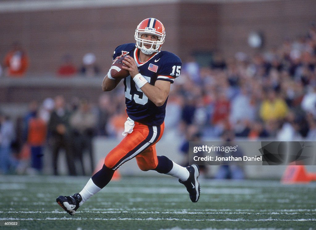
I've never associated our numbered helmets with Alabama (as someone else noted, the stars distinguish them.) I have no idea (and don't believe I've ever seen) what our helmets looked like before the stars/numbers were used. When exactly did the Riddell plastic helmets supplant the leather ones? I believe it was the early '60s and those starred/numbered ones may have been our initial design.
Accordingly, I'm familiar with only four distinguished Illini helmet designs: the three trotted out for this coming MemStad centennial season and Bob Blackman's arched Illini design incorporating two stripes, which he pioneered at Dartmouth in the '60s. The remainder are forgettable.
That Dartmouth helmet, BTW, is up there with the (pardon me while I pause to choke back the bile rising in my throat) Michigan winged helmet in terms of distinguished design.
I don't find our starred/numbered or arched Illini helmets derivative, while the '70s arch design w/stripes and the ILLINOIS ones certainly are.
Inserting the striped Illini helmet photo here for completeness, as @Schlepper did earlier in the thread, and the old Dartmouth design. Coach Blackman used this design at Cornell in the late '70s and early '80s in his final coaching stop after leaving Illinois.
Last edited:
Fighter of the Nightman
- Chicago, IL
I am sympathetic to this opinion, but just as the modern take on the Flyin' Illini throwbacks took a classic uniform and actually IMPROVED upon it by updating the sizing of the numbers and lettering and refining the trimming...Two opinions I've never been able to wrap my brain around.
I continue to believe that the 2001-era unis are, taken all together as a coherent whole, the best the program has ever done aesthetically.


... I would like to see a similar "fix-up" done to the 2001-ear uniforms. I think if you took some pieces from our current set and morphed them with the 2001-era ones (e.g., an orange outline on the number), you would have the home run of all home runs ... but JMO.
/cdn.vox-cdn.com/uploads/chorus_asset/file/24863026/F371Y8mWUAAXP10.jpeg)
I suppose that is a roundabout way of saying that I actually really like our current uniforms ... and I definitely like these helmets vs. the 2001 ones. My only complaints really are the numbers (would prefer just a traditional block letter like the 2001 numbers) and preferring the stripe on the sleeves vs. the shoulders.
People eat nostalgia up, and honestly, our fanbase does it to the extent that we make it nearly impossible for the school to try anything new. We'll always complain when something isn't exactly what it was in our preferred era, whatever that era may be (for most, it's when they became fans). I think the only way to get a new helmet design that this fanbase wouldn't complain about would be to put the Chief logo on it. Even then, there'd still probably be some people not happy. You could probably go find posts made in the last 9 months from a lot of the people saying to make one of these throwbacks permanent saying they love the new current helmet (on here or on any other site). As soon as a nostalgic throwback became an option, people jumped off the Block I support train even if previously, they genuinely liked it.Also, are we all working under the assumption that this represents a vote of no confidence in the Block I helmet, and one of these/something else will be our helmet starting in 2025? Because I certainly am - if not that, it’s a major branding blunder.
altgeld88
- Arlington, Virginia
Ah... here we go. The plastic helmets apparently date to the mid-'40s if this site is accurate. Agreed that the numbers-only ones aren't special. Plus they remind me of Syracuse. I like the one with the stars, however.
Iowa reinvented its branding when Hayden Fry arrived in the late '70s and they hit a HR. (Please note that the hyperlink below spells Illinois as "Illinios." That's some Indinia-level lack of proofreading.)
[EDIT: Looking through the Helmet Hut site it seems that all teams had numbers on their helmets in the '50s and early '60s. Even Michigan. I wonder if that was an NCAA rule.]
Illinios Index
www.helmethut.com
Last edited:
ChiefGritty
- Chicago, IL
I do too.I suppose that is a roundabout way of saying that I actually really like our current uniforms
Classic Illinois Football to get something like that right and then immediately associate it with crushing disappointment.
The Galloping Ghost
- Washington, DC
Yup. This is me when I see the ILLINOIS:It is literally just selecting the bold, italic and underlined options while making sure you have the most boring font available to you in Microsoft Word ... that was our logo!!
altgeld88
- Arlington, Virginia
BTW... I was wrong last night when I posted that photo of Tony Eason with the gray face mask. It wasn't exclusive. We apparently used orange face masks with this design, too, at some point. It clashes in the photo below. Perhaps a color match would look good.I’m going to be that guy, but the arched ILLINI needs the orange facemask, it’s not the same with the gray.
Fighter of the Nightman
- Chicago, IL
All this REALLY gets you thinking of an alternative universe where Illini Football never descends into futility, and our "brand" remains cool. I mean, THESE jerseys are considered iconic for absolutely no other reason than several generations of fans saw these programs win in them over and over, and now they are "classic" ... but they're objectively as boring as can be (and I say that as someone who loves classic/traditional uniforms).


The only reason some past Illini uniforms aren't seen that way is, well ... we lost a lot of games in them! I also feel similarly about Memorial Stadium on the football side as I do about Minnesota's The Barn for basketball. In other words, if you just swapped our program's history with Minnesota's but kept everything else the same, people would unanimously rank The Barn as a top 10 venue in the country that has this exceptionally classic feel and is an absolutely hornet's nest for visitors. However, because Minnesota has been bad more often than not, losing plenty of games there and beating down their fan base to the point where the environment is pretty meh most times, it just blends in with the crowd. Similarly, I think if you just gave us Wisconsin's or Iowa's success over the last 30+ years, Memorial Stadium would be seen as an absolute "can't miss" venue within the conference. The "bones" are absolutely there with the unique architecture, history and layout around the stadium for some pretty epic tailgating.
I also think if we had been that good over the past 30 years, we would have fixed up the hideous Horseshoe by now and really turned MS into the beauty it can be.
I know it will never happen, but a guy can dream, right? (I would do a blue facemask but didn't know how to photoshop that in.)

illinidarrin
- from parts unknown
TentakilRex
- Land O Insects between Quincy-Macomb-Jacksonville
With modern tech, I can create a better logo in a few minutes that:Meanwhile, I can create the slant Illinois logo in this text box that I use to respond on an Internet message board, lol...
ILLINOIS
It is literally just selecting the bold, italic and underlined options while making sure you have the most boring font available to you in Microsoft Word ... that was our logo!!
A. that also copied off a retro helmet of a NFC East team that won a Super Bowl in the 1980s
B. that looks a lot like a helmet of a team that won a national championship in the 2010's. Heck my dopplegandr might be a future B1G to boot.
Heck I can easily make an orange version and could do a white version too on request
Nice work. It could be simplified by just saying Cook County and...Downstate.
That said, as someone who was raised in "Metro East" but with no family still in the area, but with Facebook a lot of reconnect with old friends, I know a little about the area. First, more specifically, I did my 5th grade through high school in Granite City. Yeah, I know, Granite City. I would suspect that most of the GCHS grads who went to Illinois were first generation college. And of those who did go to Illinois, I doubt any returned to Granite City. Those who returned to the St Louis metro area I suspect gravitated to "West County." As a result, a lot of people who graduated from Illinois, like my sister, send their kids to their state flagship university. Considering out-of-state tuition at Illinois, it's even less likely that they'd go to their parent's/parents' alma mater. And then the grandparents still in Metro East become Mizzou fans because that's where the grandkids go.
I live in Norhteastern Pennsylvania now, and go into New Jersey and down to Maryland (to see my daughter and Terp-in-law, and where we lived for ten years, and where my wife got her PhD--at UMd) relatively frequently. Observations: I see a LOT of Penn State gear whenever I go out. I see more East Stroudsburg University of Pennsylvania because that's one of the 14 PASSHE (PA State System of Higher Education) schools, but the students/alumni have dual loyalties. One to their Division II school, and two, to Penn State, for Div I. PSU also has what faculty at the PASSHE universities call "outhouse campuses." These vary in size, but the common element is that they have no intracollegiate athletics. All of those students, who get PSU diplomas with no disclaminers that they didn't go to "main campus" and alumni are Penn State fans. It's built in.
Again, all of the 14 PASSHE schools (PASSHE is being dismantled by the current Democrat administration in Harrisburg) are Div II. They don't compete directly with PSU. On the other hand, in Illinois, NIU, EIU, WIU and SIU are all Div I. We play them in sports, hopefully from a superior position but PSU doesn't play any of the 14. When push comes to shove, the directionals in Illinois will back the Illini, I suppose, but not the way Pennsylvania backs Penn State.
It's interesting that there is only one sticker for Rutgers cars, and that's a big red "R," one of those magnetic stickers. Away from Piscataway they're fairly rare, but more common than UMd identification outside of College Park. There doesn't seem to be much passion in displaying their colors, perhaps because of all the "prestige" universities in NJ and MD, well, going to a "public" university is kind of second rate. I don't know whether that's true. They'd say no. And I know that no Illinois alumni defer to Northwestern. Still, driving around Illinois when I come back to the Old Country, I see very little if any Illini gear, license plate frames, decals, shirts, jackets or hats. Compared to Penn State in Pennsylvania, it's embarrassing.
TentakilRex
- Land O Insects between Quincy-Macomb-Jacksonville
I am extra worried about the next generation.....
It was the logo, and everyone knew who it belonged to.Have to disagree with you there ... say what you want about the Block I, but we have at least added SOME variations to it over the years like double outlines and curving the corners:

Meanwhile, I can create the slant Illinois logo in this text box that I use to respond on an Internet message board, lol...
ILLINOIS
It is literally just selecting the bold, italic and underlined options while making sure you have the most boring font available to you in Microsoft Word ... that was our logo!!
I can live with the block I as long as the helmets stay orange, but changing the outline doesn’t change the fact it’s just a letter. Not exactly Wisconsin’s or Arizona’s either, who pull it off nicely.
For those who are anti nostalgia, Illinois has tried tons of trendy uniforms the past 10 years or so. Most sucked, as did the team.
Last edited:
"Charming". I agree. Like LALA land UCLA. I want to look tough. I think the numbered helmet does that best.I am biased, but I definitely agree. I will admit that it is not the "coolest" helmet in the world. But I think it is charming and unique. If you see our current uniforms from afar with the "I" helmet, it could be confused from afar as a Syracuse uniform. But there is no mistaking the ILLINOIS helmet for another school, and I think that is something we should embrace.
Fighter of the Nightman
- Chicago, IL
At that point if we’re having full words on our helmets, just mock up a script Illini and be done with it!I am biased, but I definitely agree. I will admit that it is not the "coolest" helmet in the world. But I think it is charming and unique. If you see our current uniforms from afar with the "I" helmet, it could be confused from afar as a Syracuse uniform. But there is no mistaking the ILLINOIS helmet for another school, and I think that is something we should embrace.
As long as it's the curved Illini I'm in.Also, are we all working under the assumption that this represents a vote of no confidence in the Block I helmet, and one of these/something else will be our helmet starting in 2025? Because I certainly am - if not that, it’s a major branding blunder.
But I think the Block I will still be the helmet going forward.
redwingillini11
White and Sixth
- Batavia
But the point I was making was there is no mistaking the ILLINOIS helmet for any other team in major college football. It is entirely our own. The script Illini is very aesthetically pleasing, but how many other teams use a script logo on their helmets? Countless. My point is that we should embrace a look that is unmistakably our own, and both ILLINOIS and the arched Illini provide that.At that point if we’re having full words on our helmets, just mock up a script Illini and be done with it!
A lot of people were pretty unhappy with the rebranding to the lighter shade of orange, but this side-by-side makes me extra glad we ripped that band-aid off and went for it. It's closer to the orange we've used over the previous century and it contrasts better with our dark blue secondary color.Have to disagree with you there ... say what you want about the Block I, but we have at least added SOME variations to it over the years like double outlines and curving the corners:
Meanwhile, I can create the slant Illinois logo in this text box that I use to respond on an Internet message board, lol...
ILLINOIS
It is literally just selecting the bold, italic and underlined options while making sure you have the most boring font available to you in Microsoft Word ... that was our logo!!
People eat nostalgia up, and honestly, our fanbase does it to the extent that we make it nearly impossible for the school to try anything new. We'll always complain when something isn't exactly what it was in our preferred era, whatever that era may be (for most, it's when they became fans). I think the only way to get a new helmet design that this fanbase wouldn't complain about would be to put the Chief logo on it. Even then, there'd still probably be some people not happy. You could probably go find posts made in the last 9 months from a lot of the people saying to make one of these throwbacks permanent saying they love the new current helmet (on here or on any other site). As soon as a nostalgic throwback became an option, people jumped off the Block I support train even if previously, they genuinely liked it.

mattcoldagelli
- Script Illinois Enthusiast
If so, then that's a deeply puzzling choice to not use it at all for an entire season. It's a relatively new design and this year - the first of the new B1G - is a significant one in terms of new people encountering the conference and its member schools. I'm not sure how you can be committed to Block I on the helmet and put it in timeout for all of 2024.But I think the Block I will still be the helmet going forward.
- Status
- Not open for further replies.