Shield looks great on those. Fighting Illini across the back is brutal.
You are using an out of date browser. It may not display this or other websites correctly.
You should upgrade or use an alternative browser.
You should upgrade or use an alternative browser.
New Illinois Football Uniforms
- Status
- Not open for further replies.
Fighter of the Nightman
- Chicago, IL
Another random uniform thought - I actually wouldn't mind the white pants with the navy jerseys or (especially) the orange jerseys ... I just don't like them with the white jersey. I think if you go all white, you should have a shiny white helmet to match, AND it should probably mean you only have one primary color (i.e., not us!). I really don't like when teams do a colored helmet with the rest of the uniform being white. It is interesting, however, to look at what some of our fellow orange and blue teams do now, based on last season:
Florida Gators
Home: O/B/W ... also see some O/B/B, but they don't seem to wear orange pants at home much.
Away: O/W/B ... only exception was O/W/O at Vanderbilt.
Alternate: They never wore it last year, but Wikipedia says their official alternate is O/O/W.
Auburn Tigers
Home: W/B/W
Away: W/W/W
Alternate: W/O/W ... they don't seem to hardly ever wear this, though.
Syracuse Orange
Home: O/B/O
Away: Totally all over the place ... saw O/W/O, W/W/O, W/W/W and O/W/B.
Neutral: O/O/O ... and it wasn't good, but they did wear W/O/W once, and it looked cool.
Nobody shoot me for comparing us to Syracuse, but our uniforms are always just naturally going to be fairly similar ... so, I think this picture that I came across while doing this gives a good idea of how our away jerseys might look with navy pants.

Frankly, I think ours would look even better than that with no wording on the front, no large collar and our stripes being more prominent. Make it happen, Bret!!
Florida Gators
Home: O/B/W ... also see some O/B/B, but they don't seem to wear orange pants at home much.
Away: O/W/B ... only exception was O/W/O at Vanderbilt.
Alternate: They never wore it last year, but Wikipedia says their official alternate is O/O/W.
Auburn Tigers
Home: W/B/W
Away: W/W/W
Alternate: W/O/W ... they don't seem to hardly ever wear this, though.
Syracuse Orange
Home: O/B/O
Away: Totally all over the place ... saw O/W/O, W/W/O, W/W/W and O/W/B.
Neutral: O/O/O ... and it wasn't good, but they did wear W/O/W once, and it looked cool.
Nobody shoot me for comparing us to Syracuse, but our uniforms are always just naturally going to be fairly similar ... so, I think this picture that I came across while doing this gives a good idea of how our away jerseys might look with navy pants.
Frankly, I think ours would look even better than that with no wording on the front, no large collar and our stripes being more prominent. Make it happen, Bret!!
splitter
- and not Nebraska
The Block I on the Shield need to be tweaked. Orange instead of white.Shield looks great on those. Fighting Illini across the back is brutal.
For me the shoulder stripes sort of start out of nowhere then basically
fizzle out altogether on the back. Player number or Block I instead.
I like the new unis except for the numeral font(ugh). Too bad we coulThe goofy nike number font looks way better on the soccer kits than on the football jerseys.
 dn't have gotten something like this:
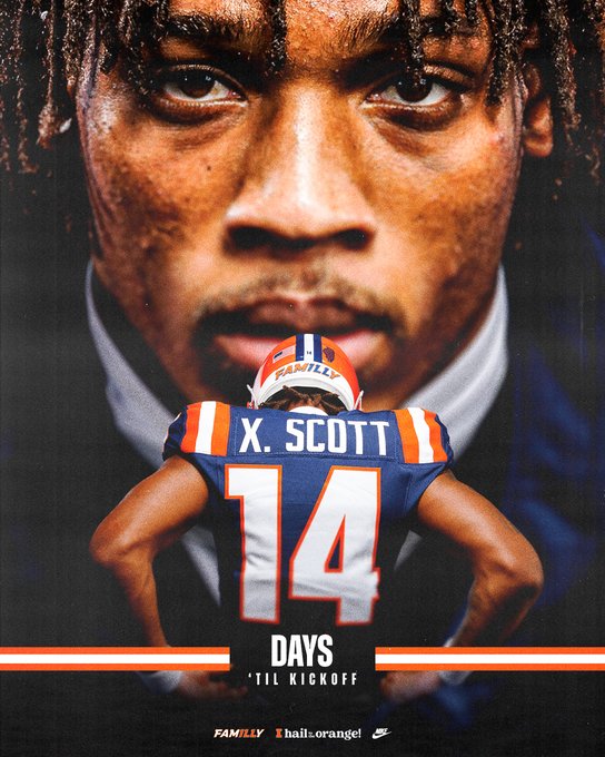
I have just now realized how much I get Xavier Scott and Miles Scott mixed upThe new uni from this perspective is very good.

orange100
time to hop on the wife
We will never see something this cool again.I like the new unis except for the numeral font(ugh). Too bad we coulView attachment 27780dn't have gotten something like this:View attachment 27780
Fighter of the Nightman
- Chicago, IL
I think they are definitely cool and maybe I am a bit too biased by modern trends, but it seems the stripes might be a bit much for my taste. Kind of like Florida, I think there are too many and too wide. Pretty damn great for that era, though.We will never see something this cool again.
That bronze block I helmet was truly awful
chiefini
- Rockford, Illinois
The variance in Pantone’s on the orange is absolutely awful and unacceptable. Pick a darn Pantone, and stick to it, not just in helmet colors, but in ALL sports and ALL uniforms. No other B1G school has this inconsistency issue. It’s just such poor branding and PR. Sure doesn’t look like this problem was fixed last year like it was supposed to be…
lstewart53x3
- Scottsdale, Arizona
UhmThe variance in Pantone’s on the orange is absolutely awful and unacceptable. Pick a darn Pantone, and stick to it, not just in helmet colors, but in ALL sports and ALL uniforms. No other B1G school has this inconsistency issue. It’s just such poor branding and PR. Sure doesn’t look like this problem was fixed last year like it was supposed to be…
agreeThat bronze block I helmet was truly awful
and the ones with the state outline are right there with them as butt ugly
chiefini
- Rockford, Illinois
Ok. Thanks. I eat my words. Please disregard my post…

So, just to put this out there: they do not have “almost our exact same jerseys”I think the shoulder stripes look better on the navy than the white.
Did you guys notice that Syracuse has almost our exact same jerseys. What’s with that? I have no idea how that could happen. Nope. Fully escapes me.
- different shade of orange
- different shade of blue
- different color face mask
- semi-gloss finish helmet versus full gloss
- different collar color
- we have no chest wordmark
- different font numbers
- stripe-on-sleeve vs. stripe-over-shoulder
- Syracuse has no pant pocket logo
That’s 9 differences. They’re not even close. They have the same color scheme and they both have stripes. That’s really where the comparison ends. If you look at this and see the same uniform then you’re either blind or you don’t really care much about uniform aesthetics. It’s a fun joke, and I like the Syracuse-Illinois playful comparison because it’s funny and we basically have no connection to them (shoutout to touchdown Tommy, though!), but if you’re *actually* upset about it, that’s annoying because you’re not looking very hard.
…they’re nearly identical to the ‘08 ‘Cuse uniforms, but they still have different color facemasks and different number font. AND those were fire uniforms so it’s not necessarily a bad thing lol
Attachments
I lol’d at the 16-second mark when the athlete does the “check the name” gesture across her chest …when there’s no name there lolAs an owner of several women's soccer jerseys and a long-time member of team shield, I'd grab those immediately if they sold them.
Basically came off as “check out my chest” And her somewhat awkward facial expression makes me think a media member told her to do it and it didn’t make any sense to her either
need to go back to the script
we NEVER had the scriptneed to go back to the script
Fighter of the Nightman
- Chicago, IL
Yeah there’s no picture of a script helmet … I hope to GOD he/she doesn’t mean ILLINOIS. Lol…we NEVER had the script
TentakilRex
- Land O Insects between Quincy-Macomb-Jacksonville
I think he/she meant the ones with the arching "ILLINI" helmets in the second row.Yeah there’s no picture of a script helmet … I hope to GOD he/she doesn’t mean ILLINOIS. Lol…
MoCoMdIllini
- Montgomery County, Maryland
Underlined and Italicized is so redundant.Yeah there’s no picture of a script helmet … I hope to GOD he/she doesn’t mean ILLINOIS. Lol…
that's exactly what I meant- way better than the block I lolYeah there’s no picture of a script helmet … I hope to GOD he/she doesn’t mean ILLINOIS. Lol…
Fighter of the Nightman
- Chicago, IL
Oof, agree to disagree…that's exactly what I meant- way better than the block I lol
aiwpfan
- Springfield, Il
that's exactly what I meant- way better than the block I lol

- Status
- Not open for further replies.