You are using an out of date browser. It may not display this or other websites correctly.
You should upgrade or use an alternative browser.
You should upgrade or use an alternative browser.
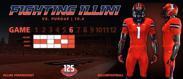
The 2014 Illini Nike Uniforms and Rebrand
- Status
- Not open for further replies.
Orange on Orange on Orange it is.
frankfortillini
- Frankfort, IL
Nice look - beat down Purdue and move on!
IlliniNation05
- Champaign, IL
I think the orange helmets look great.
I agree. I was afraid they would look bad on TV, but they were obviously awesome last weekend...can't wait to see them in person on Saturday.
The all orange looks so much better then Nebbies all red!
ILLiNimob
I
Guest
they are clean and sharp, the all orange is awesome. it will interesting to see however how much or little the helmets "matchup" w the rest of the uniform
classof2016
C
Guest
I really hope they do away with the two tone script. It just doesn't look good.
The font/script was a big miss with this project, imo. I was hoping for something like Michigan State's.
IlliniNation05
- Champaign, IL
they are clean and sharp, the all orange is awesome. it will interesting to see however how much or little the helmets "matchup" w the rest of the uniform
Definitely. They look pretty close based on the uniform tweet!
The font/script was a big miss with this project, imo. I was hoping for something like Michigan State's.
How is it much different? Both are similar with the difference that Michigan state's tails on the letters are pointed and ours are kind of squares. Also while the two-tone look may not be popular with everyone, I think it looks great on backgrounds that aren't orange or blue. And it's unique.
Uniform choosing for a game is fluid
Just like recruiting
County issue orange.
How is it much different? Both are similar with the difference that Michigan state's tails on the letters are pointed and ours are kind of squares. Also while the two-tone look may not be popular with everyone, I think it looks great on backgrounds that aren't orange or blue. And it's unique.
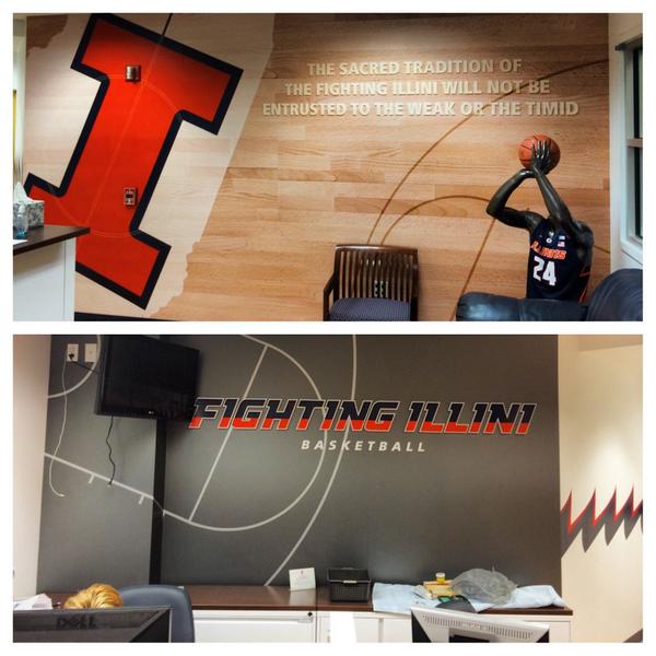
It looks really good on the grey. Coach Salem's daughter tweeted this picture of the basketball office a while back:
Hood Done!!

Roof Done!!

Tailgate Done!!

Sides are next as soon as I can figure out the layout.

Roof Done!!

Tailgate Done!!

Sides are next as soon as I can figure out the layout.

Soxfreak64
- Bloomington
VERY NICE
Wow, nice work!
OrangeAndBlue217
- Decatur, IL
Awesome!
classof2016
C
Guest
How is it much different? Both are similar with the difference that Michigan state's tails on the letters are pointed and ours are kind of squares. Also while the two-tone look may not be popular with everyone, I think it looks great on backgrounds that aren't orange or blue. And it's unique.
The two-tone is the worst part about it in my opinion. I agree it looks much better on a grey or white background though.
The font to me is just not aesthetically pleasing. Too blocky (the squares you mentioned) and the I/1 thing just seems like a lame reach. I was hoping for a font that looks good on everything, and this doesn't look good on shirts/shorts, even though it looks decent enough on jerseys and banners and stuff.
Again, this is all a matter of opinion, and I should mention that I suck at design. Just my thoughts on it.
Illini_1979
- Oregon
This. :thumb:The all orange looks so much better then Nebbies all red!
Illini_1979
- Oregon
Hood Done!!
Roof Done!!
Tailgate Done!!
Sides are next as soon as I can figure out the layout.
Very nice work!
Groundhogday
G
Guest
Have to say I haven't seen our boys on TV yet with the orange helmets, but how different are they from Syracuse? That would explain the "shipment error" for the wrong shade of orange. Their uniforms tonight look like what ours will when we finally get blue
The Syracuse helmets don't have the center stripe and the letter is blue. The orange shades are similar. The uniforms don't look that similar other than the colors.


- Status
- Not open for further replies.