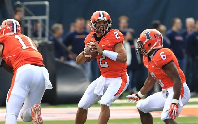
Have you been working out with Nnanna Egwu? Because that is one hell of a hedge.
That's not a hedge. That's the truth. I didn't exist when those uniforms did. I can't objectively speak about how I would have felt about their existence back then. I think it's likely I'd have been annoyed by that kind of a change for the sake of jumping on a trend. I don't think any issue with "brand" would have caused any annoyance, though.
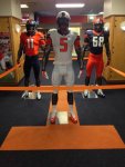
I don't mean to call you out or anything, but I was reading what you and others were saying about the rebrand on that sports logos board, and I was struck by how you design folk seem unable to separate the lazy, blithe pretentiousness and buzzword-speak of Nike (on which you are absolutely 1000% correct) from the successes or failures of the designs themselves. Just because Nike rolls up some hype machine about a "secondary palette" doesn't mean they aren't just playing with gray as a neutral color for now, for a bit, while it's the cool thing of the moment. That's absolutely what is happening.
When gray is no longer cool, we will obviously keep wearing it for 3-4 years as it becomes hopelessly lame because we're Illinois, but after that, it will disappear as if it had never been there, and you will never hear of it again.
There is a lot of factors that go into what makes something successful. And there's also the serious question (I don't have the answer to this) of how okay it is to cut corners and/or be imperfect if the impact of it is negligible.
I'm a perfectionist, and I think attention to detail matters—even when it doesn't matter. Which is every bit as confusing as it sounds. But basically, I think if you take shortcuts in some places just because you can get away with it, might you not do it somewhere that you end up not being able to get away with it?
Additionally, I do think there's the potential for some of the stuff I'm bothered by to have a noticeable impact. Not now, but down the line. Remember the whole reason we're doing this is because of how fragmented our brand had become.
Starting off with a fresh brand that already shows big signs of fragmentation and inconsistency may lead us back there quicker than we'd like. Fonts and logos are the piece that is relatively consistent, and in the case of the fonts, I'm afraid they'll be dated quickly.
So I guess I'm saying that I think some of those "little" things I'm complaining about have real potential to become real problems down the line.
But to your point, I'll admit there are other times I'm complaining about the littlest things that could never change and never matter, but it would still drive me nuts. Can't help it. I'm a perfectionist and I've got an eye for that stuff and I don't know. Just can't unsee it. An example of this would be things like LSU's or Auburn's "classic" uniforms. People love them, they may never change to any real degree, but the striping from element to element doesn't match. It never has and never will cost them fans, recruits, sales or anything else. But it just breaks a fundamental design principal and drives me nuts.
It's like the burnt out bulb in the room that has 4 other lamps. Doesn't matter. But it's irritating if you notice.
What if the only place gray appeared was on a road baseball uniform? Is it acceptable then? This is what I'm talking about about trying to have it both ways.
I'm pretty confident we just disagree on this being a principal, and that's fine, but my answer is yes, that is acceptable, and no I don't believe that's having it both ways. Because road baseball uniforms are conventionally a base color that isn't part of the rebrand, specifically grey. Like I said, we disagree on that principal, and that's ok.
")