The 2014 Illini Nike Uniforms and Rebrand

Status
Not open for further replies.
#1,126      

Kams Bathroom

K
Guest
I dig the football unis, the basketball unis are whatever, not bad but nothing special. I like the foward facing hog.

I'm cool with a modern minimalist basketball look.

The forward facing hog is probably unnecessary, but it's clever. All the hogs are now facing in the same direction on the football uniform.
 
#1,129      

JSpence

Evansville, IN
Their typography is sweet, and the forward-facing hog is a good badge.

They got the new Washington cut of football jerseys - I like ours better, though either would have fit them.

I'm surprised we don't see more tusks. Their volleyball jerseys are fairly meh, but their softball uniforms look perfect.
 
#1,130      

HsvIllini

Alabama
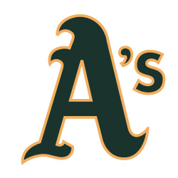
"Respect the Past. Represent the Future." Is that their blanket catch phrase for all the recent rebrandings? Also, isn't their tertiary logo a blatant rip-off of the Oakland A's logo? Granted, it's modified VERY slightly, but....

a-lg-white-bg.jpg


oakland_athletics.jpg
 
Last edited:
#1,131      

CardsIllinifan8

C
Guest
I think the Nike dri fit is polyester microfiber. So it should never shrink and the color shouldn't wash out (unless you use bleach). Similar to underarmour.


Yes it is. I have about 15 dri fit shirts and a few pair of shorts. Love them. They don't shrink, and are the most comfortable shirt ever. I like the dri fit material better than under armour. I know each person is different, but I recommend dri fit to anyone.
 
#1,132      

HsvIllini

Alabama
Yes it is. I have about 15 dri fit shirts and a few pair of shorts. Love them. They don't shrink, and are the most comfortable shirt ever. I like the dri fit material better than under armour. I know each person is different, but I recommend dri fit to anyone.

Never tried under armour, but I can vouch for the dri fit being probably the most comfortable shirt ever.
 
#1,133      

Indicchief

I
Guest
Like the white unis.

The rest of unis are OK, nothing to write home about.

The shield is a mess. In 2014 they ought to have a better contemporary shield.
 
#1,135      
Like the white unis.

The rest of unis are OK, nothing to write home about.

The shield is a mess. In 2014 they ought to have a better contemporary shield.

Yeah, the original euphoria of a rebranding has worn off for me and now I'm left wondering what could have been. After reading from 3 sources that there was an original rebrand planned that was denied by the university higher ups due to political correctness, it makes me wonder if the shield wasn't just thrown together. If you watch the rebranding ceremony the Nike guy is just struggling to find any symbolism in what they did. Opposing F's for future and past? the block I symbolizes crossroads? The two tone Illinois symbolizes the sky and the earth?
Come on! I would love to see the original rebrand idea. Was it too militaristic or Indian based? Here's an idea if you moved top of a larger block I slightly out of the top of the shield and up turned the corners would it hint at arrowhead appearance?hmm
 
#1,136      

mattcoldagelli

The Transfer Portal with Do Not Contact Tag
Their typography is sweet, and the forward-facing hog is a good badge.

They got the new Washington cut of football jerseys - I like ours better, though either would have fit them.

I'm surprised we don't see more tusks. Their volleyball jerseys are fairly meh, but their softball uniforms look perfect.

Yeah, I like the font as well, especially the thinner one.
 
#1,138      

Kams Bathroom

K
Guest
After reading from 3 sources that there was an original rebrand planned that was denied by the university higher ups due to political correctness

Well this is going to be one of the more obnoxious old wives tales in Illini history, I can already tell.
 
#1,141      

HsvIllini

Alabama
Yeah, the original euphoria of a rebranding has worn off for me and now I'm left wondering what could have been. After reading from 3 sources that there was an original rebrand planned that was denied by the university higher ups due to political correctness, it makes me wonder if the shield wasn't just thrown together. If you watch the rebranding ceremony the Nike guy is just struggling to find any symbolism in what they did. Opposing F's for future and past? the block I symbolizes crossroads? The two tone Illinois symbolizes the sky and the earth?
Come on! I would love to see the original rebrand idea. Was it too militaristic or Indian based? Here's an idea if you moved top of a larger block I slightly out of the top of the shield and up turned the corners would it hint at arrowhead appearance?hmm

I don't remember where I read it, but I read that one of them involved the soldier we saw the little piece of and also some aspect of the Chief. Is that the one they may be talking about?
 
#1,144      

STL FANATIC

S
Guest
They used grey, so the rebrand is bad.

No. It's imperfect. Man is it frustrating to have your words twisted just because they're in disagreement with someone else's.

Black has been an alternate color for Arkansas for some time. That means grey is a more natural fit, and also at the same time not necessary because black is already there.

I actually like deep charcoal grey quite a bit. If I could do anything with their colors, I'd have probably replaced all black with that (Nike calls it "anthracite"), dropped black, and not bothered with that light grey.

But as much as it may annoy me for technical reasons, grey is just a shade of black, so it doesn't stand out as bad when it is used for Arkansas.

And it's a minor note that I can overlook given the strength of the rest of the brand.

I do agree, of course, that they had a stronger starting point than we did. I still think they got a better effort and a better result.
 
#1,145      

HsvIllini

Alabama
No. It's imperfect. Man is it frustrating to have your words twisted just because they're in disagreement with someone else's.

Black has been an alternate color for Arkansas for some time. That means grey is a more natural fit, and also at the same time not necessary because black is already there.

I actually like deep charcoal grey quite a bit. If I could do anything with their colors, I'd have probably replaced all black with that (Nike calls it "anthracite"), dropped black, and not bothered with that light grey.

But as much as it may annoy me for technical reasons, grey is just a shade of black, so it doesn't stand out as bad when it is used for Arkansas.

And it's a minor note that I can overlook given the strength of the rest of the brand.

I do agree, of course, that they had a stronger starting point than we did. I still think they got a better effort and a better result.

So is the tertiary logo which was essentially stolen a good element of the brand?

Edit: Nevermind, it looks like it was this way even before the rebrand.
 
Last edited:
#1,147      

DrewD007

Woodridge, IL
So is the tertiary logo which was essentially stolen a good element of the brand?

Apparently they've been using that logo for baseball and softball for some time now.

"The Arkansas script "A" is most commonly associated with the Razorback Baseball and Softball teams. Historically, the logo, mascot or team’s initial is placed on the cap. Arkansas proudly displays the letter “A” on their caps."

It was probably originally inspired by the A's, but that was before Nike was involved I'd imagine.
 
#1,149      

STL FANATIC

S
Guest
Apparently they've been using that logo for baseball and softball for some time now.

"The Arkansas script "A" is most commonly associated with the Razorback Baseball and Softball teams. Historically, the logo, mascot or team’s initial is placed on the cap. Arkansas proudly displays the letter “A” on their caps."

It was probably originally inspired by the A's, but that was before Nike was involved I'd imagine.

Correct. And there's other examples of this in sports. Eventually very similar logos can become to be identified with 2 different organizations depending on the context. (See the Chicago Bears and Cincinnati Reds.)

FWIW, the Arkansas logo is actually even closer to the A's than the image above shows, though. The A's tweaked their A sometime in the 90s. Oddly this resulted in a cap A that was different from their primary logo A. Weird but that's how it is. Here's what they wear on their caps which is very similar to the Arkansas A.

7qhqw3dgcot1g01bhcgi4zuac.gif


And of course both A's are inspired by Olde English forms, so neither are completely proprietary.
 
#1,150      

HsvIllini

Alabama
Apparently they've been using that logo for baseball and softball for some time now.

"The Arkansas script "A" is most commonly associated with the Razorback Baseball and Softball teams. Historically, the logo, mascot or team’s initial is placed on the cap. Arkansas proudly displays the letter “A” on their caps."

It was probably originally inspired by the A's, but that was before Nike was involved I'd imagine.

Yeah, I noticed that after I posted.
 
Status
Not open for further replies.