The 2014 Illini Nike Uniforms and Rebrand

Status
Not open for further replies.
#2,901      

BZuppke

Plainfield
I think the expert design people who comment here wouldn't like anything except their own work. My experience is with architects (creative types) and it seems that they always rip someone else's work. That being said, the redesign didn't knock anyone's socks off, but imo we have a lot better look than we've had in decades. Further, I don't believe for one minute that Nike just mailed it in. So while some can "hate" the new design, font etc., there are many who can love/like it. The overwhelming sentiment of fans/recruits/alums is that it is a nice improvement even it not a pure homerun. That consensus is what counts.
 
#2,902      

illinicb

Northbrook
I think the expert design people who comment here wouldn't like anything except their own work. My experience is with architects (creative types) and it seems that they always rip someone else's work. That being said, the redesign didn't knock anyone's socks off, but imo we have a lot better look than we've had in decades. Further, I don't believe for one minute that Nike just mailed it in. So while some can "hate" the new design, font etc., there are many who can love/like it. The overwhelming sentiment of fans/recruits/alums is that it is a nice improvement even it not a pure homerun. That consensus is what counts.
Now that some time has passed, I have a better take on if I really like it or not. In general I'm ambivalent I guess. I do like the new block I with the rounded interior edges. Not sure I would have cared, but when I see the old block I it seems dated. In general, I liked the football uniforms, but didn't love them. I would probably like more blue once that is available.

The font is fine I guess, but I suspect it will look dated sooner than later. Maybe it will grow on me. The basketball unis are OK, but nothing particularly special, but I feel like that most years.

I'm still not a big shield guy, but I don't think its the end of life as we know it.

As I suspected, the new uniforms haven't seemed to have a positive impact on the performance on the field/court. Oh well.
 
#2,903      
Don't understand the WW2 General Patton tank commander helments. Shiny=Good,
Dull= well, Dull. The grey uniforms looks like the days on no color TV..ho hum. We need something more "electric" with some WOW factor. (see Oregon).
 
#2,904      
The grey uniforms looks like the days on no color TV..ho hum. We need something more "electric" with some WOW factor. (see Oregon).

Illinois-R3-590x785.jpg


ducks-uniforms-championship-game-01052015.jpg
 
#2,908      
I'd love to see the orange incorporated like it was on the basketball uniforms.

oh, I agree. Some orange accents or stripes on the pants, jersey and/or helmet would be nice.

And the complete lack of blue this year save the one game we wore blue helmets made no sense to me either.
 
#2,909      
I just wonder if we will ever have a "usual" look once all pieces have been debuted. Of course there can be games where we have "special" looks. I just don't want to wear something different every week just for the sake of doing it. As my dad would say I just want to have a look where a casual viewer channel surfing would click over to our game and immediately know that's Illinois.

The most important part of this, to me, is the helmet. I'd love to see us just pick one and stick with it for 9-10 games out of the year. Personally I'd love to see that be the orange one since its the most unique. White, like black or silver with some other schools, is becoming so en vogue that it's not that special. So for home or road I'd love to see orange be the "standard" look. How many other school's have that as their main color dome? Florida, 'Cuse, Clemson, Oregon state, Okie state (maybe?), Bowling Green?, sometimes The U? A few others might have an orange version but not their go to.

I've heard people say that for the home tops they like to go orange when it's hot and blue (if we ever actually get them) when its cold, which makes sense. But I'd still like to have just one that's there say 80% of the time. Other schools, in far warmer climates, get away with darker jerseys in the early months of the season (granted they get more night games than we probably do). I'd like to see blue emerge here for us simply because it pairs with all the pant combos (I know that goes against my whole argument of having just one look, but you'll never stop them from branching out totally). Plus if we've ever had a signature look it's been orange helmets and blue tops, our classic look if you will.

Pants... I can't quite put into words how much I dislike the white pants. I know people like them because they look clean and crisp (or my least favorite argument that they make us "look faster") but they're just so bland. I want to see as much Orange and Blue as possible and having an entire half of the uni just be blank so much of the time is a bit sad to me. We're lucky enough to cheer for a school with two colors, not just one color and white like Wisky, MSU, PSU. Let's use them to their full potential! Orange pants would be my choice for the standard pants look with blue for the special occasions, (big ten championship game if we ever get there). Goes back to my young childhood where we'd go O/B/B for the big games, loved it.

For the road I actually love the new white tops, like most of us do. But to use the white pants with that just goes back to looking too bland. Love the Blue pants for the road. I'd like O/W/B for the road but O/W/O or even a blue lid would look good sometimes too.

Sorry for the novella but I just don't even recognize us most of the time when I see us on the field. We're in that limbo between having a classic look and trying to be Oregon. And I think we've lost enough over the last 10 years to put the superstitious thing to bed, NO combo will help us win better than any other, but we can at least play looking like the U of I.
 
Last edited:
#2,915      

CardsIllinifan8

C
Guest
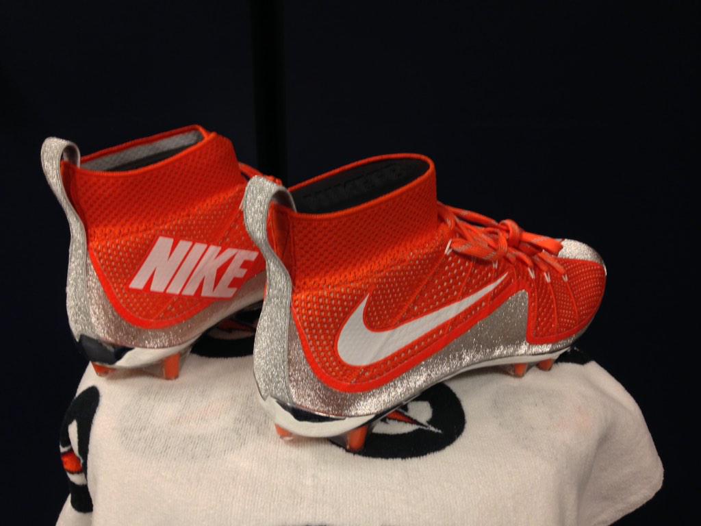
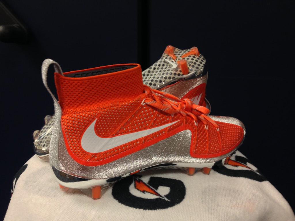
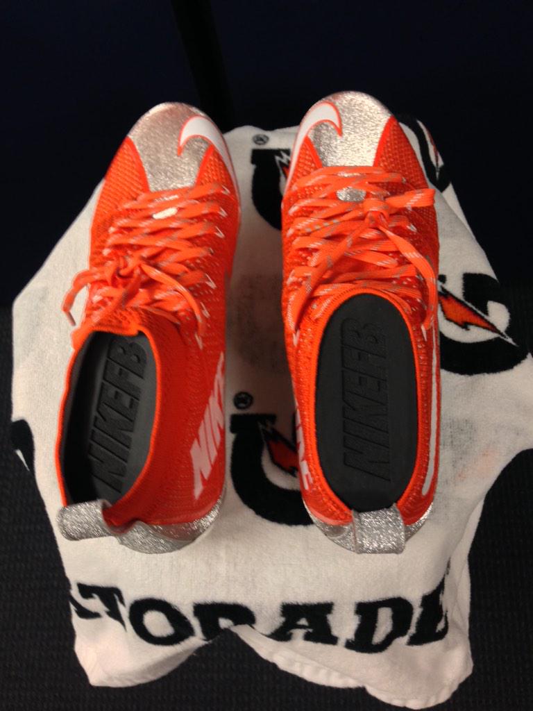
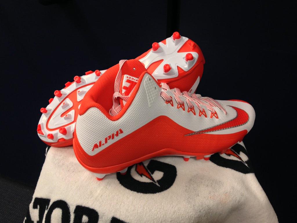
The orange shoes w/ the silver trim leads me to believe we'll see another version of those grey ghost unis, possibly with some more orange this time


Agreed. The jerseys were liked a lot. Think we see me orange top, and maybe silver bottom.
 
#2,919      
wait a second.............new secondary logos?

the Hawks, Celtics, Penguins & Pirates have been using those for years.......

With the exception of the the Penguins logo, I see slight changes on each.
Boston-no Celtic only white outline
Pirates-Skull and crossbones is yellow now, the old one was white.
Hawks-A jagged line on the Hawk's head where the old was straight, and the beak looks to be "sharper".
Penguins looks the exact same, and I hate that generic logo.
 
Last edited:
#2,920      

wILL-INI

Charlotte, NC
wait a second.............new secondary logos?

the Hawks, Celtics, Penguins & Pirates have been using those for years.......

79d4396ab18c3c0aac0860e6b78ac507.jpg

the hawks is just updated.

The Celtics is new in the fact its a one color logo.

The Pittsburgh 2 are just reunveilings for throwback jerseys so "new"
 
#2,921      
Didn't the Sixers not actually use the Ballin' Ben Franklin logo? (Which is just so awesome, btw, and all the more evidence that Fightin' Abe should be an Illini thing)
 
#2,923      
and couldnt the IronPigs have figured out a more imaginative 'bacon strip' ?
 
Status
Not open for further replies.