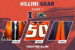
The 2014 Illini Nike Uniforms and Rebrand

Status
Not open for further replies.
#3,276      
No the jerseys look fine. If anything it's the helmets that should be different. It's not supposed to be a triple stripe oreo type pattern, it's supposed to emphasize the dual stripes against a common background color. That's the "dual column" concept.

And by emphasizing that, you can create consistency across every color combination, which is otherwise impossible.

But there's a downside. You create that consistency, and the stripes on the white helmet and white jersey suddenly look kinda drab, and you detract from your most attractive combo (IMO) in the name of fastidiousness.

And how often will we wear the blue jerseys with the blue helmets anyway? That will probably be the least used of any combo.

You do what looks right, not what solves the internal design logic puzzle. On the White/Orange/White combo we wore most often last year, the white middle shoulder stripe is "wrong", but I defy you to tell me it would look better if it were "right".
 
#3,278      

wILL-INI

Charlotte, NC
Pardon if this question is scandalously ignorant, I haven't done a good job following the board.

But these unis don't look like the Nike ones at all. Have we just walked away from the Nike work and gone our own way?

In what manner? They are 100% Nike, granted they are already the outdated. Nike has the new Mach Speed Uniform (see TCU, Oregon, Texas, Ohio State, Air force and Colorados template)
 
#3,279      
I agree that the blue jerseys and pants would look great with a white stripe between the two orange stripes. But the orange border around the numbers is a nice improvement over the ones unveiled last year .
 
#3,280      

wILL-INI

Charlotte, NC
This is more of a personal preference, but im interested in what the community thinks.

To me the collars are just too big and intrusive. Id rather see them left off and just have the sleeve stripes. But I tend to like a simpler uni, on the side of boring.
 
#3,281      
I agree that the blue jerseys and pants would look great with a white stripe between the two orange stripes. But the orange border around the numbers is a nice improvement over the ones unveiled last year .

In agreeance with you....the white stripe is very needed....i guess at least we arent as dull as penn state iowa indiana wisconsin purdue minnesota uniform wise....smh lol
 
#3,282      

illini1

Springfield, IL
Solid addition but putting a stroke around the numbers. Man the striping bugs me though. Orange White Orange on the helmet, Orange blue Orange on the jersey and pants.


They have the same problem with the orange pants too. The striping is blue/orange/blue, but the helmet and jersey are blue/white/blue.

I don't care if the middle stripe is white or not. I just want it to be consistent on all uniform elements.
 
#3,283      
They still match. They still accent. The white helmet is blue orange blue. The blue and white jerseys are the same as are the pants. Which would lead me to believe that the orange and the blue helmets are alternates and white is the primary. Then again, maybe not. Maybe thats just how they had to do it.
 
#3,284      
This is more of a personal preference, but im interested in what the community thinks.

To me the collars are just too big and intrusive. Id rather see them left off and just have the sleeve stripes. But I tend to like a simpler uni, on the side of boring.

They look better on the full uniform than just worn in street clothes, IMO.
 
#3,285      
Volleyball breaking out grey uniforms this evening. It appears they have orange, navy, and grey in the new style, but not white. :eek:
 
#3,291      

illini1

Springfield, IL
ImageUploadedByTapatalk1441368091.595117.jpg
 
#3,293      
Is it too much to ask for the classic Illini combination of orange helmet, blue jersey, orange pants?

Yes. Nike didn't rebrand the University to keep it looking classic. It's 2015. Things change and our uniforms were one of them. I love the fact that there are multiple combinations now with 3 helmets and the Gray Ghost unis. Love everything about it, its what young recruits are looking for. When you have an "Orange Out" wearing blue tops defeats the purpose.
 
#3,295      

HsvIllini

Alabama
Yes. Nike didn't rebrand the University to keep it looking classic. It's 2015. Things change and our uniforms were one of them. I love the fact that there are multiple combinations now with 3 helmets and the Gray Ghost unis. Love everything about it, its what young recruits are looking for. When you have an "Orange Out" wearing blue tops defeats the purpose.

Don't blue pants also? Using that argument, it should be orange on orange.:noidea:
 
#3,297      
According to my convo with Mike Waddell on Twitter, they are wearing all white (yes, at home) against WIU.

O/B/O will be debuted against MTSU.

My guess is things will be switched up a ton this year with all options available.

I actually think the stormtrooper look might be our best combo, but a home "whiteout" is still lame.
 
#3,299      

IlliniByProxy

St. Joseph, IL
Has anyone seen a blue 77 jersey for sale anywhere? Or just a 77 jersey in general? I can't find anything but 1 and 15 jerseys.
 
Status
Not open for further replies.