Fanatics had whites. I can't recall what number.
Those are the old ones though. They have 7 and 9 in those.
Fanatics had whites. I can't recall what number.
Those are the old ones though. They have 7 and 9 in those.
Right. I can understand not making all the colors and options. BUT to have one jersey with one number option to me is simply not acceptable. Perhaps sales have declined so much with jerseys because the manufacturers (Nike is most guilty of this with college jerseys) have increased prices compared to five years ago ($59 to $90). Last year having grey and orange were good options, but to literally not be able to purchase, customize, buy an expensive authentic version... of blue or white is comical.
A simple search on fanatics for Indiana football jerseys http://www.fanatics.com/search/indiana%20football%20jersey shows both color options for them as well as multiple numbers AND they're only $65. I'm too lazy to do any more research, but I imagine that other Adidas football schools that aren't exactly marquee programs still have all their jerseys available for purchase.
So, where does the blame fall for this. If one believes Mike Waddell (no reason not to here), it's that the school gave the ability to Nike to license and sell the numbers 1, 15, 50, and 77. It is then up to Nike to decide what they are going to make to offer to retailers. I suspect that on top of that, a retailer could call up Nike and place an order for several hundred/thousand additional pieces and get it custom made, but this would likely require high volume that a program in our state is not going to be doing. While I generally feel that Nike hasn't been the one to blame for a lot of this rebrand and that it is more simply circumstantial on most of peoples' complaints, this seems to be an area that they are really dropping the ball in. I understand jerseys aren't huge money makers, but that doesn't mean you should drop the ball completely.
Why don't the football jerseys they have for sale have the striping on the front? I thought that was the best part of the new uniforms, and was definitely going to get one before I saw that the replicas didn't have them. I am also a big fan of the stripes because they are unique to Illinois, and Would help to distinguish us from other similar colored teams (I was asked at OSU why I was wearing a Broncos jersey a few years ago)

Very good question. I completely agree.
Saw this tonight. Too bad there isn't a roster to pick a name, but rules are rules. http://www.fansedge.com/Illinois_Fi...ois_Fighting_Illini_Orange_Custom_Game_Jersey
 Does the name you pick have to match the one on your credit card?
Looks like O/W/O this week.
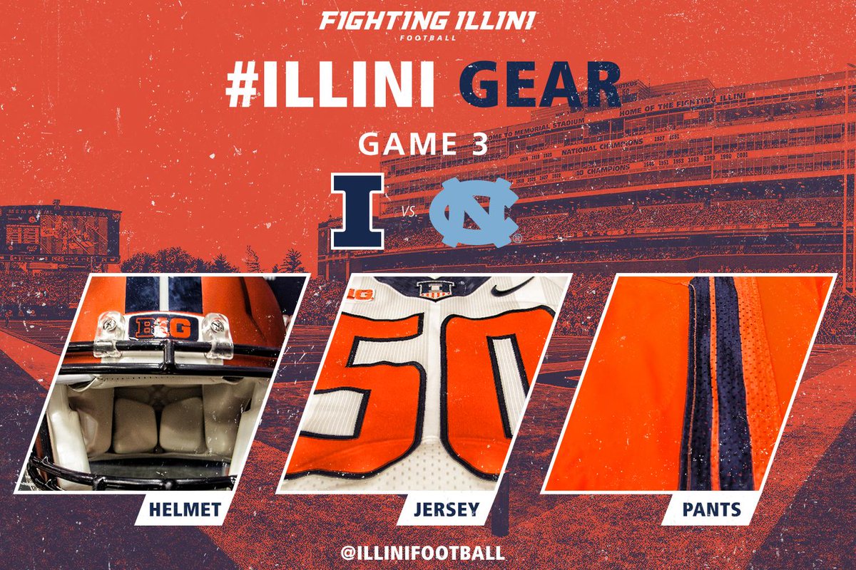
I'm sure this has been brought up before, but does anyone have a good reason why the stripes on the orange helmet don't match the stripes on the orange pants? I think the same issue applies with the blue helmet and jerseys.
It's just laziness on Nike's part. There is no excuse to have this F'ed up striping, when all they preached was consistency.
I agree that it would look better with the matching stripes but I interpreted the consistency pitch much differently. To me consistency references logos, fonts and colors. Design is a separate issue.
It's just laziness on Nike's part. There is no excuse to have this F'ed up striping, when all they preached was consistency.
Thoughts: the orange chrome helmet has not looked good with any jersey combinations the team has worn with them. The look would be complete if the numbers were chrome or some other component of the uniform was chrome. I like the orange chrome helmet, but the rest of the uniform does not compliment the look of the chrome helmet.
I would like to see this combination: Orange Chrome Helmet, Blue Jersey, White Pants
For arguments sake, I thought it looked good with orange pants and a white or blue jersey in the pictures i've seen, including the look we saw saturday (even though that combo has led to blowouts between this weekend and OSU last year). Also they really aren't chrome, they're technically anodized.
Not that it matters, but my 8 year-old saw what we were wearing on Saturday and laughed. He really dislikes the orange helmet. Not being familiar with the situation, he told me that Illinois should pay a company to come up with a better uniform.
I showed him pictures of the white/blue/white and he much preferred that.
The weird Matte/Semi-Reflective Orange helmets look so out of place with their uniforms. I think they might look good on top of an all blue uniform, but even then i'm not sure. Maybe on top of all white as well. But when they wear orange jerseys or pants the stark difference in the color of the oranges looks truly awful.
Not that it matters, but my 8 year-old saw what we were wearing on Saturday and laughed. He really dislikes the orange helmet. Not being familiar with the situation, he told me that Illinois should pay a company to come up with a better uniform.
I showed him pictures of the white/blue/white and he much preferred that.