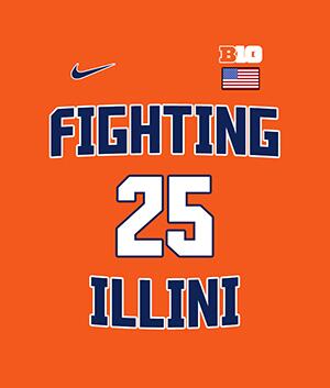
The new basketball uniforms

Status
Not open for further replies.
#501      
The waistband rolling is a point of emphasis in HS bball in texas. You would be happy here.

Saw a ref make a kid unroll his shorts in a Jr High game here in Illinois last week.

I also noticed Mark Smith pull his shorts up very high in Fiday's game, but not roll the waistband. It seems some of the kids don't like where the shorts hit them...then again, maybe I'm old and I just don't know that it's cool!
 
#502      

icengineer

Southern Illinois
Problem solved!

428429884_c8d6b79244.jpg
 
#503      
Dear Santa,

Ditch the rebrand (letter and numeral fonts) in all sports, keep the football helmets. Go for tradition design, that is all, carry on.
 
#504      
I've got no problem with the rolling, make the uniform as comfortable as you can. Just hate the way they make the colors look.

Sent from my SM-G930P using Tapatalk
 
#506      
Heard we will be adding two more uniforms this season (Thank god). Really sick of these zigzags. We could really benefit from some different uniforms.
 
#507      
Heard we will be adding two more uniforms this season (Thank god). Really sick of these zigzags. We could really benefit from some different uniforms.

Adding two or replacing two?

Because we've got three sets of zig-zags.

The uniforms we need seem head-smackingly obvious to me. The color combinations of the 05 uniforms, the formatting of the 89 uniforms and the fonts of the rebrand. And replace the zig-zag striping with the "columns" striping from the football uniforms. Take all the good ingredients we've got and stir them up in the same pot.
 
#509      
Why not get the patent to "Flying Illini" and use this to represent the basketball program moving forward?

Also could rebrand, mascot, and market the entire new image with uniforms and all, talk about changing the culture while embracing the past that made us what we all want to return too?
 
#510      

Ransom Stoddard

Ordained Dudeist Priest
Bloomington, IL
Meh. I can do without the fonts of the rebrand. Bring back the solid block ILLINOIS and FIGHTING ILLINI. 1LL1NO1S never looked right to me.
 
#511      

ILL in IA

Iowa City
I will take the White Fighting Illini jerseys at home. Update the Orange uniforms that we had in 05 as the road kit. I think the orange stands out on the road more than navy. Match-up with what the fans will be wearing going into road arenas. Update the navy uniform as the alt.
 
#512      
Flying Illini- Eagle Mascot? Illinois is the 2nd highest winter living area for bald eagles behind only the state of Alaska.

www.pure-spirit.com/more-animal-symbolism/629-eagle-symbolism

The whole mascot thing could be resolved, the new image/uniforms could get us moving forward with the new culture and fierce determination to get this program back to where we all want it?

We all WANT the Chief, that said he is not coming back...anyone with photoshop skills? Conjure up a Eagle logo with the university colors for the feathers etc?
 
#514      

haasi

New York
Something like Villanova's? My #1 choice.

AP_18083059806157-1521960971.jpeg


These would be great. So simple and classic. We don’t need to go exact replica of 89, but something simple with a nice big ILLINOIS in block letters on the front would be great.


Sent from my iPhone using Tapatalk
 
#515      
Meh. I can do without the fonts of the rebrand....1LL1NO1S never looked right to me.

I don't entirely disagree, but it's what you've got and it's been rolled out to the other teams on campus. The concept of having a consistent brand identity is sound, it's just that the font itself wasn't the world's greatest execution. Get it on the front of uniforms that look good and on teams that win and it will settle in.
 
#516      
Save the "FIGHTING ILLINI" as the alternate, block "ILLINOIS" as the main uni. "1LL1NO1S" must go. Just my 2 1/2 cents. PS - lose the grays.
 
Last edited:
#518      

GortTheRobot

North Bethesda, Maryland
Save the "FIGHTING ILLINI" as the alternate, block "ILLINOIS" as the main uni. "1LL1NO1S" must go. Just my 2 1/2 cents. PS - lose the grays.

100% agree. I can't stand the 1LL1NO1S. Please go back to the block lettering. And NO ZIGZAGS! Just horrible.
 
#519      

Illini_1979

Oregon
Man, this thread has been going on for almost 4 years.

I agree with the above comments that simpler, block lettering is preferred. No zigzags or anything flashy. Just classy looking, like the Nova unis shown above.

Just my $0.02.
 
#520      
Heard we will be adding two more uniforms this season (Thank god). Really sick of these zigzags. We could really benefit from some different uniforms.

By adding two, do you mean keeping the existing five (white, orange & blue with zigzags, Fighting Illini and grey alternates) and adding two more alternates or replacing existing ones with new ones?
 
#521      

redwingillini11

White and Sixth
North Aurora
By adding two, do you mean keeping the existing five (white, orange & blue with zigzags, Fighting Illini and grey alternates) and adding two more alternates or replacing existing ones with new ones?

My sources seem to suggest we are done with the zig zags (BU never liked them). I don't have any other details, but we are getting a new "set" this year, and they are said to look good. I would assume though that the throwbacks are here to stay though.
 
#522      
My sources seem to suggest we are done with the zig zags (BU never liked them). I don't have any other details, but we are getting a new "set" this year, and they are said to look good. I would assume though that the throwbacks are here to stay though.

Great to hear! I strongly disliked pretty much everything about the uniforms since the day they were announced during the rebrand.
 
#524      
I wish I had the photoshop skills to mock up the synthesis I'm describing. I'm convinced it would have a 95% approval rating.

It would be basically this (someone here made this in the pre-rebrand thread), just with the actual fonts:

Bi9WXLyCYAAeZai.jpg
 
Last edited:
#525      

GortTheRobot

North Bethesda, Maryland
I wish I had the photoshop skills to mock up the synthesis I'm describing. I'm convinced it would have a 95% approval rating.

It would be basically this (someone here made this in the pre-rebrand thread), just with the actual fonts:

Bi9WXLyCYAAeZai.jpg

Yes, with the right font, that is the best look. Of course, a new mascot would be great too.
 
Status
Not open for further replies.