The 2014 Illini Nike Uniforms and Rebrand

Status
Not open for further replies.
#3,401      
The new uni's aren't that bad (except the drab faddish gray ones).

I would love to see us scrap the (also faddish) metallic orange helmets though and go back to our more traditional orange paint scheme helmets (with the new orange color tone of course).

:chief:

Like maybe an alternate illini helmet with the new illinois font in that giants style logo we used to have???
 
#3,403      

Kramer

Des Moines, Iowa
I like all the new uniforms, I think they are very nice and stylish without being too much like a lot of the UA uniforms.

I was happy to see that helmet go away, very dated.
 
#3,404      
i just dont like the i on the helmet.....its too dull....theres like millions of possibilities of an illinois helmet and they just decided to do an i??? like indiana??... im not feelin it....though i love the new font
 
#3,405      

RHITIllini

Chicago, IL
What might spice the helmet up is replacing the middle stripe with the zig zag pattern like wILL-INI has in his signature.
 
#3,407      

wILL-INI

Charlotte, NC
What might spice the helmet up is replacing the middle stripe with the zig zag pattern like wILL-INI has in his signature.

Unfortunately I think ive moved on from this opinion (like my early concepts). While I think itd still work from a design standpoint. We've changed too much. And if were locked into this rebrand itd be such a HUGE clash.

I would like to see our helmets move on from the metallic. Like you all have said, its dated and too gaudy. Simple orange coating. Done and Done...
 
#3,408      

wILL-INI

Charlotte, NC
I WOULD HOWEVER DO ANYTHING TO GET THE WHITE FACEMASKS BACK!!!

It's a tragedy Beck made us change them, and its even worse we havent gone back. The white mask worked so perfectly.

CPMFG_lXAAA1Fw5.png
 
#3,409      
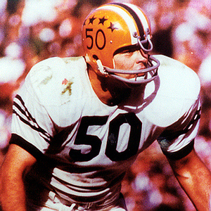
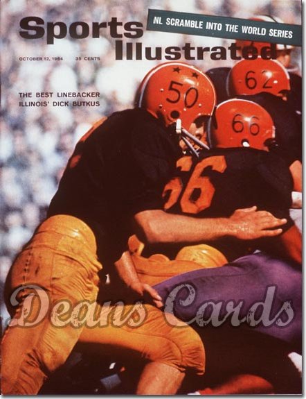
Does anyone know what the four stars represented on the Ditka-era helmets? Thought those would be a nice throwback/ addition to the new helmets, but never knew what they stood for
 
#3,414      
The only guess I had was that it had to do with your year in school, but that wouldn't make sense for the guys that didnt have any on their helmets.

I always thought it would be a good look to revisit if there was a greater meaning behind those stars. I was a big fan of the helmets we wore a few years ago with the 11 stars for the guys who died in the war, the design looked a little like clip art, but would be great to incorporate stuff like that a bit more
 
#3,415      
I recall when I was at the DI back in '08 and we wore the Renaissance throwbacks I was told that they were merit stars for performance. It seems they were given out quite judiciously.

Of course in the '08 throwback game they had everyone wearing the same amount of stars, in part because Zook didn't have any comparable helmet-sticker regime.
 
#3,416      

aiwpfan

Springfield, Il
I think it has something to do with awards, or achievements? Because the whole team did not have them.

Right, those were merit stickers, kind of like the Buckeye stickers Ohio State uses now.
 
#3,417      

dgcrow

Kelso, WA
I WOULD HOWEVER DO ANYTHING TO GET THE WHITE FACEMASKS BACK!!!

It's a tragedy Beck made us change them, and its even worse we havent gone back. The white mask worked so perfectly.

CPMFG_lXAAA1Fw5.png

Agreed. Loved those white face masks.
 
#3,419      
I believe the best look would be if the mask matched the helmet.ImageUploadedByTapatalk1452779033.470553.jpgImageUploadedByTapatalk1452779040.567034.jpgImageUploadedByTapatalk1452779047.642062.jpg
 
#3,421      

Hoppy2105

Little Rock, Arkansas
I've always loved the white face masks but I think they are best on the orange (non metallic) helmet. It may sound weird but it was one of the first things I noticed as a young fan at the games and, oddly, always have felt it was a reason for my fandom. Just something about the stark white contrast against the orange was awesome.

Now the other colors could use white, or contrast with a different color or keep the color the same as the helmet but leave that orange and white combo alone!

:thumb:
 
#3,422      
i think we should go ahead and go chrome....we are so behind on the metallic
 
#3,424      

wILL-INI

Charlotte, NC
why cant we just have an orange helmet. No metallic, no chrome, no sparkle. Orange.

All this extra stuff is like the hot young kid who walks into an interview with a shiny suit. Sure, its flashy and it gets attention, but you do not look professional. We do all this junk to have recruits to "ZOMG!!!!1 THESE HELMETS fire emoji fire emoji fire emoji" and then on signing day they go to Iowa. Its cool to be flashy for a bit, but id rather have a look that will look good in 20 years, not for just a week.

And metallic specifically is horrible when it comes to color... because its metallic. You can match colors with it, because it is the color of its surroundings.
e202aae7c8b93ce2705ce7a1cdfb8ef1.jpg
You might have it be orange, but on gameday it'll be green and blue and whatever color is around it.
 
Last edited:
#3,425      
i think we should go ahead and go chrome....we are so behind on the metallic

No chrome ... that's about as outdated now as the metallic one we have.

No silly zig zags (which have absolutely no real connection to the Chief).

Please no :shield: decal on the side of any helmet ever.

Just replace the current metallic orange paint with regular orange paint and all is good. Keep the :illinois: on the sides of the helmet until we can come up with a better secondary logo that isn't an embarrassment.
 
Status
Not open for further replies.