Illinois Football Uniforms

Status
Not open for further replies.
#76      
Am completely with you on the cursive "I". *shudder*

IIRC, we used the arc "ILLINI" on the helmets from Blackman's arrival in '71 (or a season afterward... and with those cool, Dartmouth-inspired, dual white stripes while he was our coach) through White's departure in '87, with maybe only a blip for a season when Moeller might have used a blank orange helmet (or maybe not... memory is foggy). That's much longer than we've used the Block "I", I believe.

Older (and wiser) fans can correct me but I don't recall that the program ever used the Block "I" in the pre-'70s eras. I believe we used only blank helmets or helmets bearing jersey numerals. I believe the Block "I" was a purely post-Zook introduction. Beckman (??... again, *shudder*) introduced it and it stuck (like gum to the sole of one's shoe, IMO.) It just reminds me of Indiana's use of the "I", and not in a positive way.

I will be grateful, however, to anyone who can educate me about Illini helmet history and correct my misconceptions.
There is a website called the helmet project that has teams' different helmets and the years worn.
http://www.nationalchamps.net/Helmet_Project/

I'm not very old nor wise but somehow I know this...
Moeller had the slanted "illini" after blackman, minus the dartmouth stripes and had blue facemasks
White initially had grey facemasts with slanted Illini (looks like a chiefs headress in some pics) then to orange facemasks and Chief helmet stickers.
Macovic got rid of slanted Illini so for a year they were plain orange with orange facemasks and no decals except for stripes in the middle, then the ILLINOIS a la NY Giants was adopted.
Under zook, ILLINOIS was modified slightly to have a blue outline
Then I stopped paying close attention for a few years during Beckman and Lovie b/c every game that had something different.
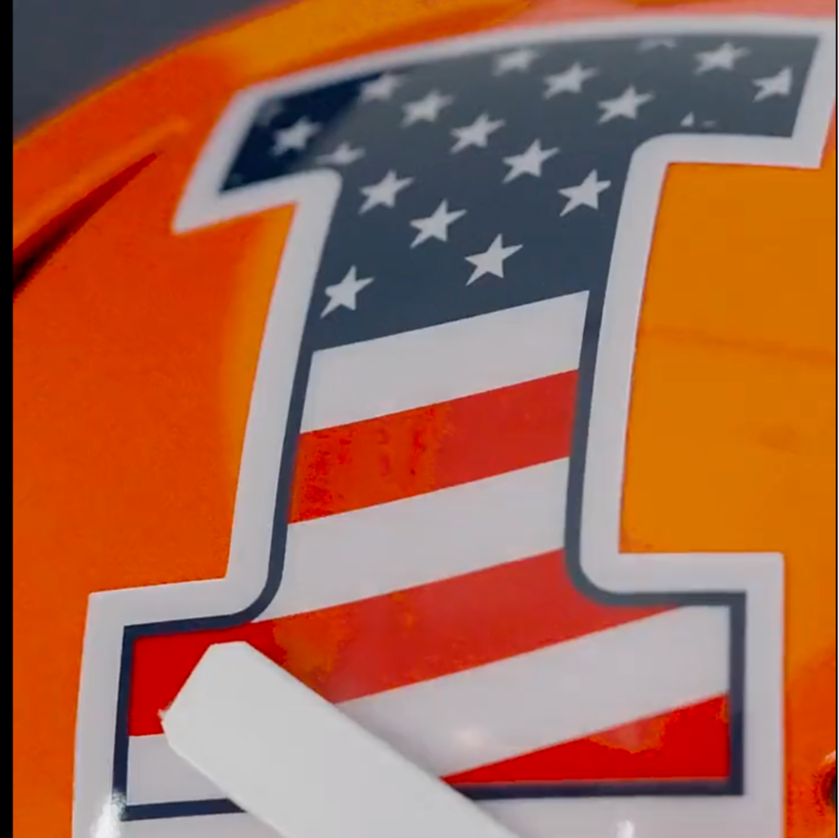
Bielema is at least consistent with orange helmets and white facemasks, albeit with a block I.

On this thread I mentioned someone who came up with some conceptual designs on another thread and he (or she) replied that they created those.

@ TheFlyinIllini 1317, may I ask you post those again so people can take a look? It is an updated version of the slant Illini of 70s and 80s, that I think looks pretty awesome.
 
Last edited:
#77      

Mr. Tibbs

southeast DuPage
you have the coaches timing wrong


Blackmon basically introduced the curved ILLINI which was similar to the Cincy Bengals helmets
Moeller took away the "dartmouth" stripes
White did very little to it then
Mackovic introduced the slant & underlined ILLINOIS which was similar to the NY Giants helmets
Zook did very little to it then
Beckman introduced the block I
so far, BB has done very little to it so far

I dont consider facemask color as anything worth noting, really

Im okay with the Block I helmet decal. We simply dont have any other logo to use and I doubt anything is going to change regarding that soon
Im more interested in seeing some more " pop" to our uniforms and am hoping for white outlines on the numbers on the orange and blue unis (do we even have blue jerseys anymore ?) for sure, and maybe on the pants stripes. I like seeing orange & blue (and a little white) on our unis
 
Last edited:
#78      
There is a website called the helmet project that has teams' different helmets and the years worn.
http://www.nationalchamps.net/Helmet_Project/

I'm not very old nor wise but somehow I know this...
Moeller had the slanted "illini" after blackman, minus the dartmouth stripes and had blue facemasks
White initially had grey facemasts with slanted Illini (looks like a chiefs headress in some pics) then to orange facemasks and Chief helmet stickers.
Macovic got rid of slanted Illini so for a year they were plain orange with orange facemasks and no decals except for stripes in the middle, then the ILLINOIS a la NY Giants was adopted.
Under zook, ILLINOIS was modified slightly to have a blue outline
Then I stopped paying close attention for a few years during Beckman and Lovie b/c every game that had something different.
Bielema is at least consistent with orange helmets and white facemasks, albeit with a block I.

On this thread I mentioned someone who came up with some conceptual designs on another thread and he (or she) replied that they created those.

@ TheFlyinIllini 1317, may I ask you post those again so people can take a look? It is an updated version of the slant Illini of 70s and 80s, that I think looks pretty awesome.
Slant ILLINOIS didn't come about until 1989 under John Mackovic. The site below is a little more accurate re: history.

 
#79      

JFGsCoffeeMug

BU:1 Trash cans:0
Chicago
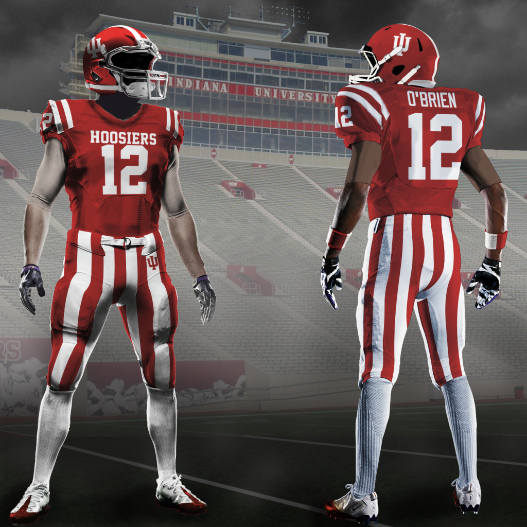
Yuck. That website just reminded me about Indiana's chrome candy stripe helmet.

Throw Up Tim And Eric GIF by Adult Swim
 
#80      

Mr. Tibbs

southeast DuPage
have we ever had helmet "stickers" under any coach ala what O$U does for big plays / rewards for special things ?
 
#83      

socalini

So Cali
Brilliant. Lasagna introduced the Block "I". Thanks. [EDIT: That helmet history site is a diabolical rabbit hole and I have work to do! D&*n you!]

The script and block (back to the Lee Corso era) reminds me of the Hoojins. I like our BLock "I", colors and stripes much better, of course, but would rather have something different on the helmets.

View attachment 23124 View attachment 23125

I thought these Sam Wyche-era helmets were awful:

View attachment 23126
Kinda like the script Indiana. Reminds me of the Leinenkugel's logo.
 
#84      

altgeld88

Arlington, Virginia
Kinda like the script Indiana. Reminds me of the Leinenkugel's logo.
I can see that, now that you mention it. IU football ~ well-brewed, relatively inexpensive Wisconsin beer. I'll ponder that as I watch us punish the Badgers tomorrow afternoon.
 
#85      
you have the coaches timing wrong


Blackmon basically introduced the curved ILLINI which was similar to the Cincy Bengals helmets
Moeller took away the "dartmouth" stripes
White did very little to it then
Mackovic introduced the slant & underlined ILLINOIS which was similar to the NY Giants helmets
Zook did very little to it then
Beckman introduced the block I
so far, BB has done very little to it so far

I dont consider facemask color as anything worth noting, really

Im okay with the Block I helmet decal. We simply dont have any other logo to use and I doubt anything is going to change regarding that soon
Im more interested in seeing some more " pop" to our uniforms and am hoping for white outlines on the numbers on the orange and blue unis (do we even have blue jerseys anymore ?) for sure, and maybe on the pants stripes. I like seeing orange & blue (and a little white) on our unis
My coaching timing is correct tibbs. We’re saying the same thing.

Although I disagree with you on face mask color. It is part of the helmet, therefore a big part of look/brand/identity, whatever you want to call it.

Think auburn fans want orange face masks back or usc fans red ones back? I doubt it
 
#87      
My coaching timing is correct tibbs. We’re saying the same thing.

Although I disagree with you on face mask color. It is part of the helmet, therefore a big part of look/brand/identity, whatever you want to call it.

Think auburn fans want orange face masks back or usc fans red ones back? I doubt it
To comment on my own comment, whilst after being over served last night:

Who else has the nickname Fighting Illini? Or, refers to their teams as illini? No one. When I see block I on a bad tv or in weird lighting it looks like I’m watching Indiana on big 10’s greatest games from the bill Mallory/Anthony Thompson days.

I’ve built a little hill, and by gosh I will die on it. An updated version of illini on orange helmets with white (grey or orange could be cool too) face masks is the way to go
 
#91      

BZuppke

Plainfield
some schools have iconic looks and should stick with them. We really don’t except perhaps for color. We almost always have had orange helmets but what was in them has varied. So if we want to stick with tradition we should always wear orange helmets. I think the curved Illinois and the block I have been the better two scripts but I can’t say either has ever wowed me.
 
#93      
Whatever they choose, I hope they stick with it. There's something to be said for consistency in branding. I actually didn't completely hate the"giants" script illinois because it was at least distinct and recognizable. Good uniforms are synonymous with feeling classic.
 
#98      

Ransom Stoddard

Ordained Dudeist Priest
Bloomington, IL
Random football fan flips through channels, winds up on a UIUC game where the script Illinois is on the jerseys. They're not gonna be able to read that.

Block letters ILLINI or ILLINOIS work. Do they dazzle? No, but they don't smell like try-hard.
 
#99      

Ryllini

Lombard
It is an appropriate time of year to have a good old fashioned uniform thread 🤪
I think the script is a sexy look, but would look discombobulated on a small moving surface such as a football helmet. Give me a solid block I, Illini, or Illinois on the helmets and stick with it forever.
Also, bring me a soldier a true fighting Illini along with a war Chant. My wish my dream.
 
#100      
I think the script is a sexy look, but would look discombobulated on a small moving surface such as a football helmet. Give me a solid block I, Illini, or Illinois on the helmets and stick with it forever.
Also, bring me a soldier a true fighting Illini along with a war Chant. My wish my dream.
I think enough people have convinced me script Illinois won't work in the helmet. I would like to update the Butkus era helmets. I want a helmet with the Chicago flag 6 pointed stars in an arch in navy above jersey numbers with a white facemask and center strip.

Take the above jersey and put the block Illini on the front and I'm in love
 
Status
Not open for further replies.