I would hope we don't have an orange jersey and the blue and orange would be reversed.Almost looks like exactly what we would do (except replace the Reeses brown with our blue).
You are using an out of date browser. It may not display this or other websites correctly.
You should upgrade or use an alternative browser.
You should upgrade or use an alternative browser.
Illinois Football Uniforms
- Status
- Not open for further replies.
We got lucky that once we copied Syracuse with the current kit, Syracuse downgraded to what they have now.The endless dance continues.
ChiefGritty
- Chicago, IL
I mean the devil is in the details of these things, but it is really funny the way we keep chasing each other's spin on what is the same basic color scheme.We got lucky that once we copied Syracuse with the current kit, Syracuse downgraded to what they have now.
Always pretty obvious that our new set was going to be "traditional" coded. A shoulder stripe (which is what the Patriots have but not what Syracuse has) is as good a way as any to connote that.
Orange is my favorite color so I'm conflicted when it comes to the orange jerseys for football because I don't really feel like there's a combo that looks good with them.
Orange pants: We've never done all orange very well (cue picture with 3 different shades of orange)
Navy pants: I feel like darker colors are better for the tops and the lighter colors for the pants, so when you reverse it something just looks off
White pants: My thoughts on these are well known. Just no, never. Burn all white pants.
I just wonder how much of the "color rush" thing applies to us with those Pats unis. I like the all blue look, but that was always a "big game" look to me and wouldn't want to cheapen that by wearing it all the time.
so no pants then ?Orange pants: We've never done all orange very well
Navy pants: I feel like darker colors are better for the tops and the lighter colors for the pants
White pants: My thoughts on these are well known. Just no, never. Burn all white pants.
That's my problem that makes me lean towards only wearing the Navy tops. Although if we can actually match the helmet, pants, and top to the same shade all orange wouldn't be bad. But we've made mistakes before.so no pants then ?
Illini92and96
- Austin, TX
I've never understood and it pisses me off that we can't settle on one version of orange and use it everywhere. Just bizarre.That's my problem that makes me lean towards only wearing the Navy tops. Although if we can actually match the helmet, pants, and top to the same shade all orange wouldn't be bad. But we've made mistakes before.
mattcoldagelli
- Script Illinois Enthusiast
Orange is my favorite color so I'm conflicted when it comes to the orange jerseys for football because I don't really feel like there's a combo that looks good with them.
Orange pants: We've never done all orange very well (cue picture with 3 different shades of orange)
Navy pants: I feel like darker colors are better for the tops and the lighter colors for the pants, so when you reverse it something just looks off
White pants: My thoughts on these are well known. Just no, never. Burn all white pants.
I just wonder how much of the "color rush" thing applies to us with those Pats unis. I like the all blue look, but that was always a "big game" look to me and wouldn't want to cheapen that by wearing it all the time.
Blue pants can (and do) work great, it's just contingent on the rest of the uniform:

You might say "Sure, those two examples also have blue factoring into the helmet as a primary color" and that's fair, but we've actually done it before w/ our orange helmets and I thought it looked fine:
Maybe I wasn't clear. I was only talking about those pant colors with regards to an orange jersey. I absolutely LOVE the blue pants on the road. I wish that would be our default road look and not that dumb storm trooper thing. As much as I want to have just 1 consistent helmet I wouldn't be mad at having a navy lid on the road with those pants. Very sharp look.Blue pants can (and do) work great, it's just contingent on the rest of the uniform:
You might say "Sure, those two examples also have blue factoring into the helmet as a primary color" and that's fair, but we've actually done it before w/ our orange helmets and I thought it looked fine:
View attachment 23289
Last edited:
I worked at TIS on campus for years and nothing annoyed me more than how every single brand we'd buy from had a different shade. I would always say "I bet if we went to Ann Arbor and walked into a similar store we'd see 1 shade of "maize" or 1 shade of "scarlet" in Columbus"I've never understood and it pisses me off that we can't settle on one version of orange and use it everywhere. Just bizarre.
ChiefGritty
- Chicago, IL
So this struck me as an odd statement that didn't seem to reflect a great understanding of the uniform game (and what horrible monster would lack that?).
Reason being that the Pats "color rush" uniforms have become just their everyday base uniforms since 2020 when Tom Brady departed. Plus it's such a basic design more famously used in college by LSU and others. So to call that "the Patriots color rush uniforms" is kind of a weird reference point, who would describe that uniform set that way?
They in fact only wore those as an alternate from their Super Bowl-era uniforms six times. Once in 2016, then twice in 2018 and three times in 2019. Bret Bielema was a Pats assistant in 2018 and 2019 and then left for the Giants, the "color rush" era is his exact time period with the team. So I think it's reasonable to infer that description came straight from BB's mouth, which lends some credence to this rumor.
(I bet it's not reasonable to infer that what we come up with will be a terribly close replica though. We'll see.)
Last edited:
mattcoldagelli
- Script Illinois Enthusiast
Right. I don't think there's a non-Patriot fan alive who would even know what you were talking about if you said "Patriots color rush uniforms." They're not like the Seahawks going full neon green.They in fact only wore those as an alternate from their Super Bowl-era uniforms six times. Once in 2016, then twice in 2018 and three times in 2019. Bret Bielema was a Pats assistant in 2018 and 2019 and then left for the Giants, the "color rush" era is his exact time period with the team. So I think it's reasonable to infer that description came straight from BB's mouth, which lends some credence to this rumor.
Here's something I've been noodling on (because I, like you, think there's some credence here) - this creates an open space on the jersey: the area above the cuff and under the shoulder stripes. You could put a number there, like LSU, or a logo there, like the Patriots. Seems like a possible landing spot for the new script "Illini" we're seeing pop up all over the place.
ChiefGritty
- Chicago, IL
As a fellow true sicko I had exactly the same thought.Here's something I've been noodling on (because I, like you, think there's some credence here) - this creates an open space on the jersey: the area above the cuff and under the shoulder stripes. You could put a number there, like LSU, or a logo there, like the Patriots. Seems like a possible landing spot for the new script "Illini" we're seeing pop up all over the place.
(Though the player numbers would be more common. The Pats not having side numbers is pretty rare)
You could probably pop some shields up there that would look pretty good.Right. I don't think there's a non-Patriot fan alive who would even know what you were talking about if you said "Patriots color rush uniforms." They're not like the Seahawks going full neon green.
Here's something I've been noodling on (because I, like you, think there's some credence here) - this creates an open space on the jersey: the area above the cuff and under the shoulder stripes. You could put a number there, like LSU, or a logo there, like the Patriots. Seems like a possible landing spot for the new script "Illini" we're seeing pop up all over the place.
Last edited:
Fighter of the Nightman
- Chicago, IL
Yep, when I was a kid I thought our Zook era jerseys with the white pants (minus the slant Illinois, of course) were actually really cool. Now that I am older, I agree with Bielema's thinking of establishing a traditional "Illini look" where anyone who flips on the TV will at the VERY least know it's Illinois right away. I envy that in Iowa, Michigan, Penn State, Texas, etc.There’s something to be said for tradition. Penn State has has blue with a white stripe forever.
mattcoldagelli
- Script Illinois Enthusiast
Buddy, this thread cannot hold a chrome desk lamp to the original rebrand thread.I bet those in the know have a lot of laughs reading our speculation.
altgeld88
- Arlington, Virginia
We often went blue-on blue (and white-on-blue) in the '80s under Mike White. I didn't care much for the blue-on-blue but it was certainly a departure. We also had some white pants in '86.Blue pants can (and do) work great, it's just contingent on the rest of the uniform:
You might say "Sure, those two examples also have blue factoring into the helmet as a primary color" and that's fair, but we've actually done it before w/ our orange helmets and I thought it looked fine:
View attachment 23289
GrayGhost77
- Centennial, CO
Avatar checks out.You could probably pop some shields up there that would look pretty good.
Prefer locate the stripes on the arms (ala the Bears pic) vs the top of the shoulder pads.So this struck me as an odd statement that didn't seem to reflect a great understanding of the uniform game (and what horrible monster would lack that?).
Reason being that the Pats "color rush" uniforms have become just their everyday base uniforms since 2020 when Tom Brady departed. Plus it's such a basic design more famously used in college by LSU and others. So to call that "the Patriots color rush uniforms" is kind of a weird reference point, who would describe that uniform set that way?
They in fact only wore those as an alternate from their Super Bowl-era uniforms six times. Once in 2016, then twice in 2018 and three times in 2019. Bret Bielema was a Pats assistant in 2018 and 2019 and then left for the Giants, the "color rush" era is his exact time period with the team. So I think it's reasonable to infer that description came straight from BB's mouth, which lends some credence to this rumor.
(I bet it's not reasonable to infer that what we come up with will be a terribly close replica though. We'll see.)
I know these are dated, but back in the day these uniforms - all variations including the helmet - were amazing.We often went blue-on blue (and white-on-blue) in the '80s under Mike White. I didn't care much for the blue-on-blue but it was certainly a departure. We also had some white pants in '86.
View attachment 23312 View attachment 23310 View attachment 23311 View attachment 23308
I'd love a more modern twist on these. . . but that will never happen.
That said, I bet the new updates will be great, BB seems to have a good eye for things.
ChiefGritty
- Chicago, IL
Prefer locate the stripes on the arms (ala the Bears pic) vs the top of the shoulder pads.
(I mean, it's even Tommy DeVito! So funny)
My prediction will be that we'll get an orange and blue version of this
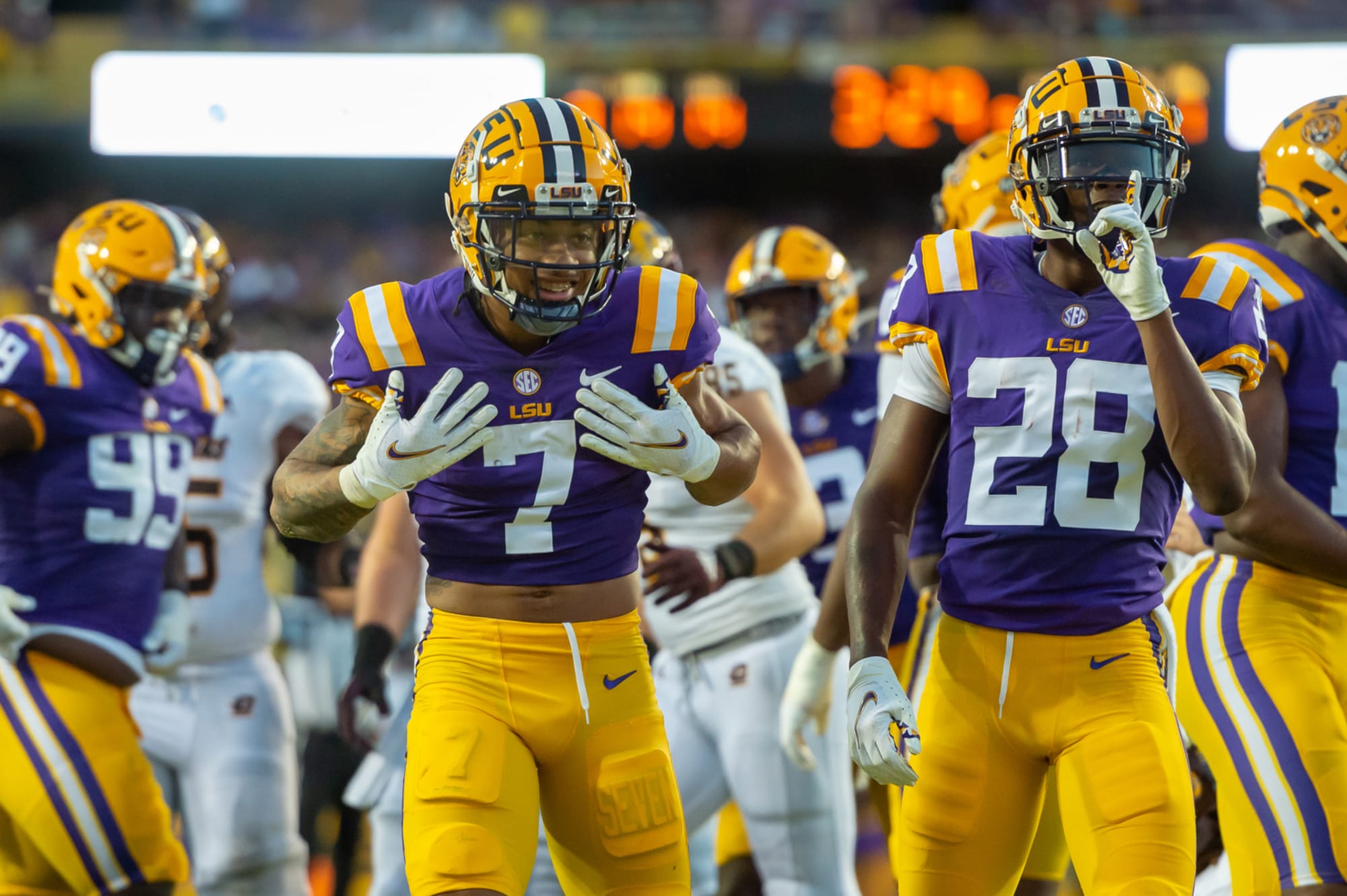
I'm not going to lie, I do think LSU has a very classic and good looking uniform. I would love an orange and blue version of this jersey with a butkus-era-esque helmet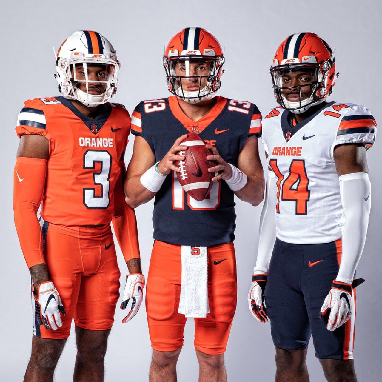
(I mean, it's even Tommy DeVito! So funny)
My prediction will be that we'll get an orange and blue version of this
- Status
- Not open for further replies.