TheFlyingIllini1317
- Chicago, IL
those shoulder stripes are uglyView attachment 27268
Would not hate it.
 - would rather just keep current uniforms
Team blue pants on the road!!One thing I don't like about the aways would be the shoulder stripe looks much better as B/O/B, but then it wouldn't match the # if there was an outline on it.
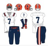
That mockup is nike's newest template "vapor fuse" hoping that doesn't give it credibility.New uniform. Road uniform has blue shoulder stripes with orange in middle. Blue numbers/lettering orange outline. Pants have same stripe as shoulders, orange pants with blue white blue. White set also. No orange jersey. Orange helmet, gloss finish, same stripe as pants. White facemask. Blue I with white outline.
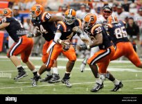
OOF DUDESo we will essentially have '08 Syracuse.
 I mean if the rumors are true it’s EXACTLY that. Jfc the anti-cuse crowd just got another gallon of fuel for the fire.
So we will essentially have '08 Syracuse.

Dear Bret,I think what I'm most excited for is how Nike tries to tie this new uniform to something from Illini history lol. I can't even think of any time when the stripes would have been at the shoulders. I guess the style is similar to the 80s jerseys but it's going to take some creativity to stretch it to there.
[whispers] GOODSo we will essentially have '08 Syracuse.
Not if we have the big nameplate, but that is funny.Ugh their away jerseys are like exactly that too. They’re a white facemask away from being the exact thing
100% The current set is actually pretty great. Reverse the stripe order on the helmet and call it a day.those shoulder stripes are ugly
I tend to agree. On-shoulder stripes often look like caps on the sleeveless jerseys. Over-shoulder provides consistency across cuts.I actually like these.... but stripes over the shoulder is better than stripes around the shoulder 100%
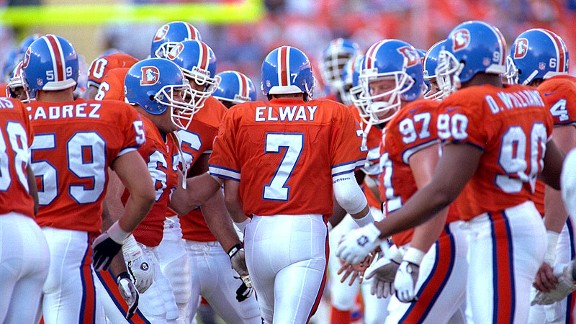
Name doesn’t check out.Surprised to say this but I'm ready to get rid of the orange pants altogether. I'd go with white pants at home and blue on the road.
From all indications that's not gonna happen.
I'm all in on loving the new unis. . . at least I really want to love them.So what does the reaction pie chart look like here? I say no matter what they look like 50% hate, 20% love, 30% meh.
I'm fully expecting myself to be in the first category. Expect the worst.
I mean if they add the big wordmark to the front and that and the numbers use two fonts that totally clash with one another and have no basis in anything past or present that Illinois has ever worn, that will just be so baffling it will be hard to react to anything else. Like, I cannot imagine the process that would have went into something like that.So what does the reaction pie chart look like here? I say no matter what they look like 50% hate, 20% love, 30% meh.
I'm fully expecting myself to be in the first category. Expect the worst.