The 2014 Illini Nike Uniforms and Rebrand

Status
Not open for further replies.
#476      

illinimandan

I
Guest
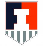
I propose shield/badge 2.0, only a few hours after 1.0 goes live. Thoughts?

View attachment 1934
:chief:
I'll be honest, I thought people were reading into the badge hoping there were "F"s in it. I was pretty surprised that it was intended, because it's a bit weak, it will have to be pointed out to a lot of people. I think this version it's obvious, but it also might look too much like a family crest or something.
 
#477      

Soxfreak64

Bloomington
Can't wait to watch Fergy streak for TD after TD in that white jersey.
 
#478      

STL FANATIC

S
Guest
I'm out of the business of too much in-depth discussion. It's bad for all of us, haha. But I needed to share this.

Remember how I felt this design might and feel it does follow lazy Nike trends like Mizzou's more than any thing particularly relevant to Illinois? I'm not here to debate that further. Most of you like it a lot. I don't. Ok. But I thought this was interesting.

Nike's description of our new number font:
Custom athletic numerals have been designed to complement the word-marks, as well as unite athletics across multiple sports. The letterforms are bold and energetic, infused with speed. The serifs are sleek and powerful, drawing inspiration from the fast cuts and aggressive playing style of Red Grange.

(By the way. Our numbers don't actually have any serifs. Which leads to this...)

Nike's description of the Mizzou font 2 years ago:
These unique characteristics of the typeface are infused with speed and the serifs are sleek and powerful drawing inspiration from the ear of the tiger.

It's still okay to like it. Just as it's okay for me not to. But I just needed to point out that Nike wasn't exactly putting the thought into this that they want you to believe. (Which isn't to say it was thoughtless—clearly there are some nice Illinois ties.) And on that note, infused with speed doesn't mean anything in regard to typography. Filler description.
 
#479      

Kams Bathroom

K
Guest
What on earth would an "Illinois" font look like?
 
#481      

STL FANATIC

S
Guest
What on earth would an "Illinois" font look like?

I don't expect a super unique font. There's some small things that maybe could be done, but nothing much really. I think you could use a font that draws from history.

But it's not so much the font that was used (although I don't care for it) its' that they blow smoke up, well somewhere, trying to convince you that this IS what an Illinois font looks like. Can't you see the speed of Red Grange in these numbers??
 
#482      

Future Walk-On

Peoria, IL
I am sorry. I am trying to keep up with limited computer access.

Any update on a theoretical "Fighting Illini" jersey for basketball....or was Groce talking about the Gray and White jersey...and there is no "F I" jersey.
 
#484      

MuckFichigan

M
Guest
I'll be honest, I thought people were reading into the badge hoping there were "F"s in it. I was pretty surprised that it was intended, because it's a bit weak, it will have to be pointed out to a lot of people. I think this version it's obvious, but it also might look too much like a family crest or something.

It was dual Easter Island Statues, John Kerry has filed a lawsuit for copyright infringement.
 
#485      

Soxfreak64

Bloomington
I don't expect a super unique font. There's some small things that maybe could be done, but nothing much really. I think you could use a font that draws from history.

But it's not so much the font that was used (although I don't care for it) its' that they blow smoke up, well somewhere, trying to convince you that this IS what an Illinois font looks like. Can't you see the speed of Red Grange in these numbers??

Should've used a semi-transparent font to symbolize the latter half of his moniker
 
#487      

illinimandan

I
Guest
Badge Update 2a

Oh, I forgot I could use gray as a secondary color. This one is better. I hope the current one gets tweaked to something similar to this. I also would mind more curved lines on the "Victory" portion on the bottom.
shield 2.1.jpg
 
#489      

IlliniRunIn07

Tampa, FL
I'm out of the business of too much in-depth discussion. It's bad for all of us, haha. But I needed to share this.

Remember how I felt this design might and feel it does follow lazy Nike trends like Mizzou's more than any thing particularly relevant to Illinois? I'm not here to debate that further. Most of you like it a lot. I don't. Ok. But I thought this was interesting.

Nike's description of our new number font:


(By the way. Our numbers don't actually have any serifs. Which leads to this...)

Nike's description of the Mizzou font 2 years ago:


It's still okay to like it. Just as it's okay for me not to. But I just needed to point out that Nike wasn't exactly putting the thought into this that they want you to believe. (Which isn't to say it was thoughtless—clearly there are some nice Illinois ties.) And on that note, infused with speed doesn't mean anything in regard to typography. Filler description.

Props to Nike. Their punctuation has improved in the last couple years.
 
#490      

Kams Bathroom

K
Guest
I don't expect a super unique font. There's some small things that maybe could be done, but nothing much really. I think you could use a font that draws from history.

But it's not so much the font that was used (although I don't care for it) its' that they blow smoke up, well somewhere, trying to convince you that this IS what an Illinois font looks like. Can't you see the speed of Red Grange in these numbers??

I mean, I agree that that's all BS, and when it takes a Syracuse-type form, you get frustrated, but the Illinois font is just sort of generically modern. It's thoroughly inoffensive.
 
#491      

SuperMetroid

Evanston
I'm out of the business of too much in-depth discussion. It's bad for all of us, haha. But I needed to share this.

Remember how I felt this design might and feel it does follow lazy Nike trends like Mizzou's more than any thing particularly relevant to Illinois? I'm not here to debate that further. Most of you like it a lot. I don't. Ok. But I thought this was interesting.

Nike's description of our new number font:


(By the way. Our numbers don't actually have any serifs. Which leads to this...)

Nike's description of the Mizzou font 2 years ago:


It's still okay to like it. Just as it's okay for me not to. But I just needed to point out that Nike wasn't exactly putting the thought into this that they want you to believe. (Which isn't to say it was thoughtless—clearly there are some nice Illinois ties.) And on that note, infused with speed doesn't mean anything in regard to typography. Filler description.

All marketing-speak is pretty bad but I agree this is extra awful. I think I recognize this slogan, too: past, future, etc.

Now for the record, I really like most of the rebrand. I do design for a living as well, although more web than graphic. I'll have to write up a detailed critique when I have a little more time. :coffee:
 
Last edited:
#492      

IlliniRunIn07

Tampa, FL
I don't expect a super unique font. There's some small things that maybe could be done, but nothing much really. I think you could use a font that draws from history.

But it's not so much the font that was used (although I don't care for it) its' that they blow smoke up, well somewhere, trying to convince you that this IS what an Illinois font looks like. Can't you see the speed of Red Grange in these numbers??

Pick a side man. You complain when Nike uses a generic description of our font (same one sentence they used for Mizzou), and now you complain when they try to tie some meaning into it. Your mind was made up the day the rebrand was started it sounds like.

You are more than entitled to your opinion. I actually think it's cool that you don't care for the new uniforms. It has the potential to add to the discussion. Some of the things you are starting to complain about, however, are getting downright silly.
 
#494      

Kams Bathroom

K
Guest
Oh, I forgot I could use gray as a secondary color. This one is better. I hope the current one gets tweaked to something similar to this. I also would mind more curved lines on the "Victory" portion on the bottom.
View attachment 1935

Bless you, but that is not better.
 
#495      

matt1all

Chicago, IL
I don't expect a super unique font. There's some small things that maybe could be done, but nothing much really. I think you could use a font that draws from history.

But it's not so much the font that was used (although I don't care for it) its' that they blow smoke up, well somewhere, trying to convince you that this IS what an Illinois font looks like. Can't you see the speed of Red Grange in these numbers??

I agree its complete baloney. But do you expect them to say we picked it because t's modern and we thought it looked cool? Like just let them say their phony stuff and move on with it. It's not enough to be offended, and since you're in this business I'm a little surprised you expected anything different from the speech
 
#497      

illinimandan

I
Guest
Did anyone else think that both the orange and blue football pants could use a white stripe down the side? I think they could both use more contrast.
 
#500      

Kams Bathroom

K
Guest
Not better than my other attempt? I think it was, perhaps you missed it. I assume you mean than Nike's Badge.

I liked your first one better, I liked the previous poster interpretations even better than that, and the Nike one is the best of all.
 
Status
Not open for further replies.