The modern uniforms are terrible. Even with the success of the teams lately, nobody in 15 years is gonna say “man i miss those uniforms, they looked so good” will be a 0 on nostalgia. I hate to say it but the zig zags (which were also terrible) had more character than our current uniforms.
You are using an out of date browser. It may not display this or other websites correctly.
You should upgrade or use an alternative browser.
You should upgrade or use an alternative browser.
Illini Basketball Uniforms
- Status
- Not open for further replies.
I think the better question is, does anyone not hate them? Anyone?Anyone else hate the newer jerseys we wear? The script and throwback jerseys are fantastic. The modern jerseys are terrible.
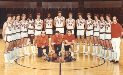
To me they harken back to the beginning of the Lou Henson era and the ascension of the Illini into the upper echelon of CBB.The script whites don't really fit our branding standards and hearken back to a mostly unknown, unloved era of the program, but they just look so damn good.
I'm a little more skeptical than my stalwart ally in these threads @mattcoldagelli that it could be the basis of our whole athletic department brand, but let's keep wearing those basketball jerseys forever.
Hate is such a strong word.I think the better question is, does anyone not hate them? Anyone?

Fighter of the Nightman
- Chicago, IL
There’s no reasonable argument for why our normal jerseys shouldn’t just be the throwbacks … Kansas, Indiana, Michigan, etc. all have jerseys that are old school, we don’t need a “new” or “modern” look.
And this would be a good enough argument for me anyway, but the fact is also that our throwbacks are absolutely elite and universally praised (even by non-fans) and our regulars suck and no one likes ‘em. PULL THE TRIGGER!
And this would be a good enough argument for me anyway, but the fact is also that our throwbacks are absolutely elite and universally praised (even by non-fans) and our regulars suck and no one likes ‘em. PULL THE TRIGGER!
Something like this, with slightly larger numerals.
ChiefGritty
- Chicago, IL
I don't hate them at all, I think they look good in all three colors, cursed blues notwithstanding.I think the better question is, does anyone not hate them? Anyone?

People are irrationally triggered by the rebrand wordmark.
They aren't as good as the respective throwbacks though, even if the Flyin' Illini ones are a tad overrated.
Last edited:
To each their own. To me it's not only about the terribe rebrand font. I also feel like the attempt at minimalism is a good idea but the execution is off in a way that just makes them on the whole look cheap and slapdash. Like for both the orange and white iterations, the blue piping on the collar looks like a last ditch effort to introduce more blue, because it doesn't match the stripes on the side and it's just a little too thick (looks thicker to the eye than the unusually small lettering on the jersey)⁷. Also, I've never thought the contrast between orange and white is enough that lettering or numbering can pop without a blue outline.I don't hate them at all.
People are irrationally triggered by the rebrand wordmark.
They aren't as good as the respective throwbacks though, even if the Flyin' Illini ones are a tad overrated.
Ransom Stoddard
Ordained Dudeist Priest
- Bloomington, IL
My triggering is entirely rational, thankyouverymuch. It was a change for the sake of change and had no grounding in any existing mark, tradition, style, or branding that we've ever used, and is a constant, painful reminder of Mike Thomas.I don't hate them at all, I think they look good in all three colors, cursed blues notwithstanding.
People are irrationally triggered by the rebrand wordmark.
They aren't as good as the respective throwbacks though, even if the Flyin' Illini ones are a tad overrated.
chiefini
- Rockford, Illinois
This.My triggering is entirely rational, thankyouverymuch. It was a change for the sake of change and had no grounding in any existing mark, tradition, style, or branding that we've ever used, and is a constant, painful reminder of Mike Thomas.
ChiefGritty
- Chicago, IL
Hey, full credit for being perceptive and in touch with the psychological underpinnings of why you're having that reactionMy triggering is entirely rational, thankyouverymuch. It was a change for the sake of change and had no grounding in any existing mark, tradition, style, or branding that we've ever used, and is a constant, painful reminder of Mike Thomas.
I don't really care about Mike Thomas anymore and very much take a Butterfly Effect perspective of the positive situation we're in in both sports, so, meh.
Hey, full credit for being perceptive and in touch with the psychological underpinnings of why you're having that reaction
I don't really care about Mike Thomas anymore and very much take a Butterfly Effect perspective of the positive situation we're in in both sports, so, meh.
redwingillini11
White and Sixth
- North Aurora
In a vacuum I think the modern white set is a sneaky good, clean look. Its hard to justify having two white sets, and the throwbacks are of course superior. But if I had to pick one of the modern sets to keep it would be that one. The modern oranges I think are extremely underwhelming and those are the ones I'd kick to the curb first.I think the better question is, does anyone not hate them? Anyone?

mattcoldagelli
- The Transfer Portal with Do Not Contact Tag
People are irrationally triggered by the rebrand wordmark.

Speaking just for myself, I don't think any of my objections to wordmark/font are tied up in Mike Thomas Era-related angst. If that were true, I'd feel the same about the new Block I or The Shield (still ride or die). The font is just faddish and a poor match for our brand and how we need to use it, down to the letters we require it to "work" for.
Think of the difference between us and Mizzou, one of the fonts which ours was clearly cribbed from. Mizzou's overall look is both figuratively and literally putrid (one of their colors matches baby poop) but the letters they require for a "motion" font work a lot better: Z, O, U, M, S - these are wider letters that don't need extra styling to avoid feeling jumbled together. Contrast that with us, and our overabundance of skinny I's and L's. There's a reason "FIGHTING" looks way better in the rebrand font than "ILLINOIS" or "ILLINI". Unfortunately for us, those latter two words are pretty important to what we're trying to do here.
Thankfully, the cavalry is already here, the powers that be just need to wake up to it:
Bite your tongue Gritty.I don't hate them at all, I think they look good in all three colors, cursed blues notwithstanding.
People are irrationally triggered by the rebrand wordmark.
They aren't as good as the respective throwbacks though, even if the Flyin' Illini ones are a tad overrated.
RichardKeenesCousin
Richard Keene's Cousin
name checks out. couldve gone with a Battle dunk pic however.Bite your tongue Gritty.These all day and twice on Sunday. You even get the Chief.
View attachment 21193
ChiefGritty
- Chicago, IL
Well, but those aren't the ones we wear, which also don't feature the Chief.Bite your tongue Gritty.These all day and twice on Sunday. You even get the Chief.
View attachment 21193
Don't get me wrong, I like the orange Flyin' Illini ones a lot. But the fact that they exude Nick Anderson silencing Other Assembly Hall vibes is doing a lot of the work there as opposed to being an inherently beautiful design.
Explain to me how this harmonizes with the Block I. Does the Shield still exist in this brave new world? Is that a logo or a wordmark, or both?Thankfully, the cavalry is already here, the powers that be just need to wake up to it:
View attachment 21192
mattcoldagelli
- The Transfer Portal with Do Not Contact Tag
Explain to me how this harmonizes with the Block I. Does the Shield still exist in this brave new world? Is that a logo or a wordmark, or both?
On the one hand, I am not a designer. On the other, I have already seen us live a more scattershot existence (there was a time when "Column I", slant Illinois, Chief, Block I, Nike "Circle I" were all in use).
Block I and Script Illinois can work together. It can be like Idaho with the script in front or like Indiana with it arched over (note: Indiana's script isn't used here because it isn't arched and has a stylized underline, but Script Illinois has neither problem). What does that look like in practice? You're kind of seeing it with the basketball uniforms - Script Illinois on the jersey, Block I in the secondary position on the shorts. For football, if we keep the Block I on our helmets (although I'd love to see us try the Script there), adding Script Illinois to the endzones would look great.
I fully realize I will need to bite the bullet and either accept the demise of the Shield, or see it demoted to super-secret secondary logo status, doomed to the neck badge of a football jersey or the waistband of basketball shorts.
ChiefGritty
- Chicago, IL
For football, if we keep the Block I on our helmets (although I'd love to see us try the Script there), adding Script Illinois to the endzones would look great.
ChiefGritty
- Chicago, IL
Cook
- Richmond, VA
Ugh. I hate admitting it, but envious of Michigan's uniforms. They are exactly the sort of style we need, and mad points for how they match their compression gear with it (I hate whenever I see our guys wearing black instead of matching the uni color).
At the same time, unimpressed with UVA's version tonight and would not want that look for us.
At the same time, unimpressed with UVA's version tonight and would not want that look for us.
I’d like to see the script “Illinois” in orange. Have droned in about it on the board occasionally.
Saw it in person in the display case in the AH Illini Basketball Hall of Fame last July when I talked my way in there late one afternoon. Loved it. Just get rid of that awful Nike or whatever it is current uniform font.
I’d also like to see a return to belted shorts.
No, I wouldn’t.
View attachment 20930
No, never. But that’s just me.
- Status
- Not open for further replies.


