You are using an out of date browser. It may not display this or other websites correctly.
You should upgrade or use an alternative browser.
You should upgrade or use an alternative browser.
Illinois Football Uniforms
- Status
- Not open for further replies.
Fighter of the Nightman
- Chicago, IL
Actually if you look closely, the biggest difference - and it makes ALL of the difference! - is the “I.” In the usual script, it’s a really cool, throwback cursive. On the football hoodies, it looks way worse and pretty much just like the lowercase “L”:Here's my pessimistic thought: the first three letters of the football hoodie look like right font, too.
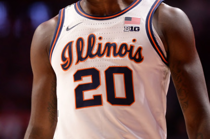

EDIT: As a fleeting member of Team Script, I wouldn’t read into the social media posts too much. We have used the script font a lot over the last couple years, pretty indiscriminately. I would love if we adopted it as the go-to Illini font or at least as a secondary logo, but I don’t think it’s being like hinted at or anything.
IlliniKat91
- Chicago, IL
I hope you're right. I love the basketball version. The football one is meh at bestActually if you look closely, the biggest difference - and it makes ALL of the difference! - is the “I.” In the usual script, it’s a really cool, throwback cursive. On the football hoodies, it looks way worse and pretty much just like the lowercase “L”:
EDIT: As a fleeting member of Team Script, I wouldn’t read into the social media posts too much. We have used the script font a lot over the last couple years, pretty indiscriminately. I would love if we adopted it as the go-to Illini font or at least as a secondary logo, but I don’t think it’s being like hinted at or anything.
lstewart53x3
- Scottsdale, Arizona
Meh is being generous.I hope you're right. I love the basketball version. The football one is meh at best
script illinois doesn't work in football, to small, leave it to golf shirts and basketball uni's please.
TeamShieldForLifeI would only have a blue or white helmet "available on short notice" should we ever play a team with orange helmets like Syracuse or Clemson in a bowl game .
Maybe wear blue if we ever wanted to do something all blue
and please burn all those patches or stickers of the failed "shield" logo
Fighter of the Nightman
- Chicago, IL
I think it could work on the helmets like Florida, UCLA, Ole Miss, etc. like I posted a couple of pages back. However, I do think the Block I on the helmet looks cleaner and more traditional and more "us." With that said, even if script Illinois is nowhere to be found on the football uniforms, I still think it should slide into our repertoire as a secondary text logo (also similar to UCLA, Ole Miss and others). It's not like it'd be less imaginative than the letter "I," haha.script illinois doesn't work in football, to small, leave it to golf shirts and basketball uni's please.
ChiefGritty
- Chicago, IL
The Bears already wear an Illini-style jersey, is the thing


The Galloping Ghost
- Washington, DC
It's the Ouroboros of jerseys.The Bears already wear an Illini-style jersey, is the thing
ChiefGritty
- Chicago, IL
Where's pruman when you need him?It's the Ouroboros of jerseys.
Fighter of the Nightman
- Chicago, IL
I know, just a way to remind Chicago’s Big Ten Team of that fact every November.The Bears already wear an Illini-style jersey, is the thing
ILLINIShox24
Orange Krush '04 & '05
More use of the true script by football
The Galloping Ghost
- Washington, DC
I'm really here for this puppy content.
More use of the true script by football
Fighter of the Nightman
- Chicago, IL
Do people still think we won't get a sneak peak of these new jerseys until August? I'm so eager, haha ... I'm at the point where as long as it isn't a total downgrade, I am going to be happy. I have confidence in our marketing/design department and Bret's apparent preference for tradition that these will be cool regardless of how often script or Block I or whatever is used!
TentakilRex
- Land O Insects between Quincy-Macomb-Jacksonville
Jerry "The King" Lawler loves puppies, oh wait....I'm really here for this puppy content.
They are using the basketball I at least, which is different that the script ILL we have seen a little bit on previous football gear.
More use of the true script by football

Fighter of the Nightman
- Chicago, IL
Regardless of whether we all prefer a script Illinois helmet or a Block I helmet or whatever ... I think almost everyone here can agree that the new football-only script Illini is such a distant third it isn't even funny, lol.They are using the basketball I at least, which is different that the script ILL we have seen a little bit on previous football gear.
ILLINIShox24
Orange Krush '04 & '05
100% agree. I love the basketball script and am thrilled that football has picked it up after briefly using that other horrible one. I honestly don't even need to see it on the football jerseys. Just the fact that the athletic department has hopefully settled on the basketball script being the one to use across sports going forward is a huge win. It's fantastic.Regardless of whether we all prefer a script Illinois helmet or a Block I helmet or whatever ... I think almost everyone here can agree that the new football-only script Illini is such a distant third it isn't even funny, lol.
Fighter of the Nightman
- Chicago, IL
I'm totally with you. While I think the script helmet mock-up I reposted a few pages back is a REALLY slick look, I totally get the arguments against it (in favor of the Block I on the helmets), and I don't care one way or the other with the football uniforms. What I really want, and it looks like we are doing this, is for the script to become a part of our "general brand" and effectively be the font that Illinois is written in for marketing purposes. It just looks a LOT cooler than the other script options I have seen out there.100% agree. I love the basketball script and am thrilled that football has picked it up after briefly using that other horrible one. I honestly don't even need to see it on the football jerseys. Just the fact that the athletic department has hopefully settled on the basketball script being the one to use across sports going forward is a huge win. It's fantastic.
Okay, here goes. I hate this color combination. Usain Bolt would look slow in this uniform. Even the white shoes don't help! And why are we neon orange? If I was in this locker room it would feel like a rave broke out with only slow guys invited. Plus, it reminds me too much of Syracuse. If I were to emulate another school's colors It would be Auburn...classic, simple, timeless! Tell me I'm wrong and I'm sure you will!

Homecoming 2019
- Chicago
I see this said all the time and don't really understand it. 1. They dont look like syracuse's jerseys and 2. literally nothing reminds of syracuse football.View attachment 26506
Okay, here goes. I hate this color combination. Usain Bolt would look slow in this uniform. Even the white shoes don't help! And why are we neon orange? If I was in this locker room it would feel like a rave broke out with only slow guys invited. Plus, it reminds me too much of Syracuse. If I were to emulate another school's colors It would be Auburn...classic, simple, timeless! Tell me I'm wrong and I'm sure you will!
Fighter of the Nightman
- Chicago, IL
I think people are mostly referencing Syracuse's old jerseys, pictured below:I see this said all the time and don't really understand it. 1. They dont look like syracuse's jerseys and 2. literally nothing reminds of syracuse football.
(This is only my opinion!!) Both have the strange and ugly combination of (1) being really plain and lacking any accent colors but also (2) not looking traditional at all. And the end result is like a boring attempt to be edgy, haha. Syracuse did a much better job with their new ones, if you ask me:

Honestly, if there were ever a time for Nike to slap us with a similar retread of a Syracuse design ... lol, kind of kidding, but those have elements that we all seem to want - a bit more traditional of a look for the numbers, some striping so they aren't so boring, an outline for the number, etc. I'm also REALLY warming up to the idea of a white jersey with navy pants on the road. That was the iconic uniform worn for our epic comeback at the Big House in 1999!
- Status
- Not open for further replies.