I'll start! Lol, nothing is like TERRIBLE about them, but we have people paid money to come up with a great uniform ... "good enough" should not be a part of the vocabulary of this conversation! These are my issues:
Number Font: If you want to go minimalist and classic, FINE! It can work. But you need to do a correspondingly classic font. Ours looks a bit too "trendy" to be on such an understated jersey, IMO. If you want to do this look, I think you just have to go with the block lettering that all of the "classic/iconic jersey" programs still use ... ours just looks way too "mix-and-match" in comparison:
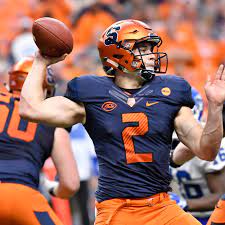
Helmet Stripe: I was actually fine with the helmets that did not have a stripe, but I also think the stripe can look good. However, I am a pretty strong believer that you should have your darker color on the outside and the lighter color on the inside. In our case, a
W/
B/
W stripe (pictured above) just does not look as good as a
B/
W/
B stripe, IMO ... the darker color on the outside just looks more stylish to me:
Those are the only two "essential" changes if you ask me ... however, I REALLY think this third one is a bit of a must, as well:
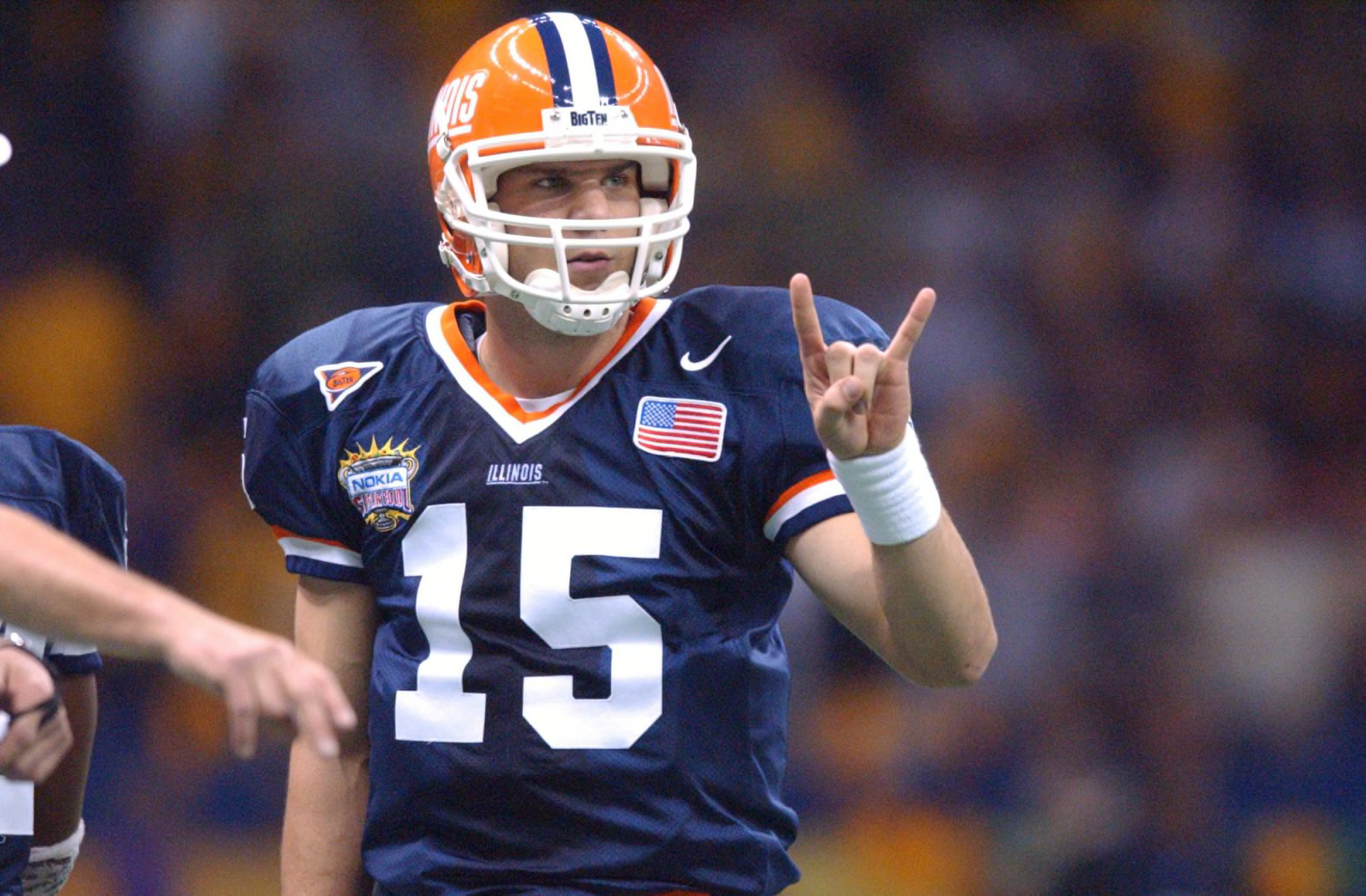
Number Outlines: I know some of the pictures above have no number outline and it "works," but I think orange on blue with no outline (and
especially the orange on white with no outline for our away jerseys) does NOT work. If you will notice, in the throwback Illini picture from above where we have no outline, our numbers are actually white, and our numbers on the away set during that era were actually blue. Orange on blue and orange on white with no outline just looks a bit unrefined to me. If we were married to orange numbers on our white away jerseys, for example, comparing these two away jerseys and looking at nothing except for the numbers, I just think it looks SO much cleaner with the blue outline:
You could definitely stop there and have a great uniform. However, I would also argue that if you are going to have a stripe on the helmet, you should probably have one on the sleeves and the pants. I know some do not do that, but I personally think it just looks a little cleaner. However, it's not a must, so these are my three essential changes:
1. Block lettering on all jerseys instead of our weird modern font.
2. Switch the helmet stripe from
W/
B/
W to
B/
W/
B on our helmet. If we do ever wear a white helmet, it should be
B/
O/
B.
3. White outline around the orange font on our navy home jerseys and blue outline around our orange font on the white away jerseys. If we wear orange ever, I think a white number with a blue outline would easily look best. Looking at past photos, I honestly do think, though, that a white number at home (with an orange outline) and a blue number on the road (with an orange outline) look a bit better...
If we
really got into changes that I just personally think would be a lot better, I would add the following:
1. Assuming we stick with
O/
W/
O as our road combo, change the numbers to blue. We did it on almost all of our past away jerseys, and it looked good!
2. If we do not do #2 and our numbers remain orange with a blue outline, then wear blue pants on the road! White and orange only just doesn't make me think of the Illini, we need more blue in there.
3. This has less to do with our jerseys and more to do with our patterns, but I would generally like us to adopt a routine of hardly EVER changing our uniform set (e.g., don't wear
O/
W/
O on the road one week and then randomly switch to
O/
W/
W one game) while ALSO having at least one "special" jersey set that we save for one or two multiple occasions. This could be anything from wearing orange vs. Missouri every year whether it's home or away (as it works with their colors) to having a special "bowl game uniform" set for home or away to my oft-quoted idea of dressing like the Bears when we play Northwestern to remind them they are a tiny private school with no fan base in Chicago.


/cdn.vox-cdn.com/uploads/chorus_image/image/71301312/ILLWY82722_101.0.jpg)
/cdn.vox-cdn.com/uploads/chorus_image/image/72380925/1424663406.0.jpg)

:no_upscale()/cdn.vox-cdn.com/uploads/chorus_asset/file/8709625/usa_today_9608002.jpg)
/cdn.vox-cdn.com/uploads/chorus_asset/file/19225581/870713586.jpg.jpg)
/cdn.vox-cdn.com/uploads/chorus_image/image/63961513/1999_Micron_PC_AP.0.jpg)

