I would generally agree with your list, but I think the second group is huge. I would argue you have these "groups" for uniforms:
1. The truly traditional (practically ancient) ones that will likely never change (e.g., Penn State)
2. The classic ones that might not be quite as old but are now totally associated with that program and likely will never change (e.g., Iowa)
3. The ones that change from time to time but generally keep the same "feel" across multiple eras and are still instantly recognizable (e.g., Florida)
4. The schools who are just updating their uniforms and font to the norm of the current era, with the only consistency being their colors (e.g., Iowa State)
Within those tiers, you might get more iconic vs. less iconic or varying degrees of schools chasing trends. Illinois has been really weird. Just look at how our most default home uniform has evolved in these last several versions, going from most recent to least recent:
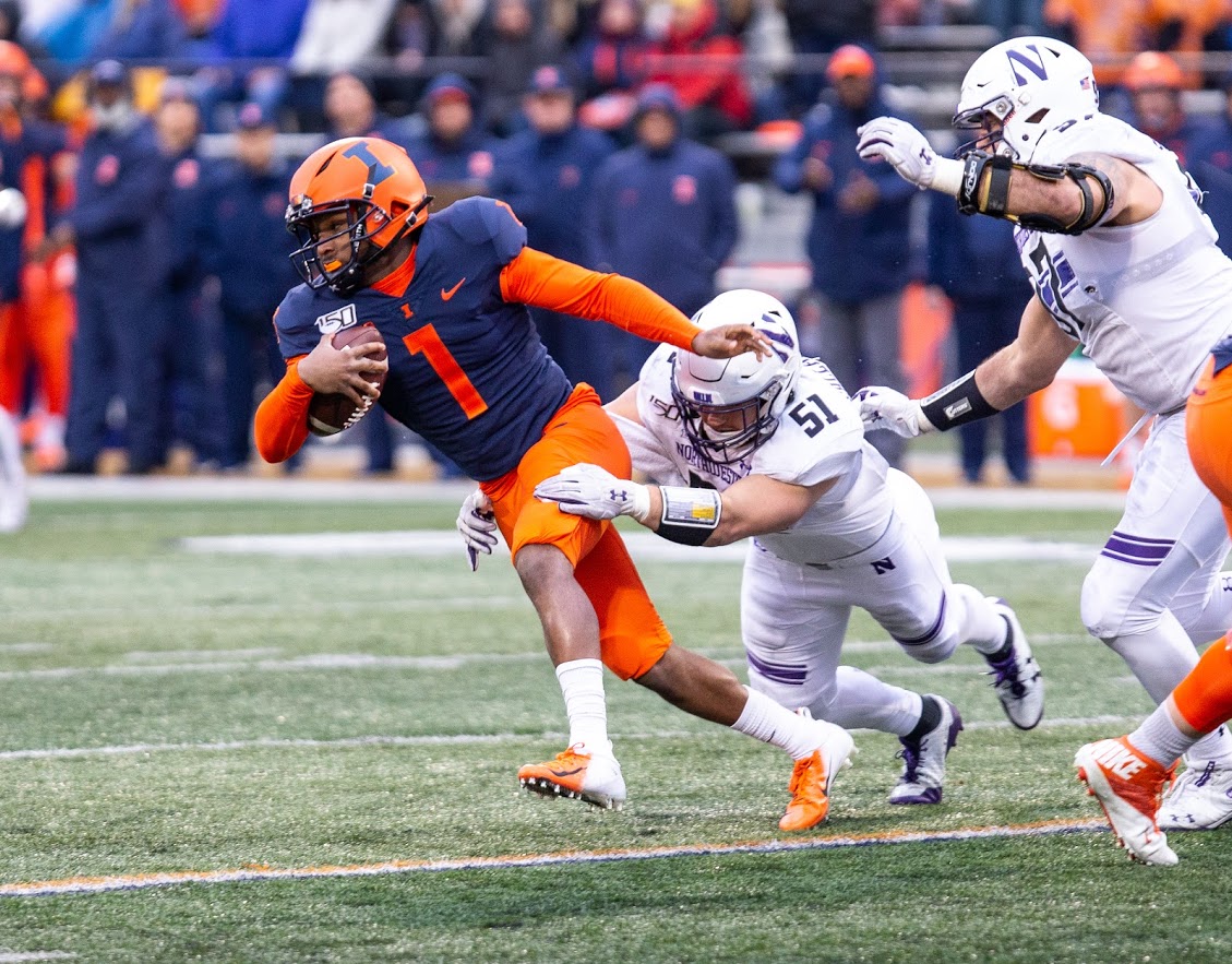
(Same basic uniform as the previous one but added the helmet stripe and switched to a white facemask to make it at least a bit more traditional)
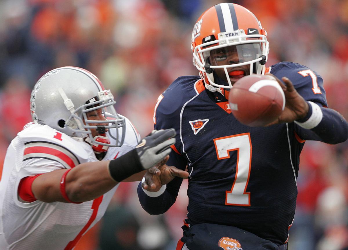
(Classic Lovie Era uniform)
(First Shield rebrand or whatever)
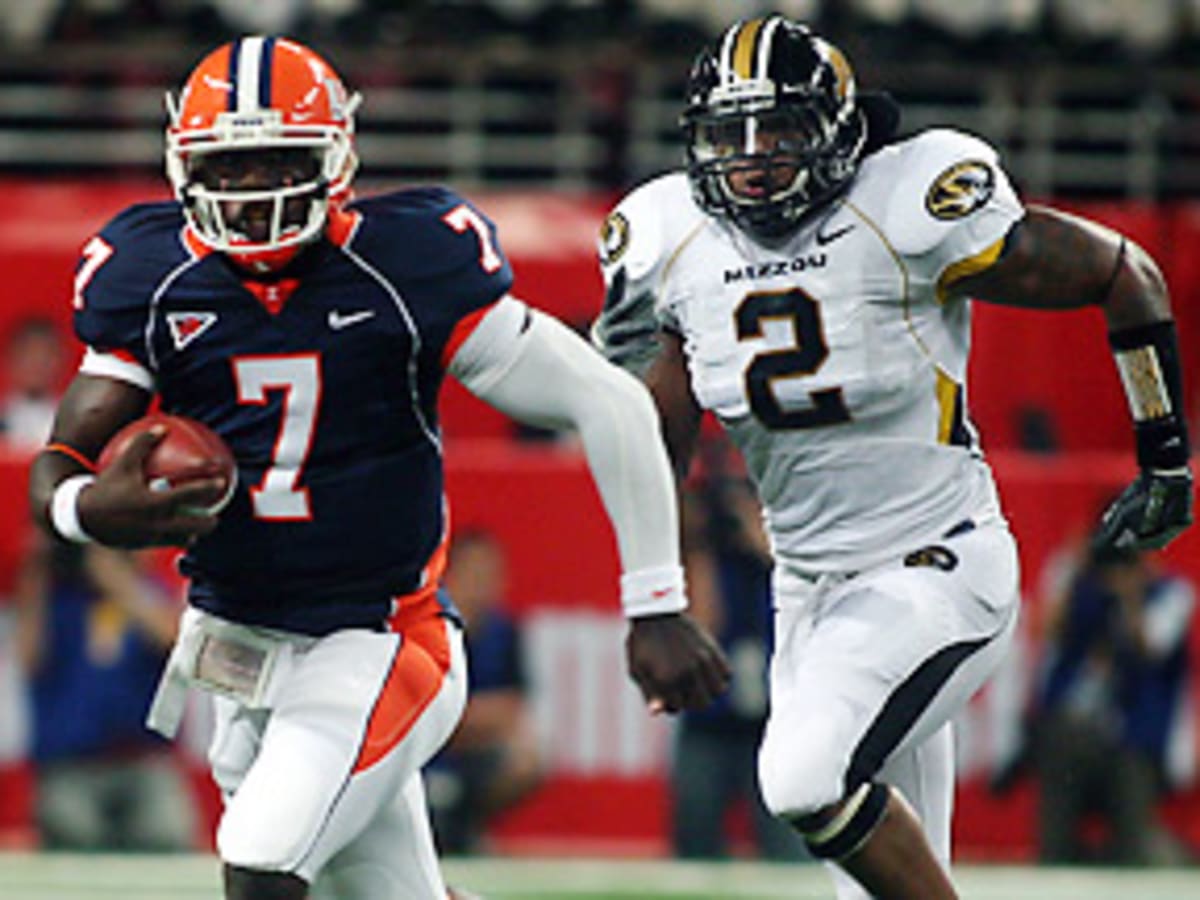
(Zook Era uniform)
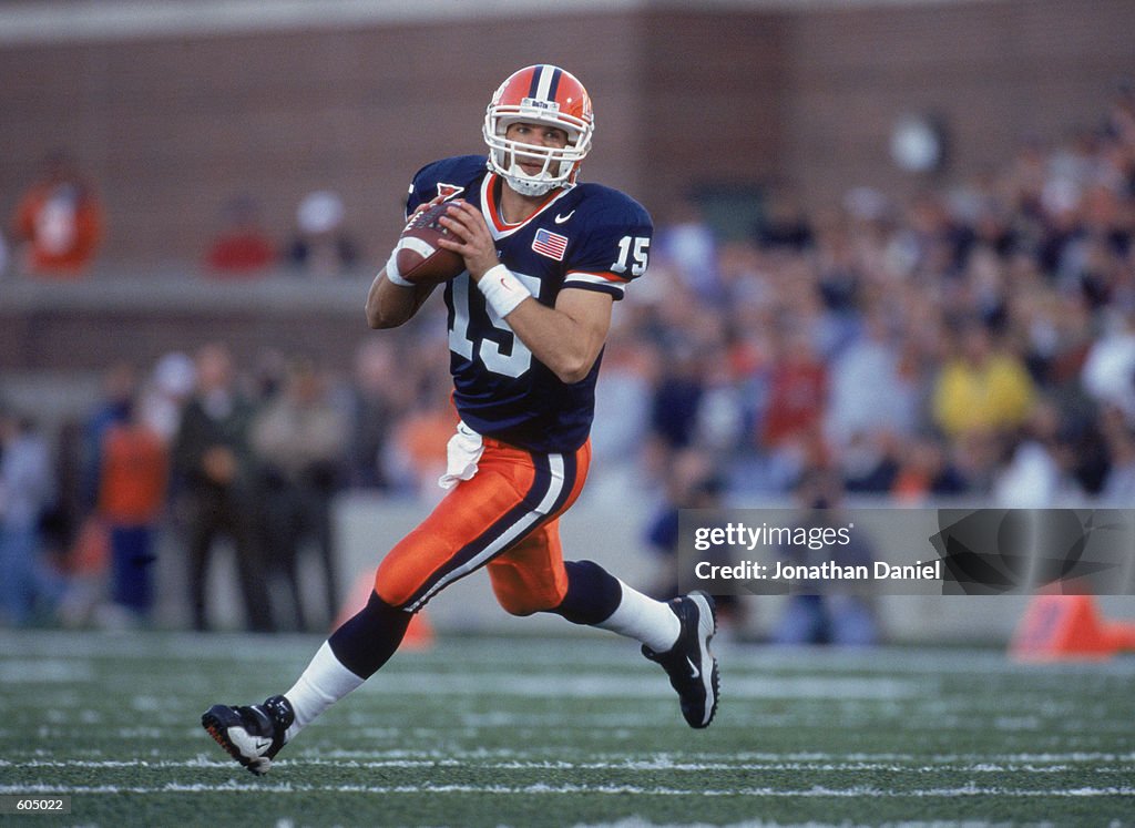
(Pre-2005 Uniform)
For the Zook Era ones, we clearly sort of chased the current trend (look how similar ours is to Mizzou's, lol), even abandoning the orange pants at home. However, every other uniform has been some weird combination of "updating" the uniforms while also trying to keep them relatively simple. I never liked them at the time, but those pre-2005 uniforms just look damn classic now ... funny how that works, huh?? What really works in our favor is that the current trend seems to BE harkening back to the classics. I think it's the perfect time to move into that "Iowa Tier" I described above where everybody knows what Illini football looks like.
/cdn.vox-cdn.com/uploads/chorus_asset/file/12013541/52072761.jpg.jpg)
 . I would absolute okay with that being our uniform. Clean and simple.
 I have stated this opinion before, but the main issues with our current uniforms are NOT big; we should not try to reinvent the wheel when we get new ones this year, and I doubt we will. Small changes like changing the numbers to a more traditional font to match the simplicity of the jersey, switching the blue and white on the helmet stripe, adding an outline to the number or a stripe on the pants, etc. would make a small but mighty difference, IMO. I think you could easily combine elements of our current uniform with the 1989-2004 set and have a smashing success.
:format(jpeg)/cdn.vox-cdn.com/uploads/chorus_image/image/36784670/20131116_ajw_sr5_638.0.jpg)
:no_upscale()/cdn.vox-cdn.com/uploads/chorus_asset/file/23614510/723BD369_33B5_4098_B2F9_99FDBB78E173_1_201_a.jpeg)
/cdn.vox-cdn.com/uploads/chorus_asset/file/8709391/usa_today_9655363.jpg)
:no_upscale()/cdn.vox-cdn.com/uploads/chorus_asset/file/8709625/usa_today_9608002.jpg)

_0.jpg?itok=gx38Dai1)

/cdn.vox-cdn.com/uploads/chorus_image/image/64915033/52072761.jpg.0.jpg)


