You are using an out of date browser. It may not display this or other websites correctly.
You should upgrade or use an alternative browser.
You should upgrade or use an alternative browser.
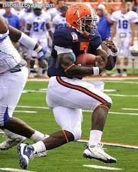
Illinois Football Uniforms
- Status
- Not open for further replies.
IMHO, the block I is dull. I like the throwback unis the best.

Block I just reminds me of Indiana. Not unique at all, illini or Illinois on helmet is just my preference., whatever font. I can live with block I though as long as it’s pretty consistent. Orange helmets with white (maybe grey) face masks and “i” won’t complain
Helmet gotta be orange
How about bringing back chief helmet stickers??? I know won’t happen but that’d be cool
Helmet gotta be orange
How about bringing back chief helmet stickers??? I know won’t happen but that’d be cool
Last edited:
My guess is the script will be more of a tie in to the era where the uniforms will draw from and less on the actual uniforms. With all the 70s and 80s font and graphics used by the school my guess is the uniforms will be similar to the uniforms worn then, or at least use them as inspiration. Also possible maybe a throwback uniform they have will.
All I ask is no white pants, ever. I can live with almost anything else. This is my insignificant hill to die upon.
Fighter of the Nightman
- Chicago, IL
ILLINOIS is, I hope, thankfully dead. Looks like someone who didn't give a crap about this kind of stuff made it up using Word Art, and I wouldn't be surprised if that is too far off.Return to 2004 uniforms for football and basketball. That is all, carry on.
Fighter of the Nightman
- Chicago, IL
Yeah, I kind of get people not wanting white pants in that it doesn't scream "FIGHTING ILLINI" ... but how could you not LOVE these?!
altgeld88
- Arlington, Virginia
Are you talking about the late '80s slant "ILLINOIS"? That was an early Mackovic-era football team rebrand, supplanting the arc "Illini" on the helmets, which unfortunately stuck to the athletic program broadly for many years. It was also completely derivative of the NY Giants helmet logo of the time. Have always wondered who actually came up with it.ILLINOIS is, I hope, thankfully dead. Looks like someone who didn't give a crap about this kind of stuff made it up using Word Art, and I wouldn't be surprised if that is too far off.
All I ask is keep the person who figured out to put the block I decal on the helmet so that it is vertical when the player is wearing the helmet, instead of vertical when the helmet is sitting on a table.All I ask is no white pants, ever. I can live with almost anything else. This is my insignificant hill to die upon.
So what? The 90s are back man…That's looks way to 1990.
You don’t see the kids wearing nirvana, sublime, Pearl Jam shirts their parents got from target?
Addendum…. I do like that illustration/picture/the end zones, as well as the aforementioned bands
Last edited:
skyIdub
"I can't tell you. Secret."
Are you talking about the late '80s slant "ILLINOIS"? That was an early Mackovic-era football team rebrand, supplanting the arc "Illini" on the helmets, which unfortunately stuck to the athletic program broadly for many years. It was also completely derivative of the NY Giants helmet logo of the time. Have always wondered who actually came up with it.

What about a cursive letter “I” logo on the helmet?
hard pass
by itself, a cursive I is difficult to distinguish from many other letters.
Look at the basketball jersey - without the context of the letters that follow it, you would not know it was an I
as generic as a block I is, we have a fairly long history of using it thru the years and various things
by itself, a cursive I is difficult to distinguish from many other letters.
Look at the basketball jersey - without the context of the letters that follow it, you would not know it was an I
as generic as a block I is, we have a fairly long history of using it thru the years and various things
altgeld88
- Arlington, Virginia
Am completely with you on the cursive "I". *shudder*hard pass
by itself, a cursive I is difficult to distinguish from many other letters.
Look at the basketball jersey - without the context of the letters that follow it, you would not know it was an I
as generic as a block I is, we have a fairly long history of using it thru the years and various things
IIRC, we used the arc "ILLINI" on the helmets from Blackman's arrival in '71 (or a season afterward... and with those cool, Dartmouth-inspired, dual white stripes while he was our coach) through White's departure in '87, with maybe only a blip for a season when Moeller might have used a blank orange helmet (or maybe not... memory is foggy). That's much longer than we've used the Block "I", I believe.
Older (and wiser) fans can correct me but I don't recall that the program ever used the Block "I" in the pre-'70s eras. I believe we used only blank helmets or helmets bearing jersey numerals. I believe the Block "I" was a purely post-Zook introduction. Beckman (??... again, *shudder*) introduced it and it stuck (like gum to the sole of one's shoe, IMO.) It just reminds me of Indiana's use of the "I", and not in a positive way.
I will be grateful, however, to anyone who can educate me about Illini helmet history and correct my misconceptions.
GrayGhost77
- Centennial, CO
I personally like the Block I helmet design. It's clean, simple, and somewhat distinctive. Far far better than the slant Illinois we had before, and I was never a fan of the curved Illini helmets from the 70s and 80s.
Fighter of the Nightman
- Chicago, IL
I agree Block I is perfectly fine for the space of a helmet and for our main logo on TV and for things like that. I would definitely like to see the 1LL1NO1S font replaced entirely by the script Illinois and the block FIGHTING ILLINI (i.e., the two throwback basketball jersey fonts), though ... and I think you can absolutely use both depending on the situation.I personally like the Block I helmet design. It's clean, simple, and somewhat distinctive. Far far better than the slant Illinois we had before, and I was never a fan of the curved Illini helmets from the 70s and 80s.
is there going to be just a uniform change for next year or uniform and helmet? Anyone know....I feel our branding needs to be more distinct......I agree Block I is perfectly fine for the space of a helmet and for our main logo on TV and for things like that. I would definitely like to see the 1LL1NO1S font replaced entirely by the script Illinois and the block FIGHTING ILLINI (i.e., the two throwback basketball jersey fonts), though ... and I think you can absolutely use both depending on the situation.
click on link:Am completely with you on the cursive "I". *shudder*
IIRC, we used the arc "ILLINI" on the helmets from Blackman's arrival in '71 (or a season afterward... and with those cool, Dartmouth-inspired, dual white stripes while he was our coach) through White's departure in '87, with maybe only a blip for a season when Moeller might have used a blank orange helmet (or maybe not... memory is foggy). That's much longer than we've used the Block "I", I believe.
Older (and wiser) fans can correct me but I don't recall that the program ever used the Block "I" in the pre-'70s eras. I believe we used only blank helmets or helmets bearing jersey numerals. I believe the Block "I" was a purely post-Zook introduction. Beckman (??... again, *shudder*) introduced it and it stuck (like gum to the sole of one's shoe, IMO.) It just reminds me of Indiana's use of the "I", and not in a positive way.
I will be grateful, however, to anyone who can educate me about Illini helmet history and correct my misconceptions.

Last edited:
altgeld88
- Arlington, Virginia
Brilliant. Lasagna introduced the Block "I". Thanks. [EDIT: That helmet history site is a diabolical rabbit hole and I have work to do! D&*n you!]click on link:

The script and block (back to the Lee Corso era) reminds me of the Hoojins. I like our BLock "I", colors and stripes much better, of course, but would rather have something different on the helmets.
I thought these Sam Wyche-era helmets were awful:
Last edited:
Bielema’s jacket in the Twitter pic with the Kenwood coach had the script Illini on it.
Do college students read cursive today?
TentakilRex
- Land O Insects between Quincy-Macomb-Jacksonville
Probably it is like Old English font to the rest of us, all of us can read it, some can write in it but few fluentlyDo college students read cursive today?
Illini in Italy
- Illini HQ, Florida Panhandle
Based on the 14 years I was an adjunct, very few can write in any language fluently . . .Probably it is like Old English font to the rest of us, all of us can read it, some can write in it but few fluently
Fighter of the Nightman
- Chicago, IL
MAN, I would actually be very disappointed with that script "Illini" the more I think about it. Like, yeah, anything beats 1LL1NO1S and all ... but we HAVE a perfect script font literally already in use that is WAY better than the one the football guys are wearing. It's right in front of us!
ILLINIShox24
Orange Krush '04 & '05
Bielema’s jacket in the Twitter pic with the Kenwood coach had the script Illini on it.
- Status
- Not open for further replies.

