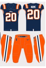
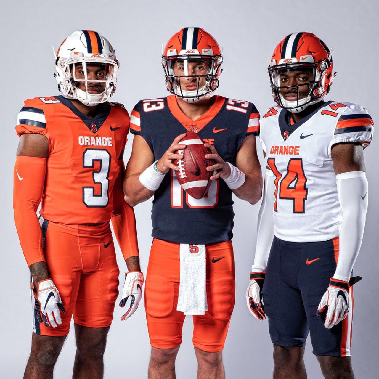
Yeah it's one of those things where you can't have exact design stability over decades and decades because the canvas you're painting on - the football uniform - changes.
The current football jersey presents a pretty clear, sharp corner demarcating the difference between the shoulder and the "sleeve" which is really just the cover over the side of the shoulder pads. Nothing goes all the way around the way those old stripes did.
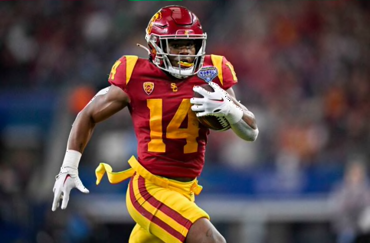
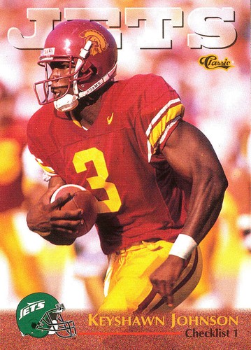
One very old school design that I feel like the modern football uniform has caught up with is USC's whose OJ Simpson-era wedge thing kinda perfectly adds some design flair to that sharp borderline
A strong contender for the best uniform in all of football. And lest you believe "oh, it's USC, that's just a timeless traditional icon that has always been perfection", that is absolutely not the case
The devil is in the difference between those two pictures. That's where the magic happens.
") )
)