I’ve said this before but the road uniform for Lovie and Beckman era was really good imo. That uniform could compete with almost anyone. The problem was the blue didn’t work at all for the Beckman era and the orange was atrocious for Lovie era and we never wore them. It’s important to remember that what works for one color may not work for another and I think Nike will do that this time. I’ll also say even tho we will go away from it the o/b/o we’ve had lately is a solid home uniform that connects with the past.
You are using an out of date browser. It may not display this or other websites correctly.
You should upgrade or use an alternative browser.
You should upgrade or use an alternative browser.
Illinois Football Uniforms
- Status
- Not open for further replies.
what makes you think we go away from O/B/OI’ve said this before but the road uniform for Lovie and Beckman era was really good imo. That uniform could compete with almost anyone. The problem was the blue didn’t work at all for the Beckman era and the orange was atrocious for Lovie era and we never wore them. It’s important to remember that what works for one color may not work for another and I think Nike will do that this time. I’ll also say even tho we will go away from it the o/b/o we’ve had lately is a solid home uniform that connects with the past.
chiefini
- Rockford, Illinois
IMO, the other really awful Nike “creative” addition for Illinois (besides the shield) is the horrific font. I’ve hated this font from the moment it was introducted. As a former journalism teacher who taught typography for yearbook and newspaper publications, I would have strongly advised my students to choose something else. While Nike was trying to be clever and modern with the sans serif 1’s (which it is not), this font is not only ugly and weak to me, but very difficult to read. I would like to see a serif font in a strong block that is easy to read.i have an idea, lets ditch Nike for a company with creative input and we dont have to stand in line waiting for something new.
all weve gotten from Nike in 10 years is a shield we rarely use (it only looks good on a t shirt) and a
minor tweek to the block I.

I mean the specific uniforms. I think we stay with the o/b/o but with more 80s/90s style uniforms. The template you see from the Nike uniforms released this year like Ok State probably pretty instructive. I also predict a 70s style orange throwback but we will see.what makes you think we go away from O/B/O
mattcoldagelli
- Script Illinois Enthusiast
I would love it if we switched to a company that didn't spur Illini fandom to act like whiny victims all the time, and as soon as that company exists, we should look into it.i have an idea, lets ditch Nike for a company with creative input and we dont have to stand in line waiting for something new.
all weve gotten from Nike in 10 years is a shield we rarely use (it only looks good on a t shirt) and a
minor tweek to the block I.
Fighter of the Nightman
- Chicago, IL
It reminds me of the 2006 World Cup where it seemed like every single Adidas team had pretty much the same kit but with different national colors, and it was so lame. From an artistic standpoint, it was practically dystopian.This era of Nike uniform templates needs to launched into the sun. A bunch of generic, mismatched stripes and panels


Yeah, the font is just so unimaginative, IMO, and the two-color version just came across like they knew it was unimaginative and tried the laziest thing possible to make it better. Again, following the theme of how similar our jerseys were to other "trend chasing" schools like Missouri in the picture I posted previously...IMO, the other really awful Nike “creative” addition for Illinois (besides the shield) is the horrific font. I’ve hated this font from the moment it was introducted. As a former journalism teacher who taught typography for yearbook and newspaper publications, I would have strongly advised my students to choose something else. While Nike was trying to be clever and modern with the sans serif 1’s (which it is not), this font is not only ugly and weak to me, but very difficult to read. I would like to see a serif font in a strong block that is easy to read.

Just trendy, 2010s italics, lol.
Completely agree. I will bet almost anything that we get a hybrid between our current uniforms, the Beckman Era ones and the 1989-2004 uniforms - likely similar to that great rendering a few pages back! And I'll be ecstatic with this.I mean the specific uniforms. I think we stay with the o/b/o but with more 80s/90s style uniforms. The template you see from the Nike uniforms released this year like Ok State probably pretty instructive. I also predict a 70s style orange throwback but we will see.
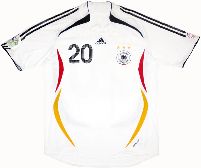
Also, I forgot to quote the person who said the away jerseys in the Beckman Era were great, but I 100% agree. I totally get wanting a consistent orange helmet across all jerseys, and they definitely got the striping wrong in the Beckman ones, but as a base white jersey...
:no_upscale()/cdn.vox-cdn.com/uploads/chorus_asset/file/8709625/usa_today_9608002.jpg)
Fighter of the Nightman
- Chicago, IL
On a serious note, as far as I can tell the only schools that use Jordan Brand for their football uniforms are Michigan, Florida, UCLA, North Carolina and Oklahoma. Based on their work with those, sign me up.I would love it if we switched to a company that didn't spur Illini fandom to act like whiny victims all the time, and as soon as that company exists, we should look into it.
Also keeps the basketball side happy. I'm down.On a serious note, as far as I can tell the only schools that use Jordan Brand for their football uniforms are Michigan, Florida, UCLA, North Carolina and Oklahoma. Based on their work with those, sign me up.
Fighter of the Nightman
- Chicago, IL
Yeah, I hate to admit it, but they're definitely the cool brand right now - there is seriously no dead weight in that group, and they also have Marquette for hoops - it and might not be a bad idea to get in early! I of course say this from a position of total ignorance toward other variables involved like our contract with Nike or other perks besides uniforms that come with these affiliations, but Jordan seems to have done a great job of respecting the traditional look of all of their schools while also improving upon them.Also keeps the basketball side happy. I'm down.
I'm sure some with a "woe is us" complex will say that we might not be prioritized by Jordan given some of those brands they have, but look at how few schools they have. They only have one school in each conference, and we would thus only be the second Big Ten school; I think they would be eager to put their best work out there. Compare that to 10 Power Five schools (counting Notre Dame here) for Under Armour in every conference but the ACC, 12 for Adidas in every conference and 45 (!!) for Nike in every conference.
Again, this is just a hypothetical, I am woefully ignorant of what all goes into the decision of which branding company to pick.
Last edited:
altgeld88
- Arlington, Virginia
Alas, correlation is not causation.On a serious note, as far as I can tell the only schools that use Jordan Brand for their football uniforms are Michigan, Florida, UCLA, North Carolina and Oklahoma. Based on their work with those, sign me up.
Depends on if it’s Gaussian or something.Alas, correlation is not causation.
perfectionI prefer the collar with the classic pant stripe tho.
Edit: I know I'm biased but tell me that's not a top 10 uniform in college football.
Fighter of the Nightman
- Chicago, IL
It's a very good uniform, but I would prefer the 1989-2004 stripe on the helmet (to match the pants), and I must admit I am not sure I get the sleeve design ... seems a bit more complex/less traditional when compared to the rest of the uniform.perfection
Fighter of the Nightman
- Chicago, IL
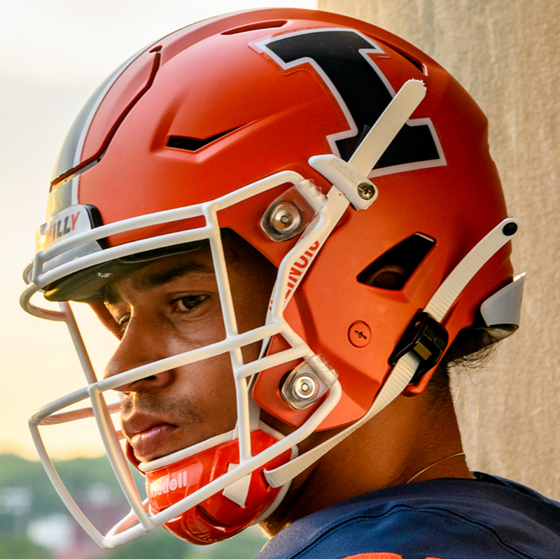
I can honestly say I will be extremely happy with either one. The Block I is great, and the script could turn into a new "iconic" look for us for future generations if we keep this train rollin' (script helmets like Florida, Ole Miss and UCLA look objectively great, IMO). I'd probably lean Block I, but I really would be fine with either.Do a majority of fans prefer the script helmet over the block I?
217sports
- Springfield
I think the block I is safer and will always be around. Script could be a quick fad and the potential to look bad is much higher. I think I overall prefer staying iconic with the block I and mixing in script with any alternates we doDo a majority of fans prefer the script helmet over the block I?
redwingillini11
White and Sixth
- Batavia
There is another option...Do a majority of fans prefer the script helmet over the block I?
what's thatThere is another option...
NO!Do a majority of fans prefer the script helmet over the block I?
My preference would be this with Block I on helmet, orange pants with no stripes. Outline the orange numerals with white if you must.

In a vacuum I do. . . that said, I much prefer our Block I on the helmet. Too many other schools with strong brands use script, I don't want to see us lumped in with all of them.Do a majority of fans prefer the script helmet over the block I?
Maybe as a once a year type of thing for script, but we need something reasonably unique, and the Block I is the closest thing we have to that.
Battle89
- Cary-Grove, the better Trojan team
There is another option...
I hate the idea of script Illinois on the helmets. I could be convinced to do the curved Illini if they did it right. The current block I looks really good.Do a majority of fans prefer the script helmet over the block I?
Fighter of the Nightman
- Chicago, IL
On this note, I will go ahead and float the opinion that the oft-criticized rebrand several years ago DID come up with a pretty great Block I. These are the kinds of subtle changes that actually make a pretty big difference aesthetically, even if subconscious:I hate the idea of script Illinois on the helmets. I could be convinced to do the curved Illini if they did it right. The current block I looks really good.
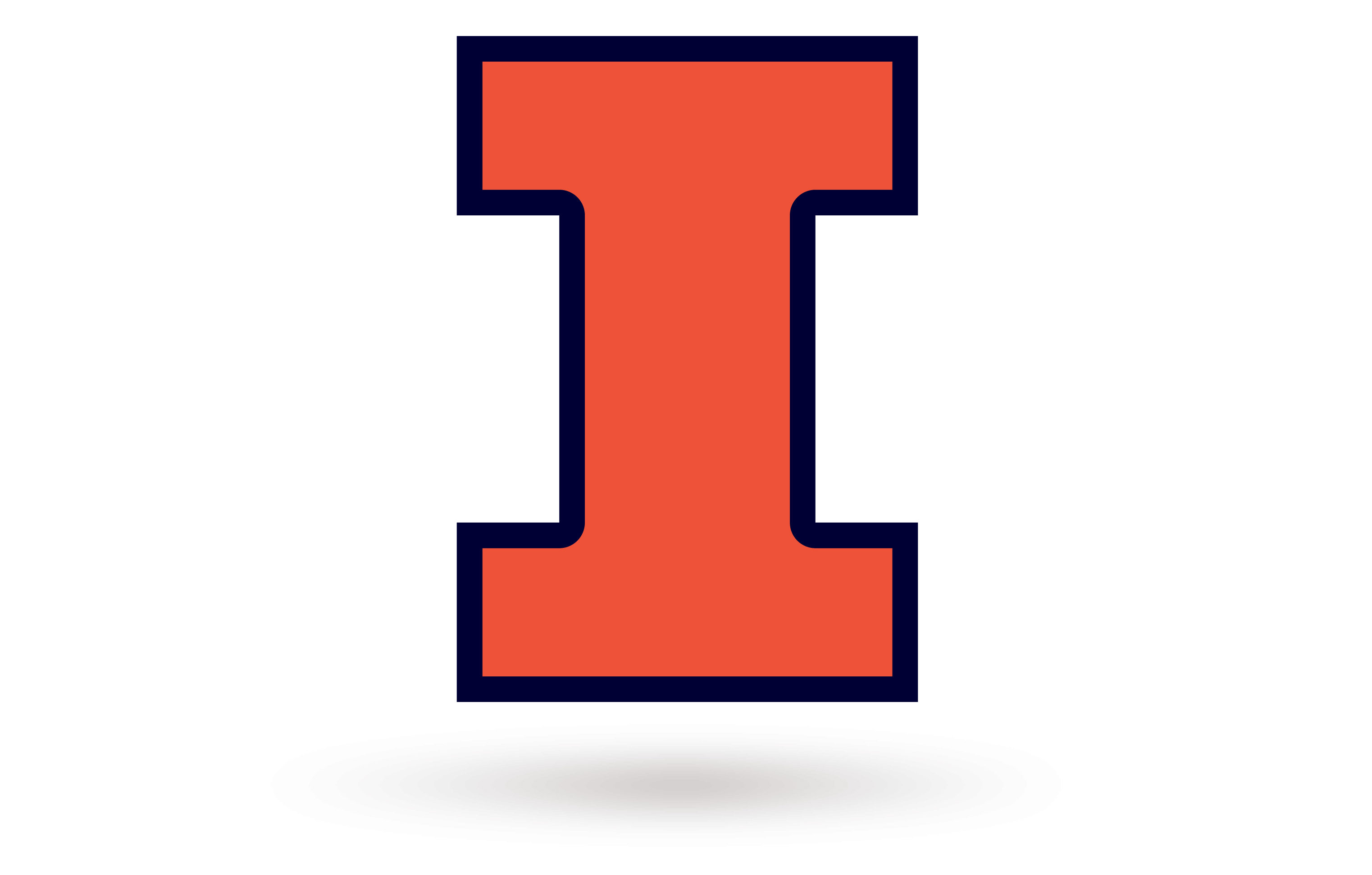
I think the second one just looks a lot slicker ... I also think typing "Illinois" out across it comes across weirdly insecure, lol. And I agree that these ended up looking great on the helmets:
- Status
- Not open for further replies.