redwingillini11
White and Sixth
- Batavia
Ok, I will admit it:
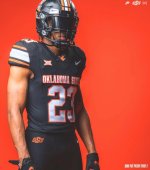
Adidas is finally figuring out how to make clean football uniforms.
Adidas is finally figuring out how to make clean football uniforms.
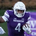
Why do I have the feeling that our updated jerseys will look similar to these?Ok, I will admit it:
Adidas is finally figuring out how to make clean football uniforms.
I just love the 80's helmet, check my profile pic and I think you'll get the sleeve design.It's a very good uniform, but I would prefer the 1989-2004 stripe on the helmet (to match the pants), and I must admit I am not sure I get the sleeve design ... seems a bit more complex/less traditional when compared to the rest of the uniform.
I guess:Ok, I will admit it:
Adidas is finally figuring out how to make clean football uniforms.
Cause it seems like every new nike jersey is similar sleeve wise. I hope we avoid something like this, how can something so basic be so ugly?Why do I have the feeling that our updated jerseys will look similar to these?
To be fair you quoted a pic of an Adidas jersey and posted another of an Under Armour jersey, so it might not just be a Nike problem!Cause it seems like every new nike jersey is similar sleeve wise. I hope we avoid something like this, how can something so basic be so ugly?


Looks pretty good. Helps that Texas is a wide state. Good letter/background (state) symmetry. IMO, Illinois is too tall and narrow to look good on a helmet. Stick with the Block I.UTRGV starts football in 2025.... and their orange script helmets are amazing.
Hoping if we do go script it looks as nice as these.
That same Vaqueros script probably would suit a baseball jersey, too.UTRGV starts football in 2025.... and their orange script helmets are amazing.
Hoping if we do go script it looks as nice as these.
It's already been pointed out that this is a UA uniform, but also, that particular stripe is something that Northwestern claims credit for and makes a (weirdly) big deal about, so whatever you want to say about it, it's not just template design.Cause it seems like every new nike jersey is similar sleeve wise. I hope we avoid something like this, how can something so basic be so ugly?
Could you imagine our lovie/beckman era sticker guys trying to place a script illinois on a helmet...I can honestly say I will be extremely happy with either one. The Block I is great, and the script could turn into a new "iconic" look for us for future generations if we keep this train rollin' (script helmets like Florida, Ole Miss and UCLA look objectively great, IMO). I'd probably lean Block I, but I really would be fine with either.
Could you imagine our lovie/beckman era sticker guys trying to place a script illinois on a helmet...
Waiting for our graphically talented posters to come up with a hilarious mock-up of this!Hysterical they claim that, and I know it's UA. I'm far from a complainer about nike, they are the best college football uni maker, and I make my concepts using a Nike uniform. I just want to stay away from these style of sleeve (my original point I worded poorly).It's already been pointed out that this is a UA uniform, but also, that particular stripe is something that Northwestern claims credit for and makes a (weirdly) big deal about, so whatever you want to say about it, it's not just template design.
I swear we have bot accounts on this board that are set to randomly and nonsensically complain about Nike in the off season and Chicago media in-season.
I don't dislike it as much as you do, but I do agree that for us in particular, that pattern would likely have too much white or too much orange. This is just my personal opinion, but I think that what really makes our colors pop is the perfect combination of navy, orange and white. Those three colors really look great together, IMO, especially for a college uniform.Hysterical they claim that, and I know it's UA. I'm far from a complainer about nike, they are the best college football uni maker, and I make my concepts using a Nike uniform. I just want to stay away from these style of sleeve (my original point I worded poorly).


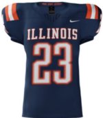
There is no way that is the new uniform.is that just a mock up for fun , or does it really say ILLINOIS in big block letters across the chest ?
tell me it doesnt
New uniform. Road uniform has blue shoulder stripes with orange in middle. Blue numbers/lettering orange outline. Pants have same stripe as shoulders, orange pants with blue white blue. White set also. No orange jersey. Orange helmet, gloss finish, same stripe as pants. White facemask. Blue I with white outline.

Wait a damn second didn’t you just say that Adidas is figuring out how to make clean uniforms with the Kansas post? Does that not have the exact same thing? Lol
The new bad trend in uniforms: school name in big letters across the chest. Unless this is just a crappy mockup, I'm not too excited....
Edit: I get that it's not far off from the Kansas uni that I posted at the top of the page. But at least what I can tell from the mockup, Kansas did it a lot better than we did. Those Illinois letters just don't look good on the chest....
Sleeve stripes > shoulder stripes. We have more letters in our name so it looks busier. And while I get having our letters outlined in orange, I think the lack of an outline around the Kansas letters is a cleaner look.Wait a damn second didn’t you just say that Adidas is figuring out how to make clean uniforms with the Kansas post? Does that not have the exact same thing? Lol
Oh I just meant exact same name above the numbers. Yeah shoulder stripes are a no-go for me but I think some marketing intern on Twitter said they’d look like patriots color rush a few months ago so wouldn’t surprise meSleeve stripes > shoulder stripes. We have more letters in our name so it looks busier. And while I get having our letters outlined in orange, I think the lack of an outline around the Kansas letters is a cleaner look.
A lot of elements are consistent with what has been hinted at, but why would the football team/social media push the script illinois/illini all off-season only to use this new, strange block font in huge letters on the new jerseys?New uniform. Road uniform has blue shoulder stripes with orange in middle. Blue numbers/lettering orange outline. Pants have same stripe as shoulders, orange pants with blue white blue. White set also. No orange jersey. Orange helmet, gloss finish, same stripe as pants. White facemask. Blue I with white outline.