TentakilRex
- Land O Insects between Quincy-Macomb-Jacksonville
AI sucks at spelling in general, but at it got the right letters this time lol.the AI needs to learn how to spell Illini
(Unlike eg the Carolina Poonats)

AI sucks at spelling in general, but at it got the right letters this time lol.the AI needs to learn how to spell Illini
the AI needs to learn how to spell Illini
Well it IS an alternate jersey, so maybe it’s a brilliant idea for an alternative spelling we hadn’t thought of. We’ll be ahead of our times and eventually everyone will be doing it.the AI needs to learn how to spell Illini
Good news: it is only Bing AI, so it cannot be too brightActually that is cryptic AI code signaling the end of human rule.

I was at that game.Bret ... it's time, buddy.
O/W/B
Lucky!I was at that game.
Yep, I am choosing the comforting story in my head that we are saving it for when we go play spoiler in Iowa City.Our BPOTR quest soldiers on, unfazed.
Could’ve really stood out vs. Minny’s gross double-maroon.

Adidas really bungled the 2010s, but they have really seemed to come around in a good way the past few years, and their new uniforms seem to be meaningful and quite aesthetically pleasing. Indiana, Kansas, Washington, Arizona State, and Georgia Tech have taken good steps forward in the last few years. I am not sure if I would go as far as saying I would want Adidas over Nike, or even Under Armor (who has its own problems), but the gap has definitely closed.I am convinced Nike is not send the best and brightest uniform designers
Heck, Rice got this combo today! Rice, the most obscure Southwest Conference ex, that Rice!
But here's the thing - we should absolutely not want the same mindset that is developing City edition jerseys (a creative, short-term marketing-focused exercise) anywhere near the development of our standard uniforms.Certainly, Nike's "best and brightest uniform designers" seem to spend a lot more time creating annual NBA city edition jerseys (I am beyond over these) and MLB city connect uniforms (ok-ish so far) than putting an ounce of thought into college football.

These are pretty plain.I am convinced Nike is not send the best and brightest uniform designers
Heck, Rice got this combo today! Rice, the most obscure Southwest Conference ex, that Rice!
Don't get me wrong, I'm not saying I want city edition jerseys in college football. Frankly, I absolutely hate what city edition jerseys have become in the NBA. I'm saying that it would be nice if Nike used its creative resources to put thought into individual football programs' uniform sets for more of the hundreds of schools they supply rather than just cycling through the same templates and just changing the colors. The reason they won't is because that doesn't make them money, while NBA city edition uniforms do make them money.But here's the thing - we should absolutely not want the same mindset that is developing City edition jerseys (a creative, short-term marketing-focused exercise) anywhere near the development of our standard uniforms.
Thankfully, CFB was at the vanguard or the Uniform Experimentation Era, it is largely over, and we can incorporate the lessons from it. The NFL and MLB are late adopters on this, to the (misguided) results we see all around us right now.
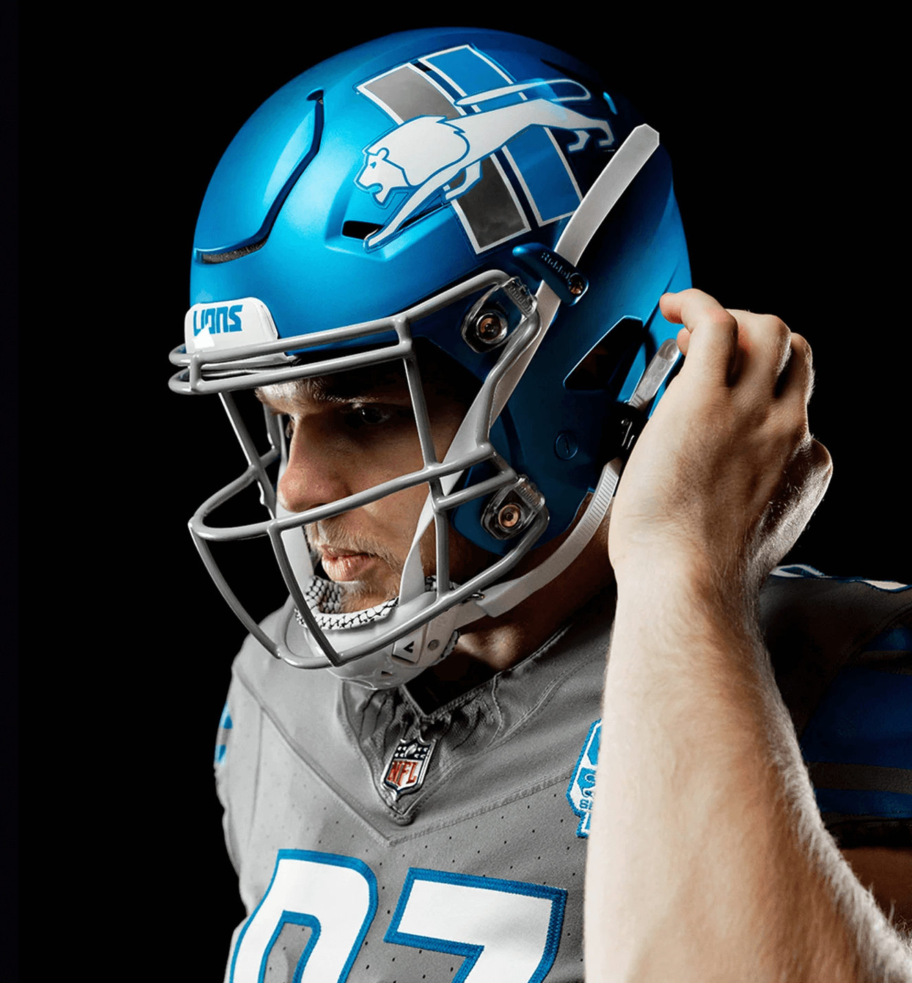
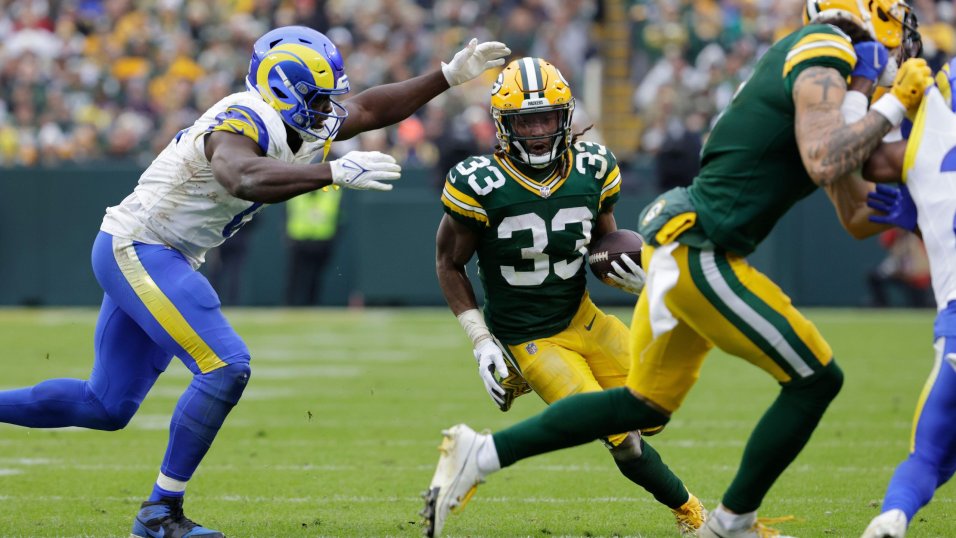
By the way, because it's just a thing I do now, here were some gorgeous uniform matchups from the NFL this weekend, showing the raw aesthetic power of wearing football uniforms correctly:

/cdn.vox-cdn.com/uploads/chorus_asset/file/24218806/1442813905.jpg)
/cdn.vox-cdn.com/uploads/chorus_image/image/72606730/IMG_7875.0.jpg)
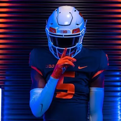
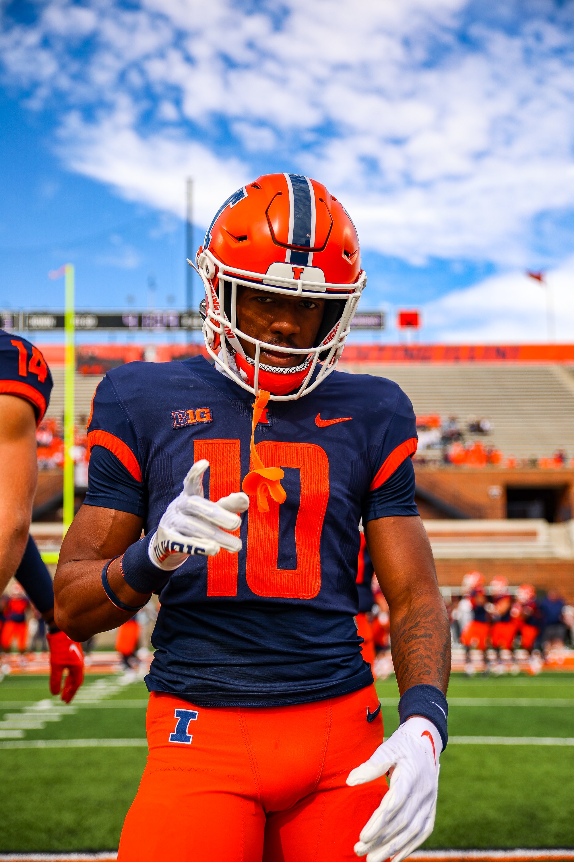
@Fighter of the Nightman Think I'd prefer the number font seen here with our new uniform set. Thoughts?