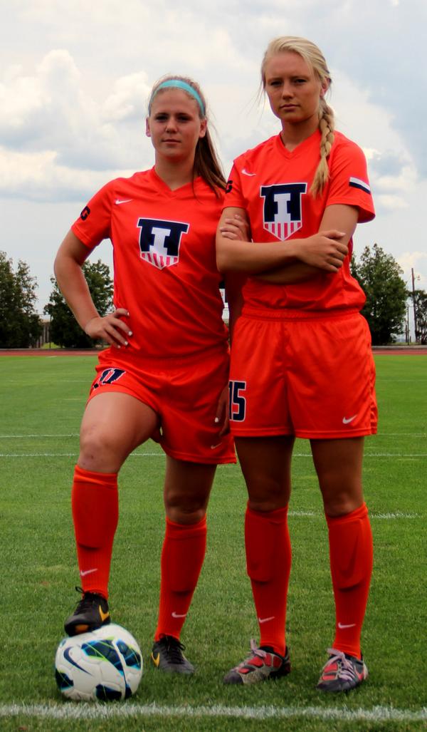
Those soccer kits are beautiful
Yeah, now THAT'S some orange!
I agree the the tops are frickin' sweet. I don't know what it is, but the really shield fits for soccer.
Those soccer kits are beautiful
wow, those girls look young!...................
to think of all the frosh girls on campus I was having fun with 35 years ago, you mean they all looked that young too ?
good thing I was 17-18 years old as well
Well one is a junior and the other is a redshirt junior, so they're 20ish.

This may not be the best place to put this but it shows how another rebranding:
New

Old
This may not be the best place to put this but it shows how another rebranding:
New
Old
I like that new logo much better than their old.
http://www.illinoisloyalty.com/Forums/attachment.php?attachmentid=2026&stc=1&d=1405801391
It's a little rough around the edges, but I think this makes more sense visually. Maybe it's just my taste.

I like the basic idea, but I'm confused by what's going on with the back of the D. Not the blue tails but the actual D and those weird jagged angles. Am I missing something? Is that supposed to be representative of something like a jet?
Definitely an improvement, but I feel like there should be something in the wing and negative space that I'm missing.This may not be the best place to put this but it shows how another rebranding:
New
Old
According to the release PR, it would seem that all the funny angles and negative space were just supposed to make it look interesting and unique. Apparently there is no extra meaning.
http://www.udayton.edu/news/articles/2014/07/athletics_unveils_new_logo_image.php
What is that?
Should have tried to do something with that negative space, one would think.I and many others think they missed an opportunity to get an airplane image in the negative space of the D.
Seems like a no brainer that they passed on
Should have tried to do something with that negative space, one would think.
 :thumb: