Kams Bathroom
K
Guest
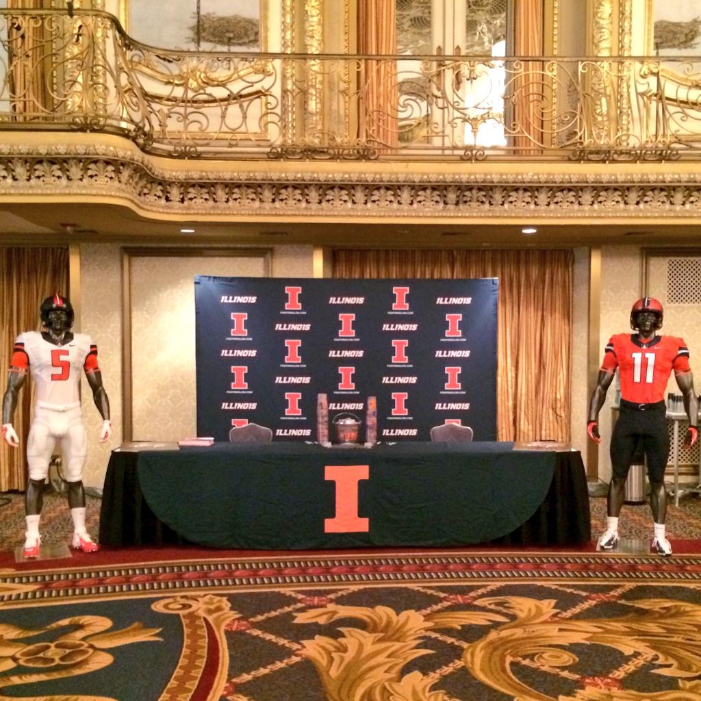
Never said it was "earth shattering". But Orange and blue are the official school colors and they, along with white, can make great combinations. Don't see the necessity for adding grey (or silver) except, of course, as a way to sell more merchandise.
Well you sure answered your own question there.