Well look, everybody freaked out based on some dude wearing a crappy t-shirt that might well be many years old and was bought by some third-party vendor using whatever orange fabric they could wholesale. Back in the day you would go to TIS and the 3 for $20 orange shirts were always a lighter, yellower shade than the official Nike gear. That's not the DIA's fault, that's not Nike's fault, that's just the nature of making cheapo knockoff t-shirts.
Orange is tough. Very subtle changes, that would be barely noticeable in other colors, show up very clearly with orange. And because of that, stock orange coloring used in other formats by other people is never going to match perfectly. You can't hit a million targets at once.
What Nike did was try to hit a shade that was as close to exactly the same as possible, but could be more consistent across different formats.
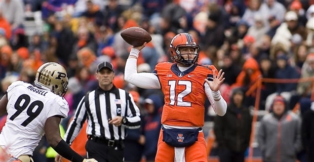
I look at these pictures, and tend to say mission, to the extent it's even possible, accomplished:

")
