The 2014 Illini Nike Uniforms and Rebrand

Status
Not open for further replies.
#551      
Man.. I know everyone has their own opinions, so I guess I'll sound off too. I just really dig the victory shield logo. Looks so classic and has so much meaning and creativity behind it.

Football unis look great, as do the other sports. Basketball unis got the shaft. That font is gross and I'd have any of the last three unis that we wore over this one. Hoping it grows on me, though. Can't wait to see which one Groce is talking about.
 
#552      
I think the baseball team got the shaft.
I actually like the basketball jerseys, minus the 2-tone lettering. Put the feathers up against a large Chief painting I have and it is obviously where they got it from.

I think my single favorite thing is the white football helmet.
 
#554      

illini1

Springfield, IL
I think the baseball team got the shaft.


The wordmark needs to be bigger and moved higher up on the jersey. They probably won't wear those until next year, so hopefully they can fix those issues.
 
#555      

midastouch11

New York, New York
I think the baseball team got the shaft.
I actually like the basketball jerseys, minus the 2-tone lettering. Put the feathers up against a large Chief painting I have and it is obviously where they got it from.

I think my single favorite thing is the white football helmet.

Not too many people are going to rush out to buy the baseball jersey. The intern over at Nike probably got charged with creating that one.
 
#556      

Dan

Admin
Now it's official-

fighting-illini-before-after.jpg
 
Last edited:
#557      

jcpelc

J
Guest
Victory Badege Tweaks

Thought I would tweak victory badge a little - I like that they said its "Fs" surrounding the block I but they are very stylized Fs. I attempted to keep their original shape a bit more.
 

Attachments

  • rebrand.jpg
    rebrand.jpg
    43 KB · Views: 178
#558      
Question: Has anyone else done a helmet center stripe like these before? i.e., wide stripe with one very thin one -- almost pinstripe like -- down the middle.

I don't recall seeing that done before, but there have been so many template-breaking uniform innovations in the past 3-4 years, for all I know that style is old hat (no pun intended) by now.
 
#562      

CardsIllinifan8

C
Guest
Thought I would tweak victory badge a little - I like that they said its "Fs" surrounding the block I but they are very stylized Fs. I attempted to keep their original shape a bit more.


That makes me want to pull out the hair I don't have.
 
#563      

Dan

Admin
Last night at the Identity event, Nike VP Todd Van Horne called the new logo a "shield", while everywhere online it's referred to as a "badge". via via

But it's a shield :thumb:

:shield:
 
#564      

KJKobs

Chicago, IL
Thought I would tweak victory badge a little - I like that they said its "Fs" surrounding the block I but they are very stylized Fs. I attempted to keep their original shape a bit more.

Nope
 
#565      

KJKobs

Chicago, IL
Last night at the Identity event, Nike VP Todd Van Horne called the new logo a "shield", while everywhere online it's referred to as a "badge". via via

But it's a shield :thumb:

:shield:

Badges? We don't need no stinkin' badges!

#BelieveInTheShield :shield:
 
#566      

TheSecretWeapon

ILLINI NATION!
Last night at the Identity event, Nike VP Todd Van Horne called the new logo a "shield", while everywhere online it's referred to as a "badge". via via

But it's a shield :thumb:

:shield:

i noticed that after Werner's tweet saying it's called a badge. I wondered at the time if they had people monitoring the message boards to gauge fan reaction and noticed the support rallying behind #TEAMSHIELD.

It could have been the grass roots Loyalty board movement that effected the name change! :shield:
 
#568      

jcpelc

J
Guest
That makes me want to pull out the hair I don't have.


I didn't say mine was better - it's just that I'm not really on board with them trying to say those are "Fs" when it would be way easier to not even mention it.

I like their design better than mine fwiw.

Also asked this in previous post but got no replies -

Will Groce get a NIKE rebrand orange blazer?
Which logo will be used for television?
Will Lucas Johnson update the paint job on his car?
 
#569      

illinimandan

I
Guest
co-worker's reaction to Nike badge

Bless you, but that is not better.

It looks like an "I" standing in front of a hut or a fireplace. He didn't see 2 "F"s either. Now all I can see is an "I" warming itself in front of a fireplace. I think the current allusion feels like an illusion. My proposal at least addresses that.
 
#570      

Future Walk-On

Peoria, IL
The Illinois Nike Rebrand

I'll take one of those "Fighting Illini" jerseys in every color those are awesome
 
#572      

illinimandan

I
Guest
Thought I would tweak victory badge a little - I like that they said its "Fs" surrounding the block I but they are very stylized Fs. I attempted to keep their original shape a bit more.
I agree with what you're trying to do, but it's a bit busy. Did you check out the one I posted last night addressing the F problem?
 
#573      
I'll throw my opinion into the mix because, why not? We can all be an amateur designer for a day. I've read most of the reactions and I pretty much agree with the consensus.

-Football uniforms are great. A good update, but not too wild or trendy. Like the addition of the white set.

-The basketball uni's are lacking, with culprit #1 being those hideous zig-zags down the side. You couldn't really see it in the "leaked" images, but when the players came on stage last night I gasped. I'm pretty sure they were trying to use some pseudo-chief/feather imagery, but it just doesn't work.

-The basketball shorts are WAY too long and baggy. Tracy and Ray look like they're wearing bloomers. Current trends are away from the baggy to a sleeker look, although not back to the Bird-Magic nut-hugger days.

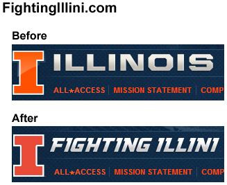
-I don't care for the new, specially created font. It reeks of what they did for Mizzou a few years ago.

-I like the shield and think it's a nice secondary mark. Certainly better than the block I in a circle thing that has kind of been our de facto second mark, although I'm not as crazily excited about it as the #TeamShield crowd.

-I also thought the presentation by the Nike guy was hilariously bad. He sounded like a high schooler trying to sound smart in a class presentation. All buzzwords and no substance, and a pretty terrible delivery to top it off.

-One element where I think I differ from the consensus is the two-tone font. I like the idea, although I liked it better on the older jerseys with the taller, leaner font.

brandon-paul.jpg
 
Last edited:
#574      

Kams Bathroom

K
Guest
Which logo will be used for television?

At this point, I'm sure it will be :illinois:

Which, unfortunately, will probably be a long process of getting the old Block I swapped out for the new one at all the various third-party outlets that exist.

Eventually, though, Shield will conquer all.
 
Status
Not open for further replies.