You are using an out of date browser. It may not display this or other websites correctly.
You should upgrade or use an alternative browser.
You should upgrade or use an alternative browser.
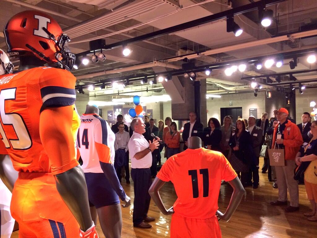
The 2014 Illini Nike Uniforms and Rebrand
- Status
- Not open for further replies.
Don't care much for the shield, but that aside, these are pretty good. Unlike the Oregon gimmick-of-the-week designs, they look strong and distinctive but aren't distracting.
I'm kind of old school when it comes to unis -- I want to see players compete and turning sports uniforms into fashion statements detracts from what sports is supposed to be about. But you can't expect people to wear the exact same thing year after year. Even Michigan's football uniforms have changed over the years -- albeit very subtly.
I think there's way too much effort put into having the latest uniform styles, and what comes out looks gimmicky. We managed to avoid that here. Now go out and win some games and maybe I'll buy one of those orange basketball jerseys...
illini1
- Springfield, IL
Here's a nice Illini Facepalm moment. So, I was puzzled that all the promotional pictures matched up with the players who were modeling the uniforms last night except for Matt LaCosse. He's #11 but all the photos featured an anonymous #55. I had seen #55's featured in other anonymous Nike photos, so I didn't think much of it, since the players were faceless in those images anyway it's probably just some Nike template.
Well, no, it was supposed to be Houston Bates...:doh:
Nike uses #55 for almost all of their college football unveilings. They used #44 for Syracuse because of Ernie Davis.
TheSecretWeapon
- ILLINI NATION!
Nike uses #55 for almost all of their college football unveilings. They used #44 for Syracuse because of Ernie Davis.
the jersey says Bates though

STL FANATIC
S
Guest
It's not off-brand, it's re-brand.
Plenty of schools have added a third color.
O&B are still the primary colors. I love the new secondary colors, dark steel gray and metallic silver, instead of just white. They look awesome with orange and also with blue.
I think this jersey is metallic silver but would look even better in dark steel gray and with F1GHT1NG 1LL1N1 in orange instead of white.
I can understand adding colors to a brand and then utilizing them. I wouldn't agree with it in the case of universities with such established colors (I'm known to rip Mizzou for their stupid "anthracite" every chance I get), but generally speaking, sure.
But even in that context, this uniform feels off brand to me. Silver/grey didn't make the uniforms in any other way (not counting what looks to be a tiny circle around the I on the basketball uniforms which itself seems off-brand), so the silver/grey jersey doesn't appear to fit in the context of the brand they established. And it's made more glaring by the lack of navy on the uniform, in my opinion.
STL Fan, I have been a little unfair to you along with some other posters, just like you have to us. This brand is all a matter of opinion. Nobody can tell someone else what to like and what not to like. People (such as myself) can't say "You have to like this" and you can't tell us we shouldn't like something. We aren't going to convince you and you aren't going to convince us it is all opinion. We disagree and that is fine.
Bottom line let's just hope we start winning some games!
Absolutely. My opinion is passionate and with a lot of reason, but I wouldn't dream of telling other people they're not every bit as entitled to have a dissenting one. Passion gets the better of us sometimes, though, and tone changes.
And there's no doubt that your last line is what matters and what we can all get behind.
If you're looking for gear, TIS bookstore is the place to go right now. They have a good selection and I got myself a blue dri-fit shield shirt. Gameday Spirit had a pretty weak selection for some reason.
http://tisbookui.com/MerchDetail.as... HATS&CatID=22067&Name=MENS HATS#.U1AiZvldWQ5
just got this dooooope hat.

Stevegarbs
- Mokena, IL
I had no idea Jim Brown went there. I forgot about Ernie Davis, and the only reason I knew that cause of the movie about him. I guess I pay more attention to basketball than football.
http://tisbookui.com/MerchDetail.as... HATS&CatID=22067&Name=MENS HATS#.U1AiZvldWQ5
just got this dooooope hat.
Is that I really textured into 3 pieces similar to a column like it shows in the picture??
Groundhogday
G
Guest
I think what I like best about the stonehenge badge, is that from a distance on a dark uniform it looks like a down arrow. I think the younger kids are really going to like wearing a buckle badge that points to their junk.

dgcrow
- Kelso, WA
they are holding back on the grey alternates. Probably unveil them the week before a big game next season. Likely going to have all kinds of features to them.
They might not even have the concept completed yet.
no hurry.
They can wait forever as far as I'm concerned. There will be plenty of combinations available wearing SCHOOL COLORS plus white. No reason why the Illini should wear one of Ohio State's colors.
Stevegarbs
- Mokena, IL
I think what I like best about the stonehenge badge, is that from a distance on a dark uniform it looks like a down arrow. I think the younger kids are really going to like wearing a buckle badge that points to their junk.
TheSecretWeapon
- ILLINI NATION!
They can wait forever as far as I'm concerned. There will be plenty of combinations available wearing SCHOOL COLORS plus white. No reason why the Illini should wear one of Ohio State's colors.
how is that any different than wearing SCHOOL COLORS plus gray?
dgcrow
- Kelso, WA
how is that any different than wearing SCHOOL COLORS plus gray?
The point is, I don't see any reason to wear gray at all, since it isn't a school color. Just my opinion.
The point is, I don't see any reason to wear gray at all, since it isn't a school color. Just my opinion.
Well, technically, it is an official school color now as far as the athletic department is concerned...
TheSecretWeapon
- ILLINI NATION!
The point is, I don't see any reason to wear gray at all, since it isn't a school color. Just my opinion.
white isnt a school color either.
I realize everyone has different tastes, I'm just trying to understand the hate for the gray.
The gray uniform is my least favorite, but not because it's gray. I think it's too bland. Needs blue or orange lettering to be more to my liking
chiefilliniwek09
C
Guest
Looks like the superhero influence wasn't unique to Illinois. Here is a link to some slides from the Syracuse release. Looks like they got Batman.
http://cuse.com/galleries/?gallery=1052
In any sense, I love the new look. GO ILLINI!
http://cuse.com/galleries/?gallery=1052
In any sense, I love the new look. GO ILLINI!
TheSecretWeapon
- ILLINI NATION!
have we discussed the bow tie on the 'cuse uniforms yet? lol

I want this too!!
Great to hear, thanks for sharing!
here's the women's shirt directly from nike
http://store.nike.com/us/en_us/pd/logo-v-neck-illinois-t-shirt/pid-1534369/pgid-1549511
AZillini
A
Guest
The point is, I don't see any reason to wear gray at all, since it isn't a school color. Just my opinion.
Then you must also be opposed to white jerseys or pants, right?
Deleted member 27002
D
Guest
I guess ghosts are grey. I don't know. I'm almost positive he said something to that effect when he talked about adding grey to our colors.
The "Gray Ghost" was a famous race horse named Native Dancer. I think they got their sports figures messed up. Ghosts are white too. Gray is a popular "special" color right now, they didn't really need to attach it to Red Grange.
Kams Bathroom
K
Guest
The point is, I don't see any reason to wear gray at all, since it isn't a school color. Just my opinion.
The gray jersey thing in basketball has become like the light blue jerseys in baseball in the early 80's. It came, it looked cool for several years, it got kinda stale, and then it went. Ten years after that, it began to be remembered fondly, and now people love to wear "throwbacks" like that. And in 20 more years, 80's nostalgia won't be cool anymore, most people who remember those jerseys in their original form on the field will be dead, and no one will ever think about them again.
I bet STLFanatic hates the light blue Vince Coleman-era Cardinals polyester pullovers.
dgcrow
- Kelso, WA
white isnt a school color either.
I realize everyone has different tastes, I'm just trying to understand the hate for the gray.
The gray uniform is my least favorite, but not because it's gray. I think it's too bland. Needs blue or orange lettering to be more to my liking
Obviously white is not a school color, but it is and always has been part of almost every uniform everywhere, especially football road uniforms and usually basketball home uniforms. You could also argue that white is not a "color" in the purest sense. White is common in part because the NCAA at one time required in most cases that shirts on road football uniforms be white.
And I never said I "hate" gray -- it's certainly better than black. What I dislike is any uniform that includes any colors other those of the school. As I did say, there is no reason to add one of Ohio State's colors to the Illini uniforms since so many combinations of orange, blue (and white) are available. I've always believed that not wearing school colors could be interpreted as an indication of a dislike for them. Jim Tatum, for example, was the first to put Maryland's football team in red and white simply because he did not like the school's official colors of black and gold.
OrangeAndBlue217
- Decatur, IL
Certainly Jim Brown and Ernie Davis rank up there with Grange and Butkus with having iconic legends in their past as well as a National Title in 1959. But more than that I'm just thinking of the vibe of the school and the athletic program overall, which is sort of an east-coast prepster cool. The basketball team manages to connote that without being lame, and also never, ever, ever wears blue. Why not make that transition for the football team too? Or leave the blue as some sort of throwback alternate, maybe rather than some 50's look, do the 90's goofy drop-shadow Donovan McNabb jerseys. 90's nostalgia is in for the kids, and that would hearken back to the last time Syracuse was nationally relevant. That would be fun.
According to the ESPN list from a few years ago that did the top 50 college players ever, Red Grange was #1 and I think Butkus was #3.
STL FANATIC
S
Guest
I bet STLFanatic hates the light blue Vince Coleman-era Cardinals polyester pullovers.
They're ok. Conventions matter, and in baseball the convention is for a road uniform to be outside of the color palette of the team's brand.
So powder blue is really no different than the past and current gray in that since.
I think grey looks better, but the Cardinals were one of the teams that could pull of powder blue too. I choose grey, but I don't hate the blue on the basis that it doesn't really break any principles of the brand.
- Status
- Not open for further replies.