The new basketball uniforms

Status
Not open for further replies.
#152      
Yeah for whatever reason the kids are liking really tight fitting shirts/jerseys and shorter shorts now.
Rephrased: people are going to dislike how jerseys are worn no matter what. They will always be too baggy, too loose, shorts too short, shorts too long, and ugly colors.

Fact of life. ;)
 
#153      

TownieMatt

CU Expat
Chicago
I could take or leave the shield, but the new block I is nice. Subtle change obviously, but a good one.
 
#154      

peace davids

Colorado
illini-block-i-logo-before-after.jpg


The block I really is the best part of the rebrand IMO. The shield will pick up steam on its own. Keep it as a secondary logo and let it find a place.
 
#155      
As long as the new Block I is the primary logo, we will never, and I mean NEVER EVER, stop seeing this:

9a45804170647934edc726d837664bc1.jpg


Never.

It's just not different enough, nor suggestive enough of what school it is.
 
#159      
There is a huge movement in graphic design towards flat, cleaner designs and logos. At the beginning, it was weird and took some time for people to adjust to it. But now, when I see logos and designs with complicated graphics, shadows, 3D effects, etc. they look awful.

The whole zig-zag, feathers pattern on the uniforms now looks awful to me. Bringing back the simplicity in the design and the clean/simple look of the past, with some improvements, is definitely the way to go.
 
#161      
As long as the new Block I is the primary logo, we will never, and I mean NEVER EVER, stop seeing this:

9a45804170647934edc726d837664bc1.jpg


Never.

It's just not different enough, nor suggestive enough of what school it is.

I couldn't help but to laugh and shake my head when I saw this, considering that the coaster directly next to my computer has this logo on it, as does the cup that is sitting on it. :D
 
#162      
One is a plain, unadorned letter. The other is a distinctive pattern which only applies to one thing.

The IU logo is recognizable in any color scheme or black and white or whatever. As would the shield.

Again I'll preface by saying that I am pro-shield. But I disagree with this. What about our school would make the shield distinctly Illinois (I know what they are going for with the columns, etc.) ?

I've had people say to me that it looks like an American flag. Obviously that's a little far fetched, but I think the shield is too open to many different interpretations. I think you have to stick to our roots (Block I) for a logo to be undoubtedly and uniquely Illinois.
 
#163      

mattcoldagelli

The Transfer Portal with Do Not Contact Tag
Again I'll preface by saying that I am pro-shield. But I disagree with this. What about our school would make the shield distinctly Illinois (I know what they are going for with the columns, etc.) ?

I've had people say to me that it looks like an American flag. Obviously that's a little far fetched, but I think the shield is too open to many different interpretations. I think you have to stick to our roots (Block I) for a logo to be undoubtedly and uniquely Illinois.

It's something that no one else uses.

The block letter "I" can never be uniquely Illinois, because of it being, you know, a letter. It's not even stylized like the motion W, Northwestern N, or Bears C.
 
#164      
What about our school would make the shield distinctly Illinois (I know what they are going for with the columns, etc.) ?

It's not that it's distinctly Illinois, it's that it is a unique symbol. A plain letter I is not. To even recognize that as a sports logo in general is completely context-dependent.

The best logos, IMO, are the ones that you can instantly identify in any color scheme and in any context.

Silhouette.png


The shield does that.
 
#165      
It's something that no one else uses.

The block letter "I" can never be uniquely Illinois, because of it being, you know, a letter. It's not even stylized like the motion W, Northwestern N, or Bears C.

But will it ever take, in a national sense, to being associated with Illinois?

I am happy with it being our secondary logo, and would even like to see it used more, but I don't know if it ever gets to the point of being the single, unified symbol that makes people think "University of Illinois."
 
#166      

mattcoldagelli

The Transfer Portal with Do Not Contact Tag
But will it ever take, in a national sense, to being associated with Illinois?

I am happy with it being our secondary logo, and would even like to see it used more, but I don't know if it ever gets to the point of being the single, unified symbol that makes people think "University of Illinois."

Maybe! We need to give it a shot, ideally over a period of time when we are not at our absolute nadir in both revenue sports
 
#167      
Last edited by a moderator:
#168      
But will it ever take, in a national sense, to being associated with Illinois?

Absolutely.

Everybody knows the primary logos of major conference schools that are simple and clean and recognizable, even if they're meaningless and those schools stink at sports.

Northwestern-University-Wildcat-Block-N-Primary-Logo.jpg

The-University-of-Arizona-01.png

6752cd9611fb32309b53742b4d7287b7.jpg

4075c155094ef047630d79e710726bca_auburn-university-logo-black-auburn-logo-clipart-black-and-white_325-381.jpeg

BC.png

8DzSAMir.jpg


Put the shield at midfield and midcourt and on the football helmets for three years, it will be as etched into the brain of college sports fans as any of those.
 
#170      
Maybe! We need to give it a shot, ideally over a period of time when we are not at our absolute nadir in both revenue sports

Agreed. I would actually love to see it incorporated in the football uniforms more. Not going to get into those ideas because it doesn't belong in this thread, but I hope in 10 years everybody in the country knows any and all Illinois logos. :shield::illinois:
 
#172      
I am over it. My point was that it is tough to come up with something recognizable when your mascot can't be shown in polite public. It's a tough position. 
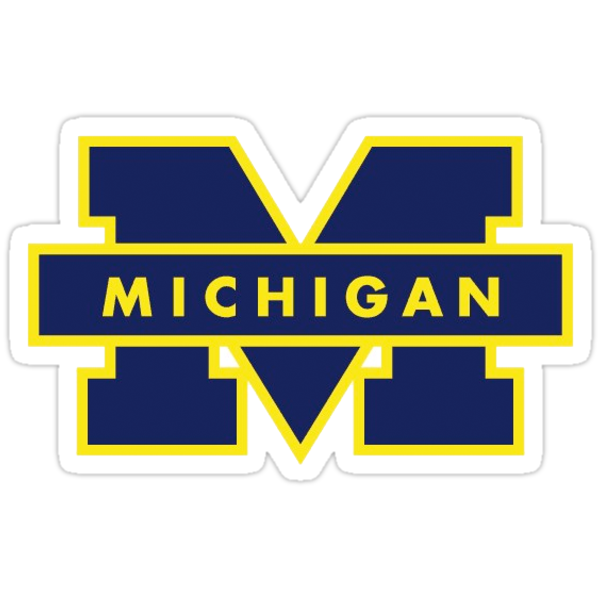
Michigan has done fine with the Block M and no one writes Michigan over it. Block I is fine if that's what they push

The chief logo was gorgeous.

Only two problems

1. It was tough to reproduce recognizably in small formats. Pencils, those stickers girls put on their faces, stuff like that.

2. It's gone and it's never coming back, get over it.
 
#174      
It's something that no one else uses.

The block letter "I" can never be uniquely Illinois, because of it being, you know, a letter. It's not even stylized like the motion W, Northwestern N, or Bears C.

If you ask most graphic designers (and I would agree with them) the motion W is terrible. A thing of the past, with shadows, etc. I also think the Cal C is also bad, awful logo. From all 3, Northwestern is the best, but even Northwestern is moving away from the stylized version for all academic purposes.

http://www.northwestern.edu/brand/brand-assets/academic-shorthand-n.html

Most companies are moving towards cleaner, flat designs, with less stylization. Even Google and the Google G, has moved towards a much less stylized version, as has their full logo.

google-logo-history.jpg
 
Status
Not open for further replies.