The new basketball uniforms

Status
Not open for further replies.
#226      
I really do think a move toward the throwback look is in the works. Most teams have new jerseys every couple of years, it doesn't have to take 3 years like it did with us. When Nike wants to do help a school out, they can do it. I say keep the throwback white, throw back the Oranges, and keep the ghost grey as a modern look. I could go either way on the dark blues.

Honestly, I would start with our greys, create orange and blue versions, and use the throwbacks for whites.
 
#227      
I like a more traditional look(except for shorts and bigger numerals).

1974%E2%80%9375_Illinois_Fighting_Illini_men's_basketball_team.jpg
 
#228      

redwingillini11

White and Sixth
North Aurora
Honestly, I would start with our greys, create orange and blue versions, and use the throwbacks for whites.

So kind of just minimalize the orange and blues (erase the zig zags)? I really don't hate these jerseys, but they just don't really pop. But if they change one thing, just one thing with these jerseys, get rid of the two tone in the lettering.
 
#229      

GortTheRobot

North Bethesda, Maryland
I'm not a fan of the zig-zags. Maybe it's an age thing. I like simpler, throwback stuff...get the zig-zags off my lawn.
 
#230      
MAke the fighting illini "throwbacks" our new permanent ones. Simple.
 
#231      
But if they change one thing, just one thing with these jerseys, get rid of the two tone in the lettering.

+1

It's awful. I haven't been able to stand it since they implemented it. I can't believe that was ever approved in the first place, especially since it pre-dates the rebrand.
 
#232      

homesickalien

Springfield
I have to say I liked the jerseys when they came out. Not so much anymore. The zig zags and two tone aren't flattering. Love the throwbacks. Wish we'd go with a more simplistic/minimalistic approach that stood out.
 
#233      
Fighting Illini would be a great jersey for the way Underwood wants to play.
 
#234      

Ransom Stoddard

Ordained Dudeist Priest
Bloomington, IL
Fighting Illini would be a great jersey for the way Underwood wants to play.

^^^This. The block lettering Fighting Illini should become an integral part of our hoops identity IMO. Home and away, all the time. It's iconic and can be done without looking "old."
 
#235      
^^^This. The block lettering Fighting Illini should become an integral part of our hoops identity IMO. Home and away, all the time. It's iconic and can be done without looking "old."

+2. Aside from the great hires, Whitman has a great opportunity to rebrand Illinois again.

Gosh, Mike Thomas was such a poor decision.
 
#236      

SampsonRelpenk

Edwardsville, IL
^^^This. The block lettering Fighting Illini should become an integral part of our hoops identity IMO. Home and away, all the time. It's iconic and can be done without looking "old."

I'm sure some people would complain about that "look" belonging to a different era, but to me, there's no shame in going back to a clean, iconic aesthetic from the past. Call it the "Miller Lite Effect": https://www.bloomberg.com/news/arti...evives-old-white-label-in-brand-wide-redesign
 
#237      
I think the obvious decision is to make the Fighting Illini jerseys permanent. Add a blue away, and orange alternate with the same template, and please keep the fit the same. I do not like nikes new wresting singlet style.
 
#238      

Firet92

Gurnee, IL
I think the obvious decision is to make the Fighting Illini jerseys permanent. Add a blue away, and orange alternate with the same template, and please keep the fit the same. I do not like nikes new wresting singlet style.

I agree, it looks brutal and extremely out of place.
 
#239      
An interesting tidbit from one of those rumor-mongering twitter accounts:


It's obvious to me what the next step should be.

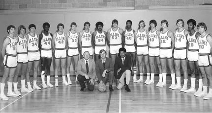
Everybody hates the zig-zag and loves the '89 throwbacks. So scrap the zig-zag and use the "columns" striping from the football uniforms as the striping on the basketball jerseys too, like the silver uniforms currently, but with a contrasting color (orange with a white middle on the blue, orange with a blue middle on the white, and white with a blue middle on the orange):

yogi.jpg


Then, using the new font and number template, make the white and orange jerseys say "Fighting" on top and "Illini" on the bottom like the throwbacks. Leave the blue road jersey as "Illinois".

And also, on the home whites, ditch the two-tone lettering. Go with blue lettering and orange numbers, those combos should always nod to these jerseys, that just pops as "us" out of generic orange and blue templates

20050331-064036-pic-466737109.jpg


Done and done. Then all we have to do is make the shield the primary logo and the rebrand is complete. #TeamShield :shield::shield::shield:
I'd like to see mock ups of these. This sounds like exactly what I would do. Except keep the block I as the primary logo.
 
#241      
Even something like these would be an improvement over current unis(I liked these, 1 year only though):

1996%E2%80%9397_Illinois_Fighting_Illini_men%27s_basketball_team.jpg
 
Last edited:
#243      
Those new Jumpman ones that Michigan and UNC have just look AWFUL. Whoever was in charge of the font style and size needs to be fired asap. The jerseys are too narrow and the font too fat so it looks scrunched together.
 
#244      

SalukiIllini

Evansville, IN
Nike has been awful at jerseys and kits for a while.

Look at how lazy they did the last USMNT kits. They literally rebranded England's for a "third kit" and slapped a USA crest in it.
 
#245      
I love the one with dee in it. Please bring those back. It would help our brand so much. Everyone hates the new design. Nike did a horrible job.
Give it 5-10 years and these will be considered straight-up throwback designs, and we'll see them again. :thumb:
 
#246      
Agreed. Need to go back to the orange we used back then as well. Just looked better. The new orange is weird
 
#247      

redwingillini11

White and Sixth
North Aurora
I forgot how good the 04-05 whites looked. Illinois in deep blue and the numbers in orange is perfection.
 
#248      

EJ33

San Francisco
I just want FIGHTING ILLINI back on the jersey. The design could vary, but FIGHTING ILLINI is sooooooooo much better than Illinois.
 
Status
Not open for further replies.