Sorry. Bad joke on cubit deal
No, excellent joke on cubit deal :thumb:
Sorry. Bad joke on cubit deal
Sorry. Bad joke on cubit deal
Jokes only as good as the person reading/understanding it. Glad my snarky humor didn't fly over everyone's head.No, excellent joke on cubit deal :thumb:
 " logo has largely been a failure? " is not used as a logo next to our name on football or basketball telecasts.
In the litany of failures by the U of I in recent years and weeks, has anyone mentioned that the massive branding spend of the "
In the litany of failures by the U of I in recent years and weeks, has anyone mentioned that the massive branding spend of the "
I am referring to it as a failure as it is not distinguishable on football or basketball uniforms, on either the field or the court, and the "
I am referring to it as a failure as it is not distinguishable on football or basketball uniforms, on either the field or the court, and the "
That isn't the intent of the shield.
Couldn't disagree more. The shield is now our IP and we can use it, hopefully with increasing frequency, for years and years and years.
The rebrand is one of the best things Mike Thomas did. Especially in football, I can't tell you how many random people have told me how much they like our football uniforms.
appears is at the top of the collar. The helmet features a block I or the outline of the state of Illinois. Hardly a uniform centered on the What is the intent? Isn't branding supposed to give people the ability to think about a product just by looking at a logo? I doubt anyone outside of Illinois could pick this shield out of a lineup
The only place the
It's all part of the same brand identity, the same process. It's all part and parcel of the same effort on Nike and Thomas' part.
It is my hope that the shield becomes the primary logo and ends up on the helmets and the midfield logos and everywhere else. But even failing that, it has added a much needed change up to what was a disastrously bad iconography profile.
O, to return to the days when our biggest concerns were fighting the good fight for #TeamShield and solving the mystery of the lamp.
Simpler times. Better times.
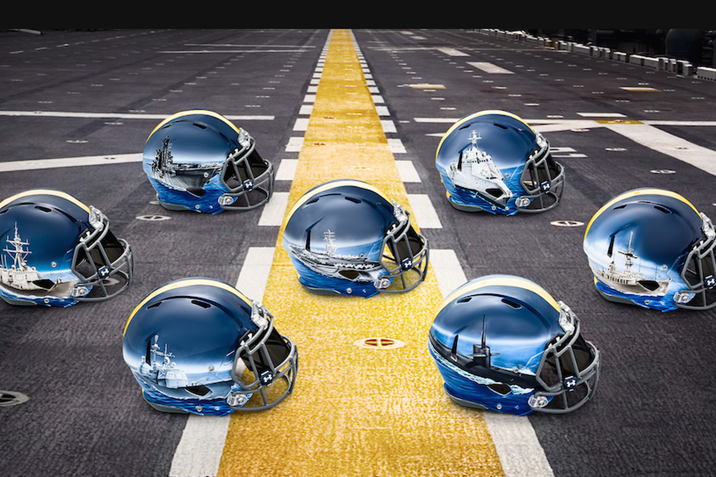
Not sure if this was mentioned much, but I loved our O/B/B color scheme in the Northwestern game. That's a great uniform.

I really think we need to do something innovative like chrome or mirror like numbers or an orange jersey or something......
they grey ghost is so plain and played out...tho i do really like the orange blue orange with blue socks
