Fighter of the Nightman
- Chicago, IL
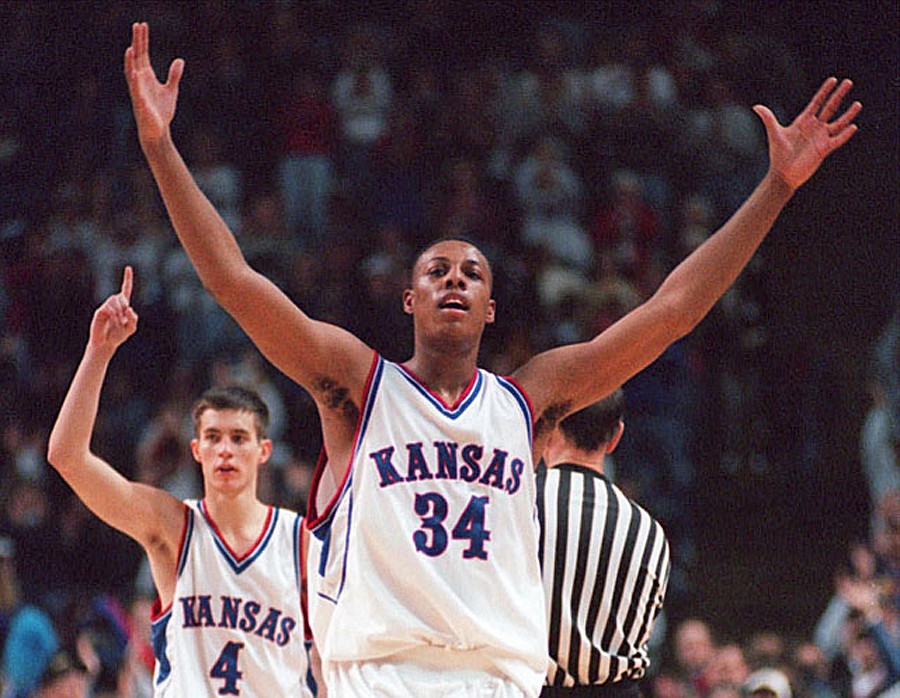
Yep, Michigan is a great example of how your “regular” jersey can still be classic/throwback … also see Indiana or Kansas. The idea that we need to have a modern Mizzou/Iowa State type font must die! Down with 1LL1NO1S!Ugh. I hate admitting it, but envious of Michigan's uniforms. They are exactly the sort of style we need, and mad points for how they match their compression gear with it (I hate whenever I see our guys wearing black instead of matching the uni color).
At the same time, unimpressed with UVA's version tonight and would not want that look for us.
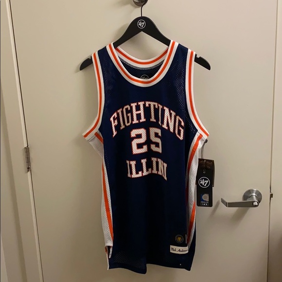
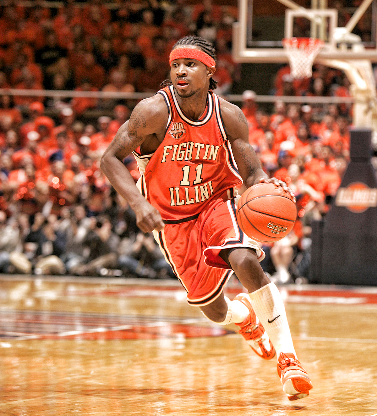
We already have two throwbacks that are widely recognized as some of the best uniforms in college hoops. My vote is to flesh them each out in the three colors and have those simply be our jerseys. However, if one simply insists we have “new” jerseys and only wear the throwbacks for special occasions, then we can still have our regulars be classic in style.
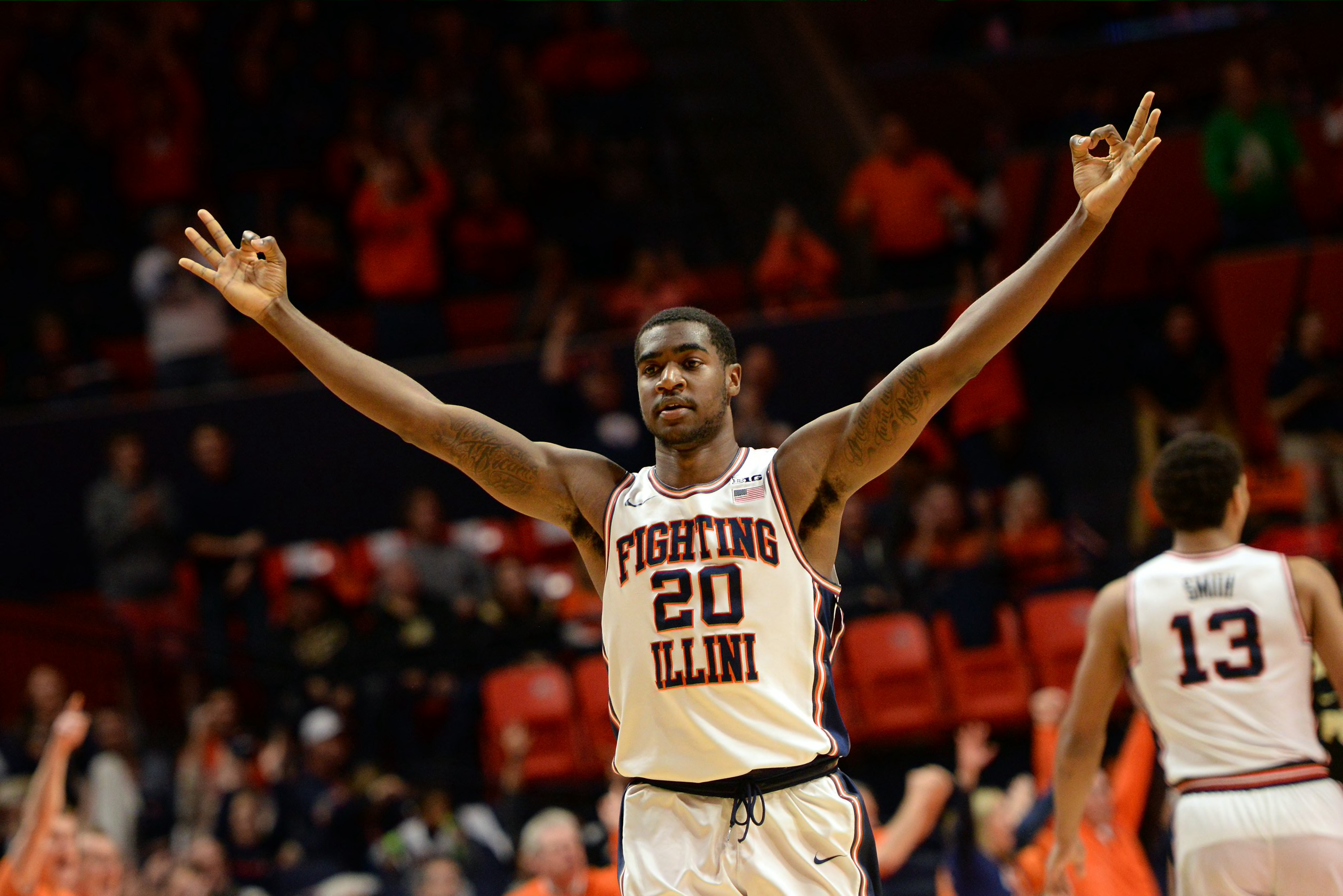
I’m sorry, but I cringe when we wear the regulars.
 Perception matters, and all my non-Illini friends comment on how great our throwbacks are and yet how bland and lame our regulars are.
/cdn.vox-cdn.com/uploads/chorus_asset/file/23614500/B307E252_9A88_416F_B65D_0B4B88C81C24.jpeg)

 If we were effing Michigan we'd have orange to match our jersey. We could at the very least go with blue instead of black!
 I admit I don’t know, but do we really think traditional football powerhouses that use Nike but keep their football jerseys literally the same each year (Alabama, Georgia, PSU, USC mostly) are cutting to the front of the line for Nike’s creativity regarding basketball uniforms? I don’t.