You are using an out of date browser. It may not display this or other websites correctly.
You should upgrade or use an alternative browser.
You should upgrade or use an alternative browser.
Illinois Football Uniforms
- Status
- Not open for further replies.
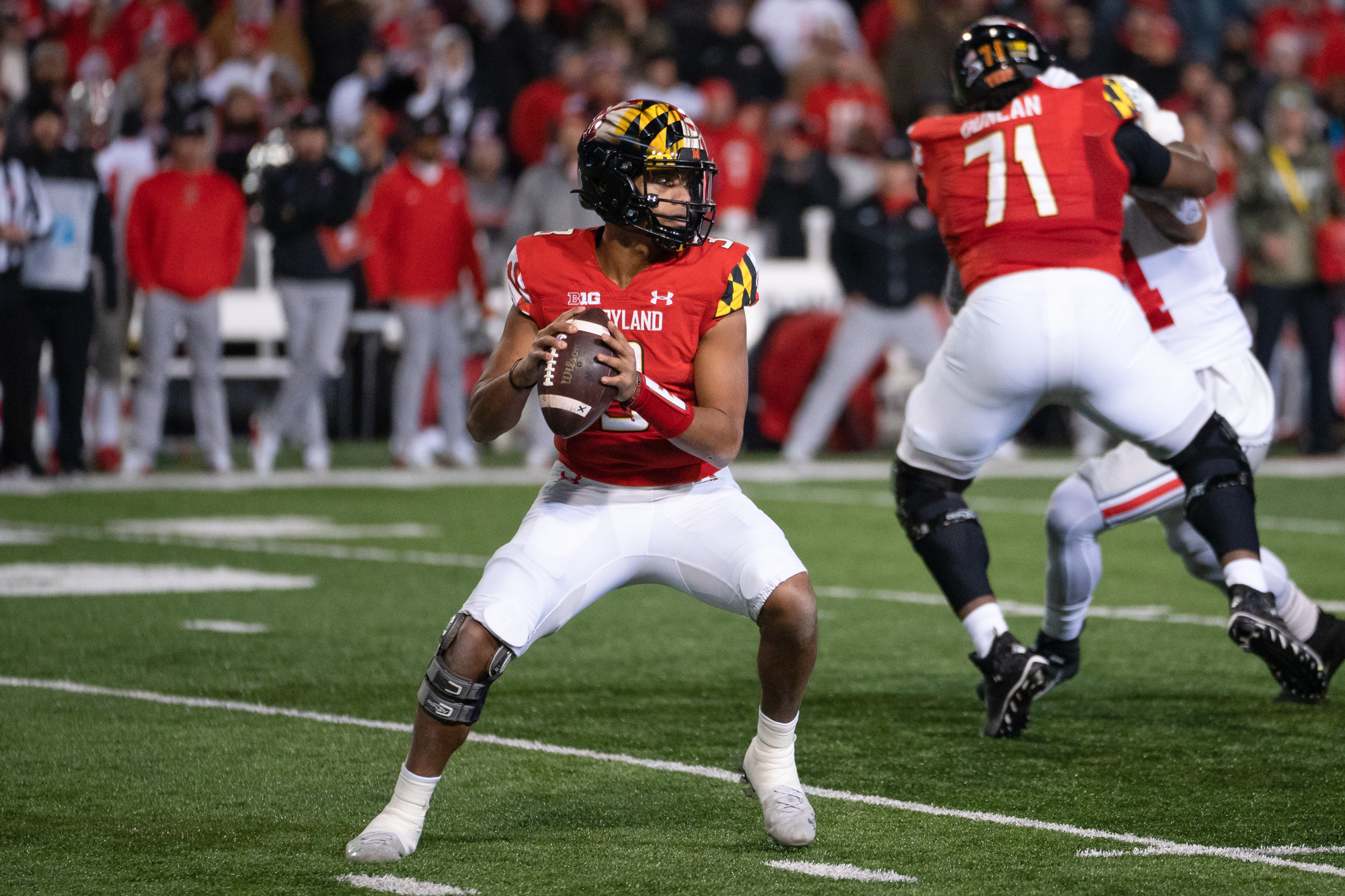
For some reason, the script Illini seems "soft" to me. I prefer the bold (aggressive?) nature of block lettering.Maryland is ditching the busiest helmet art work in college football, for the old classic ' Terps ' in script
all the more reason for us to stick with the Block I on the helmet.
View attachment 25166
ChiefGritty
- Chicago, IL
I kind of liked it?I appreciated the unique atrociousness of the previous Maryland flag helmet design.
Since the Under Armor revolution there they got in the habit of wearing a lot of goofy stuff, but where they eventually settled with that consistent Maryland flag patterned helmet was uniquely them, not actually all that garish or outlandish, and was suited to the football uniform as it exists in 2023, rather than shoehorning what worked for the uniform of 1990.
Pretty sharp IMO!
IlliniKat91
- Chicago, IL
Marylanders love that flag as much as Chicagoans love the city flag. I think it was a good look for them. It was unique to the state and school. Terps is kinda blah and it feels like they're just jumping on the script trend now as opposed to schools who have had it for a while a la Ole Miss.I think it's a good move. That's a very clean look, that is frankly more appropriate for the Big Ten. They can break out the flag for special occasions, but every game is just too much.
Fighter of the Nightman
- Chicago, IL
This is NOT an endorsement of putting script font on our helmets (I support the Block I, personally), but I have to say that in an era where throwback script font is all the rage ... ours is quite honestly pretty ELITE compared to our conference foes:


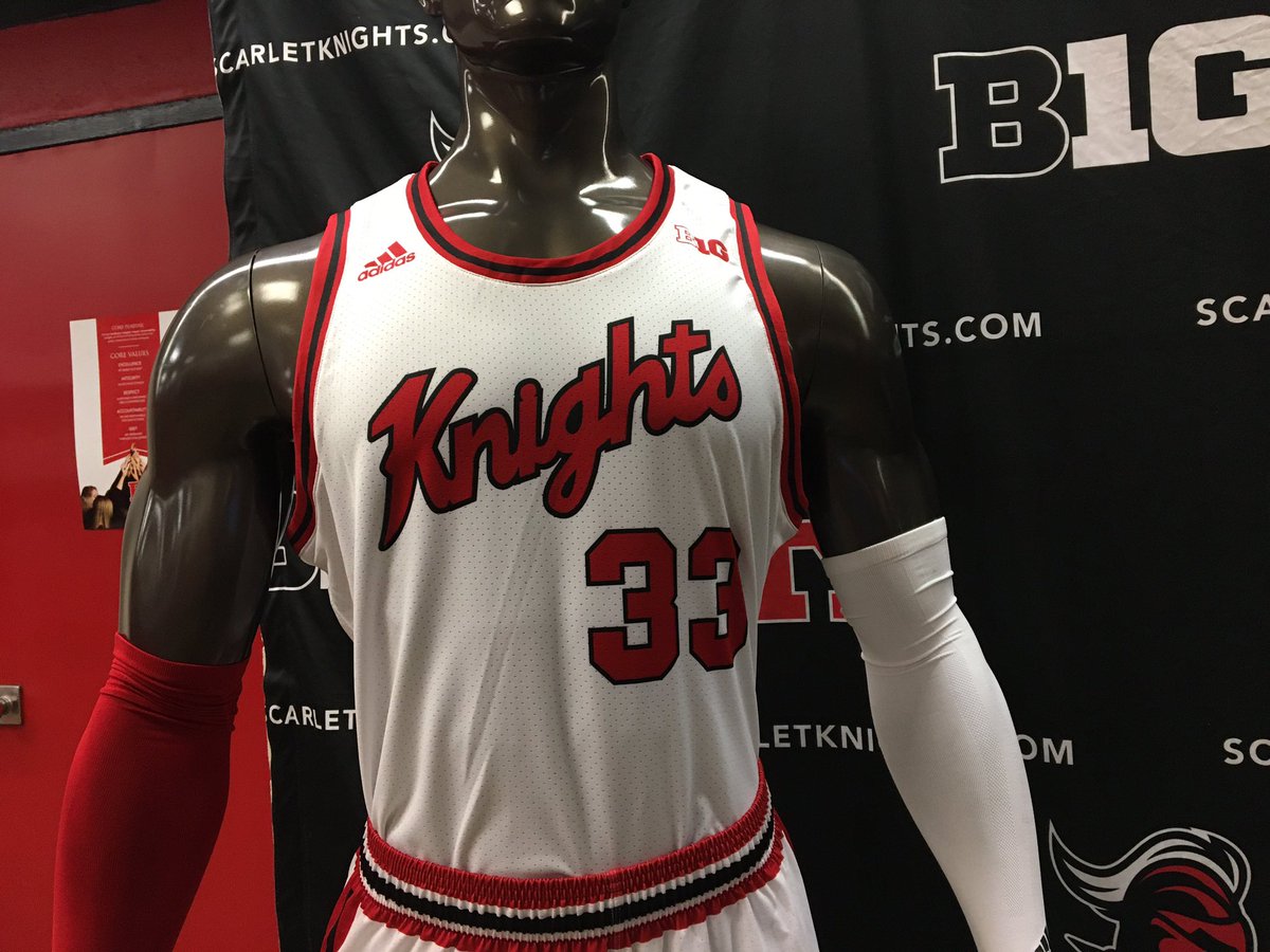
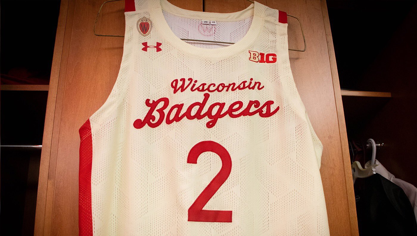
I get I'm biased and all, but Ohio State is honestly the only serious competition.
I get I'm biased and all, but Ohio State is honestly the only serious competition.
Purdue is greatThis is NOT an endorsement of putting script font on our helmets (I support the Block I, personally), but I have to say that in an era where throwback script font is all the rage ... ours is quite honestly pretty ELITE compared to our conference foes:
I get I'm biased and all, but Ohio State is honestly the only serious competition.
watch your mouthPurdue is great
Fighter of the Nightman
- Chicago, IL
I'd probably say...Purdue is great
#Elite: Illinois
Great: Ohio State, Purdue
Good: Iowa, Michigan State
Meh: Maryland, Nebraska
Bad: Rutgers, Wisconsin
this is iconic
when other teams , Like Purdue or the White Sox in 1988 ? try copying that , it doesnt work for me.
that White Sox uni was an epic fail
is it just me, or are others out there tired of the Sox wearing that 1983 era SOX jersey every Sunday ?
I personally kinda hate it , but Im a very casual Sox fan, being that Im a Cub fan
Michigan State looks like it was written by someone learning cursive for the first timeI'd probably say...
#Elite: Illinois
Great: Ohio State, Purdue
Good: Iowa, Michigan State
Meh: Maryland, Nebraska
Bad: Rutgers, Wisconsin
I'm with this. Purdue looks great till they hit the "e" and decide to turn it into an underline.View attachment 25212
this is iconic
when other teams , Like Purdue or the White Sox in 1988 ? try copying that , it doesnt work for me.
that White Sox uni was an epic fail
is it just me, or are others out there tired of the Sox wearing that 1983 era SOX jersey every Sunday ?
I personally kinda hate it , but Im a very casual Sox fan, being that Im a Cub fan

redwingillini11
White and Sixth
- Batavia
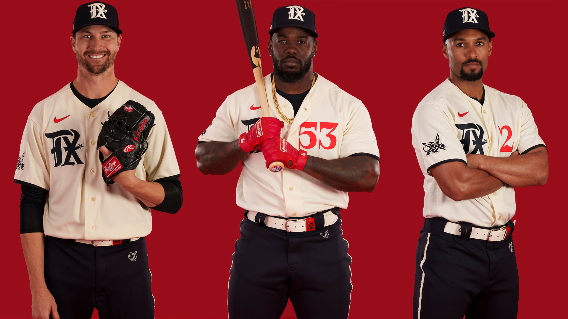
Please get better uniforms than the Arizona Cardinals did:
Ryllini
- Lombard
The bold Arizona on the red has to go. I like the ice white though.Please get better uniforms than the Arizona Cardinals did:
The bold Arizona on the red has to go. I like the ice white though.
In my opinion, they were super close. Needed to have Arizona across all three chests and shoulder/pant stripes on all three. Then shrink the Arizona across the chest to a more reasonable size. That would have been a solid modern classic uniform set. Instead it feels pretty disjointed, but what are you gonna do.Please get better uniforms than the Arizona Cardinals did:
redwingillini11
White and Sixth
- Batavia
You are exactly right. It really doesn't take much to make these uniforms perfect. Which makes it kind of baffling that of the dozens of tweaked options they were likely given to choose from, that this is what they settled on. They are an improvement, but still disappointing.In my opinion, they were super close. Needed to have Arizona across all three chests and shoulder/pant stripes on all three. Then shrink the Arizona across the chest to a more reasonable size. That would have been a solid modern classic uniform set. Instead it feels pretty disjointed, but what are you gonna do.
I'll give them this credit. The small details on the helmets are fantastic.
TentakilRex
- Land O Insects between Quincy-Macomb-Jacksonville
Have mixed feelings about the recent Texas Rangers City Connects too, though stuff with Peagle (aka Vandergriffin to some Rangers fans like me) is pretty cool. Not really into Nike's recent stuff.Please get better uniforms than the Arizona Cardinals did:
/cloudfront-us-east-1.images.arcpublishing.com/dmn/V2JZJNVOK5HEXFQBOJRFDI7RVE.jpg)
The Galloping Ghost
- Washington, DC
Football jerseys with words across the front look bad. A football jersey should be recognizable without having to put a word across the front.In my opinion, they were super close. Needed to have Arizona across all three chests and shoulder/pant stripes on all three. Then shrink the Arizona across the chest to a more reasonable size. That would have been a solid modern classic uniform set. Instead it feels pretty disjointed, but what are you gonna do.
Fighter of the Nightman
- Chicago, IL
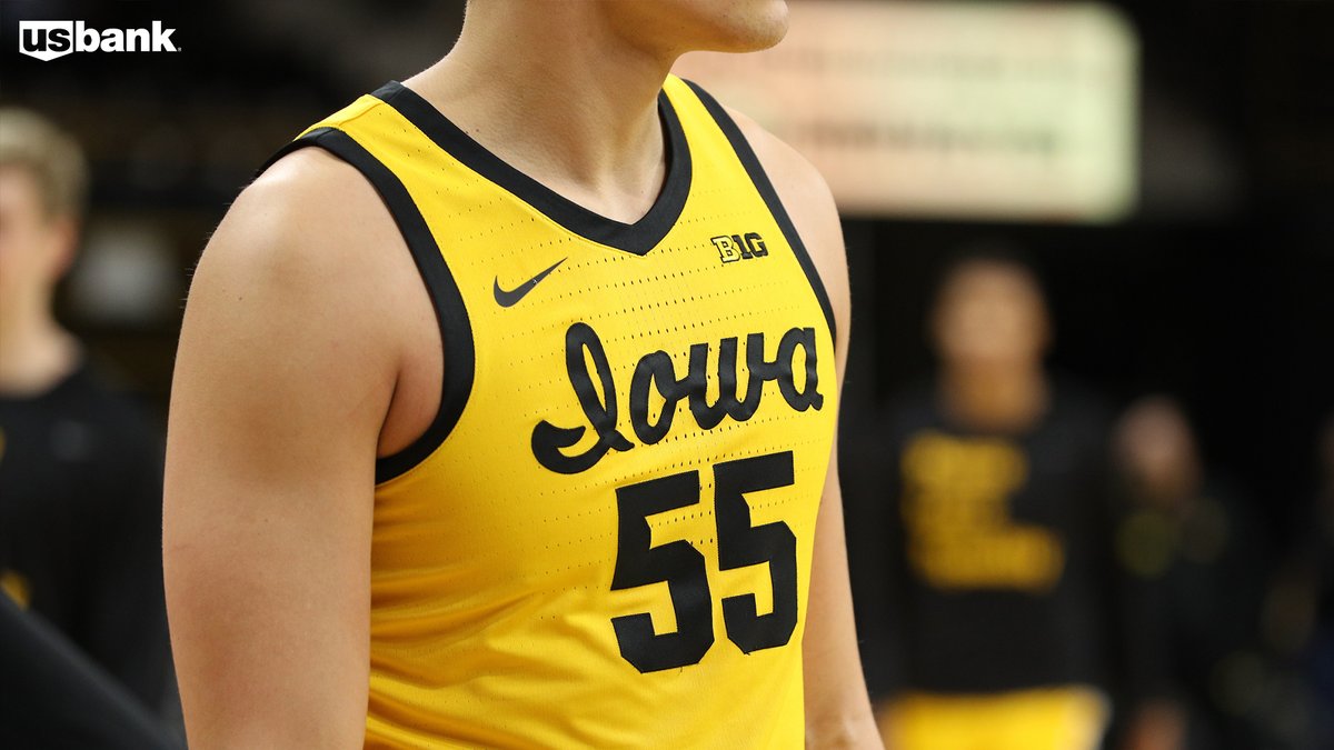
Agreed. On a related note, it looks equally jarring/bad when a basketball jersey ditches words in favor of a logo like this hideous Iowa jersey:Football jerseys with words across the front look bad. A football jersey should be recognizable without having to put a word across the front.
/cdn.vox-cdn.com/uploads/chorus_asset/file/23307587/1363380799.jpg)
The Galloping Ghost
- Washington, DC
Have mixed feelings about the recent Texas Rangers City Connects too, though stuff with Peagle (aka Vandergriffin to some Rangers fans like me) is pretty cool. Not really into Nike's recent stuff.

These are some college baseball-a$$ sh*t.
redwingillini11
White and Sixth
- Batavia
These city connect uniforms are just getting bizarre. Feels extremely forced. Seeing these uniforms in a vacuum I have absolutely no clue as to what team they are or what city they are from. It's just stupid.Have mixed feelings about the recent Texas Rangers City Connects too, though stuff with Peagle (aka Vandergriffin to some Rangers fans like me) is pretty cool. Not really into Nike's recent stuff.
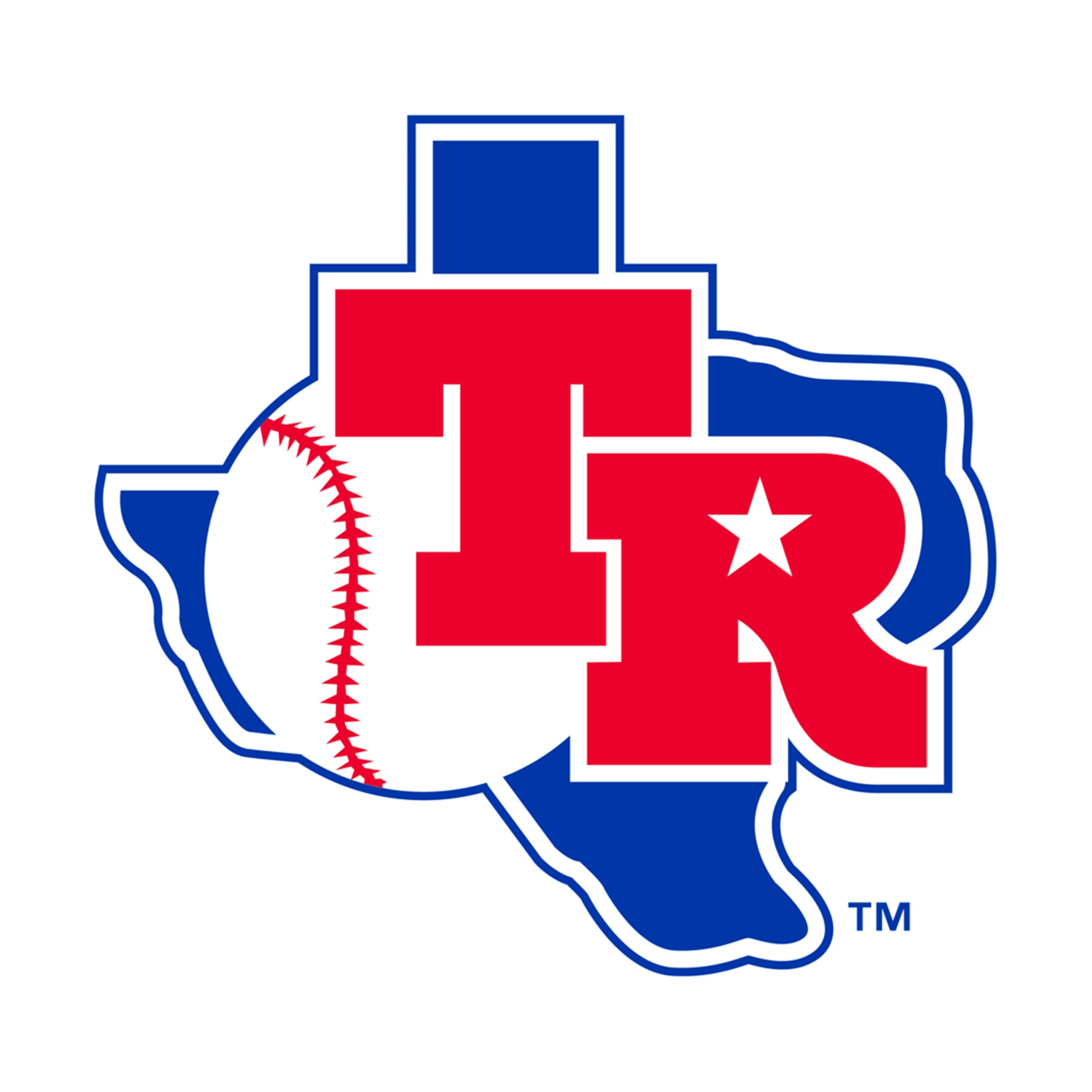
Also, I hate the Rangers' diagonal TX logo. The fact that it is a diagonal makes it look like the team name initials are TX, that they are the Texas X's. What they should have done is either horizontal TX, or just done what they did in the past with the logo below:
I am a Nike apologist to the day I die, but damn they need someone with common sense in the room to tell them to stop doing stupid stuff.
ChiefGritty
- Chicago, IL
Well, that's because they are.These city connect uniforms are just getting bizarre. Feels extremely forced.
Because honesty is the Gritty PromiseThis is NOT an endorsement of putting script font on our helmets (I support the Block I, personally), but I have to say that in an era where throwback script font is all the rage ... ours is quite honestly pretty ELITE compared to our conference foes:
I get I'm biased and all, but Ohio State is honestly the only serious competition.
 , I am going to admit, seeing this made me feel a little less pro-script. I hadn't fully digested how much of a fad this is, which means in five years it's going to be what everyone was doing five years ago.
TentakilRex
- Land O Insects between Quincy-Macomb-Jacksonville
So we should call them the George Strait jerseys lolThese city connect uniforms are just getting bizarre. Feels extremely forced. Seeing these uniforms in a vacuum I have absolutely no clue as to what team they are or what city they are from. It's just stupid.
Also, I hate the Rangers' diagonal TX logo. The fact that it is a diagonal makes it look like the team name initials are TX, that they are the Texas X's. What they should have done is either horizontal TX, or just done what they did in the past with the logo below:
I am a Nike apologist to the day I die, but damn they need someone with common sense in the room to tell them to stop doing stupid stuff.
Ryllini
- Lombard

TentakilRex
- Land O Insects between Quincy-Macomb-Jacksonville
The sequel
- Status
- Not open for further replies.