You are using an out of date browser. It may not display this or other websites correctly.
You should upgrade or use an alternative browser.
You should upgrade or use an alternative browser.
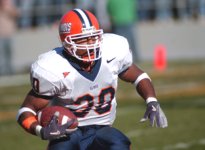
Illinois Football Uniforms
- Status
- Not open for further replies.
Gloss helmets, I like that tweak!Looks like the helmet stripe is about to switch and the helmets will move from matte to glossView attachment 25442
Fighter of the Nightman
- Chicago, IL
Yep, count me as a fan of the first change! I now just hope that if we have a similar three-layered stripe on the jersey (be it on the sleeve or the shoulder) that it follows the corresponding pattern - O/W/O instead of W/O/W. I think having white in the middle looks SO much better when you are doing that kind of thing. I'm confident they will, as it would look really goofy to not stay consistent.I like the helmet stripe being blue/white/blue and not vice versa.
the helmet needed more blue, and now we have it
ChiefGritty
- Chicago, IL
Note how much white is present here though, and not just the facemask. The gloves, the inside helmet padding, the chinstrap buckles, we also wear white socks and shoes. It's about achieving a balance.
chiefini
- Rockford, Illinois
Looks like the helmet stripe is about to switch and the helmets will move from matte to glossView attachment 25442
Thanks, Nike thread guy, for sharing this great tweet. Fighter, It looks like you nailed it with the helmet with the stripe and white emphasis, with the keeping of the Block I. Nice going.
Attachments
Yes, nice catch! Not mad about it; however, I - personally - would like it if we kept the "matte" finish, but that is just meThanks, Nike thread guy, for sharing this great tweet. Fighter, It looks like you nailed it with the helmet with the stripe and white emphasis, with the keeping of the Block I. Nice going.
") .
.mattcoldagelli
- Script Illinois Enthusiast
Positive helmet developments. Let's keep that momentum going to the rest of it. #stripeconsistency
I was about to comment on this thread a couple days ago out my wish to go back to the B/W/B stripe pattern. I just looks so much better on an orange background. Small touches like that have me pretty optimistic about the new look.
My only note would be to put something different on that tab above the facemask. You've already got the Block I on main part of the helmet, kind of repetitive top put it in front too. Don't know what would fit there instead other than "Illini" or something like that?
My only note would be to put something different on that tab above the facemask. You've already got the Block I on main part of the helmet, kind of repetitive top put it in front too. Don't know what would fit there instead other than "Illini" or something like that?
Last edited:
The Galloping Ghost
- Washington, DC
If only we had aI was about to comment on this thread a couple days ago out my wish to go back to the B/W/B stripe pattern. I just looks so much better on an orange background. Small touches like that have me pretty optimistic about the new look.
My only note would be to put something different on that tab above the facemask. You've already got the Block I on main part of the helmet, kind of repetitive top put it in front too. Don't know what would fit there instead other than "Illini" or something like that?
 secondary logo, something completely unique that could go there.
If only we had a
IMHO, the shield looks like a prop from a bad Marvel Comics movie. Pretty lame!
redwingillini11
White and Sixth
- Batavia
Shield fails guys, I'm sorry to tell you.
Fighter of the Nightman
- Chicago, IL
I used to really like the Shield, and I still don't hate it ... but I think I was kind of forcing myself to like "the rebrand." If we aren't going to do something genuinely striking like (puke) the MSU Spartan logo or the (triple puke) Iowa Hawkeye logo, then just keep the Block I.the shield looks like the front of a train engine coming at you
I dont like it . Thats Purdue's deal
AyoDos11
- Southern Illinois
I can think of a particularly iconic logo that we've had:I used to really like the Shield, and I still don't hate it ... but I think I was kind of forcing myself to like "the rebrand." If we aren't going to do something genuinely striking like (puke) the MSU Spartan logo or the (triple puke) Iowa Hawkeye logo, then just keep the Block I.
This would look sick on a helmet or something. (I know, I know, it's never gonna happen.)
Fighter of the Nightman
- Chicago, IL
Yeah, I didn’t even bother with mentioning it.I can think of a particularly iconic logo that we've had:
View attachment 25470
This would look sick on a helmet or something. (I know, I know, it's never gonna happen.)


All I’m saying is that the 2001 Big Ten Champs had the best uniform in Illinois football history and they didn’t match. Had the consistent B/W/B on helmet and pants but rocked a tri-colored stripe on jersey sleeve/collar and that was *the* coolest thing by a mile.Yep, count me as a fan of the first change! I now just hope that if we have a similar three-layered stripe on the jersey (be it on the sleeve or the shoulder) that it follows the corresponding pattern - O/W/O instead of W/O/W. I think having white in the middle looks SO much better when you are doing that kind of thing. I'm confident they will, as it would look really goofy to not stay consistent.
IMO, if the orange striped cow catcher was changed to solid navy and a thin orange stripe added to perimeter, we'd have something we could use.IMHO, the shield looks like a prop from a bad Marvel Comics movie. Pretty lame!
I like the change to the B/W/B stripe. I prefer matte helmets but can live with the change to glossy.
I would prefer semi-gloss.I like the change to the B/W/B stripe. I prefer matte helmets but can live with the change to glossy.
Maybe block I logo and B-W-B stripe on a glossy orange helmet with white face mask is the best we can do. Maybe there just aren’t better options. Maybe if we tried to get creative fans would freak out and hate it (they would). Maybe this is the smart, path-of-least-resistance choice. In fact I’m sure that it is.
But it’s not interesting. Or fun. We can’t pretend otherwise. It’s the 1989-2011 helmet combined with the 2014-present logo. Literally, that’s what it is. It’s the most boring design possible. And maybe that’s fine. A lot of teams pick boring and stick with it. Nebraska is boring. PSU is really boring. And I can definitely imagine worse designs. Much worse. But still. If that’s the new helmet, then okaaayyy zzzzzzzZZZZ
Personally, I wanted the ILLini script logo on the hat. Sure, script is not exactly fresh or groundbreaking in 2023. But I just like that it has the subtext of referring to our signature chant (“I-L-L … i-n-i”). At least that’s something. The block I symbolizes … the letter I. And yes the primary logo of many teams is just an initial. And it’s also usually boring. And it’s fine. It’s all just perfectly fine.
Look, we’re all entitled to opinions and yours is fine. BUT. 99% of the time “creative” uniforms age terribly and quickly. The very few in football (college or pro) that I’ve gone the creative route and actually worked are:Maybe block I logo and B-W-B stripe on a glossy orange helmet with white face mask is the best we can do. Maybe there just aren’t better options. Maybe if we tried to get creative fans would freak out and hate it (they would). Maybe this is the smart, path-of-least-resistance choice. In fact I’m sure that it is.
But it’s not interesting. Or fun. We can’t pretend otherwise. It’s the 1989-2011 helmet combined with the 2014-present logo. Literally, that’s what it is. It’s the most boring design possible. And maybe that’s fine. A lot of teams pick boring and stick with it. Nebraska is boring. PSU is really boring. And I can definitely imagine worse designs. Much worse. But still. If that’s the new helmet, then okaaayyy zzzzzzzZZZZ
Personally, I wanted the ILLini script logo on the hat. Sure, script is not exactly fresh or groundbreaking in 2023. But I just like that it has the subtext of referring to our signature chant (“I-L-L … i-n-i”). At least that’s something. The block I symbolizes … the letter I. And yes the primary logo of many teams is just an initial. And it’s also usually boring. And it’s fine. It’s all just perfectly fine.
1. Seahawks 2012 rebrand
2. Oregon Ducks (keep changing so much there’s no time for staleness)
3. Maryland (they’re weird, but they worked. The move to script is a bad one).
That’s basically it as far as I’m concerned. Illinois has a fanbase that, at least as far as football is concerned, has nostalgia for the few times we were good and none of those uniforms were wildly creative. We absolutely crave a sense of history, tradition, and belonging in the upper echelon. Bielema is finally getting us on track to being an equal to Wisconsin/Iowa programs. A classic, timeless uniform would fit right in with the brand we are trying to build. Run-first, hard-nose D, no-nonsense football. I think the fans want uniforms that reflect that
Fighter of the Nightman
- Chicago, IL
If we were going to go script for the helmets, we NEEDED to get "Illini" in the script font that we currently use for "Illinois." The font we use for "Illinois" is WAY cooler than the one we have seen lately for "Illini," as outlined below:Maybe block I logo and B-W-B stripe on a glossy orange helmet with white face mask is the best we can do. Maybe there just aren’t better options. Maybe if we tried to get creative fans would freak out and hate it (they would). Maybe this is the smart, path-of-least-resistance choice. In fact I’m sure that it is.
But it’s not interesting. Or fun. We can’t pretend otherwise. It’s the 1989-2011 helmet combined with the 2014-present logo. Literally, that’s what it is. It’s the most boring design possible. And maybe that’s fine. A lot of teams pick boring and stick with it. Nebraska is boring. PSU is really boring. And I can definitely imagine worse designs. Much worse. But still. If that’s the new helmet, then okaaayyy zzzzzzzZZZZ
Personally, I wanted the ILLini script logo on the hat. Sure, script is not exactly fresh or groundbreaking in 2023. But I just like that it has the subtext of referring to our signature chant (“I-L-L … i-n-i”). At least that’s something. The block I symbolizes … the letter I. And yes the primary logo of many teams is just an initial. And it’s also usually boring. And it’s fine. It’s all just perfectly fine.
Absolutely A++
Meh to Bad...

Not trying to dump on the excitement over this potential development but could it be that they stuck the Block I on an old helmet? Seems to me if Bielema wanted this stripe back, he could have done it when he first changed the helmets.Looks like the helmet stripe is about to switch and the helmets will move from matte to glossView attachment 25442
I'm not against this helmet and am looking forward to updated uniforms hopefully with outlined numbers.
Totally possible, but I think that’s unlikely. Seems like they’d have to have changed out the chins strap (updated fighting Illini font) white bumpers on the front (Block I) and back (looks to be a FamILLy rear bumper) as well. Why go through that all that trouble just to manufacture a helmet that doesn’t exist? This was intentional so at worst this is a Bielema troll job. I think it’s the new helmet though.Not trying to dump on the excitement over this potential development but could it be that they stuck the Block I on an old helmet? Seems to me if Bielema wanted this stripe back, he could have done it when he first changed the helmets.
I'm not against this helmet and am looking forward to updated uniforms hopefully with outlined numbers.
Just used Snipping Tool, PowerPoint, and Paint...I understand that this is far from perfect, but I am not a graphic designer!If we were going to go script for the helmets, we NEEDED to get "Illini" in the script font that we currently use for "Illinois." The font we use for "Illinois" is WAY cooler than the one we have seen lately for "Illini," as outlined below:
Absolutely A++
Meh to Bad...
- Status
- Not open for further replies.