Ryllini
- Lombard
 oh my, that is awesome. oh my, that is awesome.
but when their players can't read, it does allow them to find the open teammateAgreed. On a related note, it looks equally jarring/bad when a basketball jersey ditches words in favor of a logo like this hideous Iowa jersey:
/cdn.vox-cdn.com/uploads/chorus_asset/file/23307587/1363380799.jpg)
Well, that's because they are.
Because honesty is the Gritty Promise, I am going to admit, seeing this made me feel a little less pro-script. I hadn't fully digested how much of a fad this is, which means in five years it's going to be what everyone was doing five years ago.
Michigan State looks like it was written by someone learning cursive for the first time
Nike has templated all of their uniforms lately from football to soccer with unappealing results. I have very little faith we will get something outside of this and it will be boring.Please get better uniforms than the Arizona Cardinals did:
The "Knights" looks like something a movie costume design team would create. And not even for the protagonists, but for one of the fictional teams in a playoff montage, to let the audience know, "These are not the good guys. This is a bad uniform for a forgettable team. Focus on the good guys."
Holy smokes. Yes, that is it exactly my point. I wonder if I had been subconsciously thinking of the Generals.
I just think there needs to be more white … it looks so “classic” that it’s TOO simple. It looks like we didn’t try, haha. I’d say at LEAST a white outline on the numbers/names (or white font with an orange outline).

I just think there needs to be more white … it looks so “classic” that it’s TOO simple. It looks like we didn’t try, haha. I’d say at LEAST a white outline on the numbers/names (or white font with an orange outline).
Also, it works better with the blue uniforms, but I think the problem outlined above looks especially bad on our white uniforms. The orange numbers on a plain white jersey with plain pants NEEDS a blue outline to even start looking professional, IMO.

It needs a better font for the numbers. If they're going to use the Block I, use block fonts for the numbers for consistency. It's a classic look.I just think there needs to be more white … it looks so “classic” that it’s TOO simple. It looks like we didn’t try, haha. I’d say at LEAST a white outline on the numbers/names (or white font with an orange outline).
Also, it works better with the blue uniforms, but I think the problem outlined above looks especially bad on our white uniforms. The orange numbers on a plain white jersey with plain pants NEEDS a blue outline to even start looking professional, IMO.
That's a good point. I wonder if I haven't been subconsciously bothered by the inconsistency.It needs a better font for the numbers. If they're going to use the Block I, use block fonts for the numbers for consistency. It's a classic look.
Maybe both?
i’m okay with thoseMaybe both?
Really all we need, and I bet we'll get something like this.Maybe both?
I think those look greatMaybe both?
I will admit those jerseys are good, but it is lot easier to mess up the numbers with orange only. You don't need the white outline, but it makes designing a good jersey easier.No white outline necessary.
Looks like a uniform from a men's 60 and over softball league.Nike is infatuated with dark pants on their baseball jerseys, a sign? (probably not)
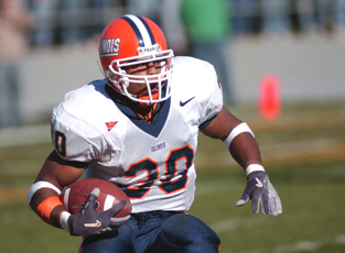
I agree with this. I didn't love this uni set at first, but it looks way better since Bret changed the helmet with the white facemask, stripe, and white around the block I. The blue mask and the weird orange outline on the I with an orange helmet were pretty brutal.

:no_upscale()/cdn.vox-cdn.com/uploads/chorus_asset/file/8709625/usa_today_9608002.jpg)

I'd be open to no white outline (or white number with orange outline) on the home jerseys IF we switch to a more classic block lettering font.
However, I think I am prepared to die on the hill that white jerseys with plain orange font just look so boring and unimaginative. I am NOT endorsing a white helmet or all white uniform or anything else in particular about the two photos below, but these two examples are close enough that I think it illustrates my point of view in that it visually isolates the lettering itself:
Again, I would have an orange helmet, and I would have a more "block" font than either of those two, along with other things. However, I think when just looking at that number on an all-white uniform, the second looks much, much better.
Actually in all honesty, my personal opinion is that as long as we keep our helmets orange (as we always should), I indeed prefer a blue number with an orange outline for our away jerseys. Minus my mortal enemy of slant ILLINOIS, I think these numbers on the white look really slick, regardless of pants color (though I think I have come around to preferring O/W/B on the road):
O/W/B
O/W/O
I'm biased as a fan, but I think our unique color scheme (within the Big Ten) does a lot of the work for us. As others have alluded to, our next uniforms are more about not messing this up than they are about reinventing the wheel.