BB said in his interview yesterday . . . that the new helmets look awesome.
Brad Underwood saw them and said they are "Elite".
BB said in his interview yesterday . . . that the new helmets look awesome.

agree for the most partIn the primary uniform game (excluding alternates and throwbacks), there are really only two types of team.
Those who have established a tradition and are now forever married to it. Michigan, OSU, PSU, Iowa, Nebraska, USC, UCLA.
Those who have not established a tradition and therefore are caught in an endless rebranding loop chasing the latest trends because the worst thing you can have is a non-classic look that has grown stale. Minnesota, Indiana, Purdue, Maryland, Rutgers. And Illinois.
And that’s the thing about the script helmet. Is it good? Is it bad? Probably doesn’t matter. It’s different, and that’s the point. It buys you four or five years to the next cycle.
I'm guessing Bielema would like to see us move into the established tradition group. I think we'll see a classic uniform that we'll be wearing for a while.In the primary uniform game (excluding alternates and throwbacks), there are really only two types of team.
Those who have established a tradition and are now forever married to it. Michigan, OSU, PSU, Iowa, Nebraska, USC, UCLA.
Those who have not established a tradition and therefore are caught in an endless rebranding loop chasing the latest trends because the worst thing you can have is a non-classic look that has grown stale. Minnesota, Indiana, Purdue, Maryland, Rutgers. And Illinois.
And that’s the thing about the script helmet. Is it good? Is it bad? Probably doesn’t matter. It’s different, and that’s the point. It buys you four or five years to the next cycle.
I completely agree. One of the things I like most about Bielema is that he almost seems inherently pissed off that Illini football became such a doormat. He seems to recognize the potential here, and he's hungry to realize it. It could be that he grew up an Illini fan in Prophetstown before going to Iowa. It could be that during his four years at Iowa, Illini football won almost 65% of its games, went to a bowl in 3 out of 4 years, was in the AP top 25 for 3 out of 4 years, had a 10-win/top 10 ranking season and routinely had 70k+ in the stands at Memorial Stadium. It could also be that while he was at Wisconsin, he was likely completely bewildered to see that exact same program be an absolute joke and perennial doormat.I'm guessing Bielema would like to see us move into the established tradition group. I think we'll see a classic uniform that we'll be wearing for a while.

This would definitely work for me.Alright, so I’m deep-diving here a bit, but after investigating Bielema’s comments on the uniforms, this is my guess:
1. "...They're not going to be a shocker. A lot of people will recognize some of the look. … We'll be a little bit more the norm than the (abnormal) …” this tells me it’s probably going to look like something that we’ve seen before (or at least will be visually similar). Bielema’s lifetime and remembrance of the U of I makes me think we’re probably getting 90’s-2000’s uniform inspiration.
2. Bielema has previously expressed his fondness of the Illinois orange, noting that orange is not a common color in college athletics and it can help his program stand out. “I wanted to accentuate orange.” This makes me think that orange is going to be a heavily-featured accent piece, but I doubt we’ll have orange primaries. He had those at his disposal for his first two years and chose not to use them at all. Not even once. "Everything I wanted to do is dedicated to branding something that people identify with.” So, odds are pretty good that if he’s trying to brand-build that we aren’t going to heavily deviate from his distinct preference for the blue top.
3. “I love the Block I.” Gotta imagine that means it’ll be featured. I’m guessing it stays on the helmet and probably on the neck collar.
4. “I put the ‘smart, tough, dependable’ below it because I think that’s something people could identify with." I don’t have great context for this comment, but I think it’s possible that the Belichick mantra of “Smart. Tough. Dependable.” Could end up on the inner neckline of the jersey as many Nike jerseys have nowadays.
5. “Orange helmets will be a constant moving forward” Bielema to Jeremy Werner in August ‘21. Think overwhelmingly likely we have an orange helmet with white mask. That said, I do think it will look a little different than we currently have. “New helmet is *awesome*” said Bielema last week. So, although I figured the helmet he posted his daughters in a few months ago was it, I kinda doubt “awesome” was merited from a stripe reversal and a change to gloss. I have no idea, here.
Ultimately, I’m thinking it’ll have the multi-stripe sleeve/collar design of the 90’s, block I on the helmet, tri-stripe (B-W-B) on orange pants, block font numbers (white with orange outline) and an ILLINOIS word mark on the front chest. Hopefully not too big… something like this.
Wow, great work. If we had that mockup except with the number fonts below (which are a bit more traditional, IMO), I would be absolutely ecstatic and would consider this a simple but effective home run!Alright, so I’m deep-diving here a bit, but after investigating Bielema’s comments on the uniforms, this is my guess:
1. "...They're not going to be a shocker. A lot of people will recognize some of the look. … We'll be a little bit more the norm than the (abnormal) …” this tells me it’s probably going to look like something that we’ve seen before (or at least will be visually similar). Bielema’s lifetime and remembrance of the U of I makes me think we’re probably getting 90’s-2000’s uniform inspiration.
2. Bielema has previously expressed his fondness of the Illinois orange, noting that orange is not a common color in college athletics and it can help his program stand out. “I wanted to accentuate orange.” This makes me think that orange is going to be a heavily-featured accent piece, but I doubt we’ll have orange primaries. He had those at his disposal for his first two years and chose not to use them at all. Not even once. "Everything I wanted to do is dedicated to branding something that people identify with.” So, odds are pretty good that if he’s trying to brand-build that we aren’t going to heavily deviate from his distinct preference for the blue top.
3. “I love the Block I.” Gotta imagine that means it’ll be featured. I’m guessing it stays on the helmet and probably on the neck collar.
4. “I put the ‘smart, tough, dependable’ below it because I think that’s something people could identify with." I don’t have great context for this comment, but I think it’s possible that the Belichick mantra of “Smart. Tough. Dependable.” Could end up on the inner neckline of the jersey as many Nike jerseys have nowadays.
5. “Orange helmets will be a constant moving forward” Bielema to Jeremy Werner in August ‘21. Think overwhelmingly likely we have an orange helmet with white mask. That said, I do think it will look a little different than we currently have. “New helmet is *awesome*” said Bielema last week. So, although I figured the helmet he posted his daughters in a few months ago was it, I kinda doubt “awesome” was merited from a stripe reversal and a change to gloss. I have no idea, here.
Ultimately, I’m thinking it’ll have the multi-stripe sleeve/collar design of the 90’s, block I on the helmet, tri-stripe (B-W-B) on orange pants, block font numbers (white with orange outline) and an ILLINOIS word mark on the front chest. Hopefully not too big… something like this.

Give me a more traditional number font and we are cooking with gas.Alright, so I’m deep-diving here a bit, but after investigating Bielema’s comments on the uniforms, this is my guess:
1. "...They're not going to be a shocker. A lot of people will recognize some of the look. … We'll be a little bit more the norm than the (abnormal) …” this tells me it’s probably going to look like something that we’ve seen before (or at least will be visually similar). Bielema’s lifetime and remembrance of the U of I makes me think we’re probably getting 90’s-2000’s uniform inspiration.
2. Bielema has previously expressed his fondness of the Illinois orange, noting that orange is not a common color in college athletics and it can help his program stand out. “I wanted to accentuate orange.” This makes me think that orange is going to be a heavily-featured accent piece, but I doubt we’ll have orange primaries. He had those at his disposal for his first two years and chose not to use them at all. Not even once. "Everything I wanted to do is dedicated to branding something that people identify with.” So, odds are pretty good that if he’s trying to brand-build that we aren’t going to heavily deviate from his distinct preference for the blue top.
3. “I love the Block I.” Gotta imagine that means it’ll be featured. I’m guessing it stays on the helmet and probably on the neck collar.
4. “I put the ‘smart, tough, dependable’ below it because I think that’s something people could identify with." I don’t have great context for this comment, but I think it’s possible that the Belichick mantra of “Smart. Tough. Dependable.” Could end up on the inner neckline of the jersey as many Nike jerseys have nowadays.
5. “Orange helmets will be a constant moving forward” Bielema to Jeremy Werner in August ‘21. Think overwhelmingly likely we have an orange helmet with white mask. That said, I do think it will look a little different than we currently have. “New helmet is *awesome*” said Bielema last week. So, although I figured the helmet he posted his daughters in a few months ago was it, I kinda doubt “awesome” was merited from a stripe reversal and a change to gloss. I have no idea, here.
Ultimately, I’m thinking it’ll have the multi-stripe sleeve/collar design of the 90’s, block I on the helmet, tri-stripe (B-W-B) on orange pants, block font numbers (white with orange outline) and an ILLINOIS word mark on the front chest. Hopefully not too big… something like this.
Oh fineGive me a more traditional number font and we are cooking with gas.
These are beautiful, and I think even the script haters could get behind them, given the Block I on the helmet. We will take the away uniforms at your earliest convenience, thanks.Oh fine
I am.The closest thing we have to a traditional—or at least signature—look is the 1989-2004 uniform. Of course nobody is advocating to bring back the slant ILLINOIS logo, nor should they. So block I on the helmet with a just slightly modernized version of the 89-04 package, and then sticking to that for at least another decade, is the most immediate route to joining the Group of Classics—again, if that’s the objective. Personally, I’m more of a script fan just because I think it’s visually more interesting, and the block I for me does not pop on a baseball cap, t shirt, or golf polo. But I’m ok with block I on the 89-04 template because at a minimum it gives us something like an actual identity and that’s the most important thing.

I think this will be quite close to what we see. However, given Bret said the "helmets are awesome" I do think they won't have the block I. Just changing the stripe wouldn't elicit that reaction but I do think you are quite right.Alright, so I’m deep-diving here a bit, but after investigating Bielema’s comments on the uniforms, this is my guess:
1. "...They're not going to be a shocker. A lot of people will recognize some of the look. … We'll be a little bit more the norm than the (abnormal) …” this tells me it’s probably going to look like something that we’ve seen before (or at least will be visually similar). Bielema’s lifetime and remembrance of the U of I makes me think we’re probably getting 90’s-2000’s uniform inspiration.
2. Bielema has previously expressed his fondness of the Illinois orange, noting that orange is not a common color in college athletics and it can help his program stand out. “I wanted to accentuate orange.” This makes me think that orange is going to be a heavily-featured accent piece, but I doubt we’ll have orange primaries. He had those at his disposal for his first two years and chose not to use them at all. Not even once. "Everything I wanted to do is dedicated to branding something that people identify with.” So, odds are pretty good that if he’s trying to brand-build that we aren’t going to heavily deviate from his distinct preference for the blue top.
3. “I love the Block I.” Gotta imagine that means it’ll be featured. I’m guessing it stays on the helmet and probably on the neck collar.
4. “I put the ‘smart, tough, dependable’ below it because I think that’s something people could identify with." I don’t have great context for this comment, but I think it’s possible that the Belichick mantra of “Smart. Tough. Dependable.” Could end up on the inner neckline of the jersey as many Nike jerseys have nowadays.
5. “Orange helmets will be a constant moving forward” Bielema to Jeremy Werner in August ‘21. Think overwhelmingly likely we have an orange helmet with white mask. That said, I do think it will look a little different than we currently have. “New helmet is *awesome*” said Bielema last week. So, although I figured the helmet he posted his daughters in a few months ago was it, I kinda doubt “awesome” was merited from a stripe reversal and a change to gloss. I have no idea, here.
Ultimately, I’m thinking it’ll have the multi-stripe sleeve/collar design of the 90’s, block I on the helmet, tri-stripe (B-W-B) on orange pants, block font numbers (white with orange outline) and an ILLINOIS word mark on the front chest. Hopefully not too big… something like this.
The helmet comment is definitely creating the main mystery here.I think this will be quite close to what we see. However, given Bret said the "helmets are awesome" I do think they won't have the block I. Just changing the stripe wouldn't elicit that reaction but I do think you are quite right.
 Then again, maybe Bret uses “awesome” in a similar way to how Brad uses “elite!” Lol.
I like those!Realized how much I love that '01 collar, wanted to add it to the concept I made and matched the stripe from the helmet to the pants. It's a very clunky edit because I'm tired and need to sleep. I like that the collar also matches the inner part of the helmet stripe too.
I think, in no particular order, the following would be top ten:I prefer the collar with the classic pant stripe tho.
Edit: I know I'm biased but tell me that's not a top 10 uniform in college football.
I !!!! with these hard. Great workOh fine
I have looked at these a few more times, and I can honestly say I think this would be the perfect combo for me. And I'm optimistic, as it seems very close to what we might get. The only thing I am hoping for that I highly doubt we get is navy pants on the road (i.e., O/W/B combo) with an O/W/O stripe on the side. I never really noticed it until recently, but I just think that is a really slick look for us:Oh fine


I would generally agree with your list, but I think the second group is huge. I would argue you have these "groups" for uniforms:I think, in no particular order, the following would be top ten:
- Michigan
- Ohio State
- Penn State
- Notre Dame
- USC
- UCLA
- Alabama
- Auburn
- Texas
- LSU
I believe Wisconsin, Iowa, Nebraska, Oklahoma, Oklahoma State’s new uniforms, Georgia, Florida, Florida State, Miami and Tulane would be the next group.
Illinois can definitely break into the “next group” here if they do a good job. But I think it’ll take a long time of no changes with a solid and recognizable brand to consider a move to top 10.
:no_upscale()/cdn.vox-cdn.com/uploads/chorus_asset/file/23614510/723BD369_33B5_4098_B2F9_99FDBB78E173_1_201_a.jpeg)
/cdn.vox-cdn.com/uploads/chorus_asset/file/8709391/usa_today_9655363.jpg)
I actually dig last year’s setI would generally agree with your list, but I think the second group is huge. I would argue you have these "groups" for uniforms:
1. The truly traditional (practically ancient) ones that will likely never change (e.g., Penn State)
2. The classic ones that might not be quite as old but are now totally associated with that program and likely will never change (e.g., Iowa)
3. The ones that change from time to time but generally keep the same "feel" across multiple eras and are still instantly recognizable (e.g., Florida)
4. The schools who are just updating their uniforms and font to the norm of the current era, with the only consistency being their colors (e.g., Iowa State)
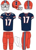
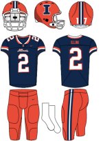
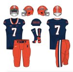
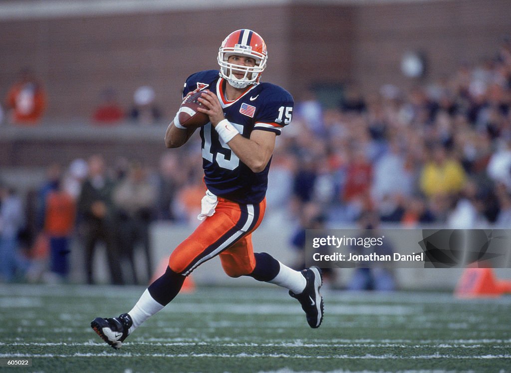
Within those tiers, you might get more iconic vs. less iconic or varying degrees of schools chasing trends. Illinois has been really weird. Just look at how our most default home uniform has evolved in these last several versions, going from most recent to least recent:
(Same basic uniform as the previous one but added the helmet stripe and switched to a white facemask to make it at least a bit more traditional)
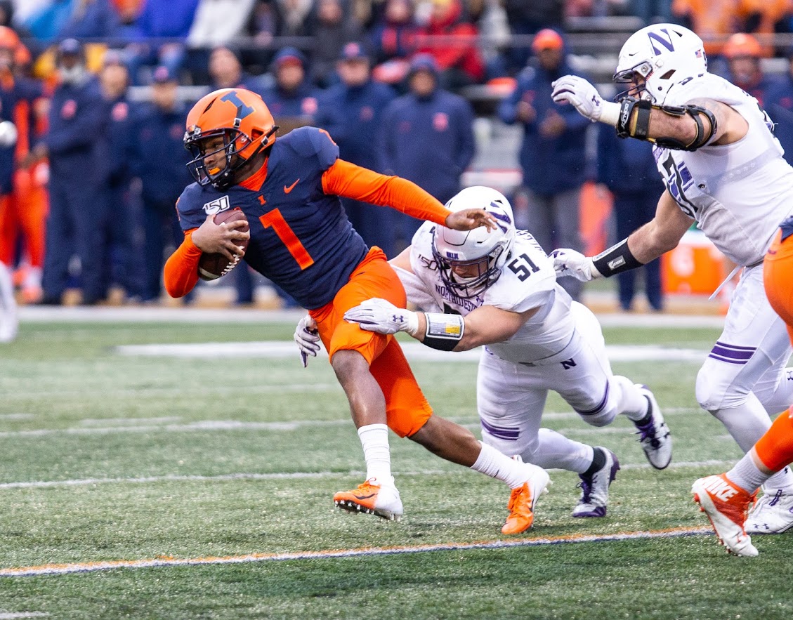
(Classic Lovie Era uniform)
(First Shield rebrand or whatever)
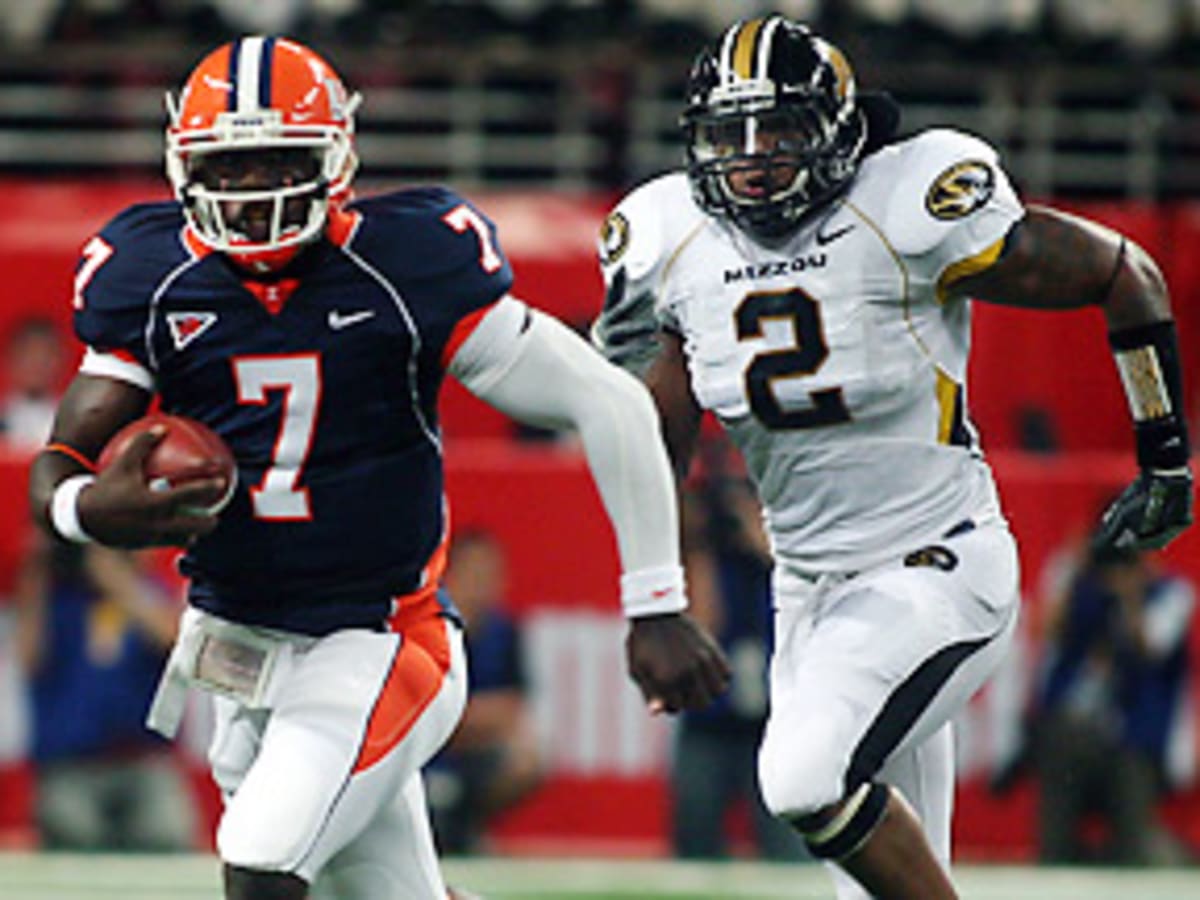
(Zook Era uniform)
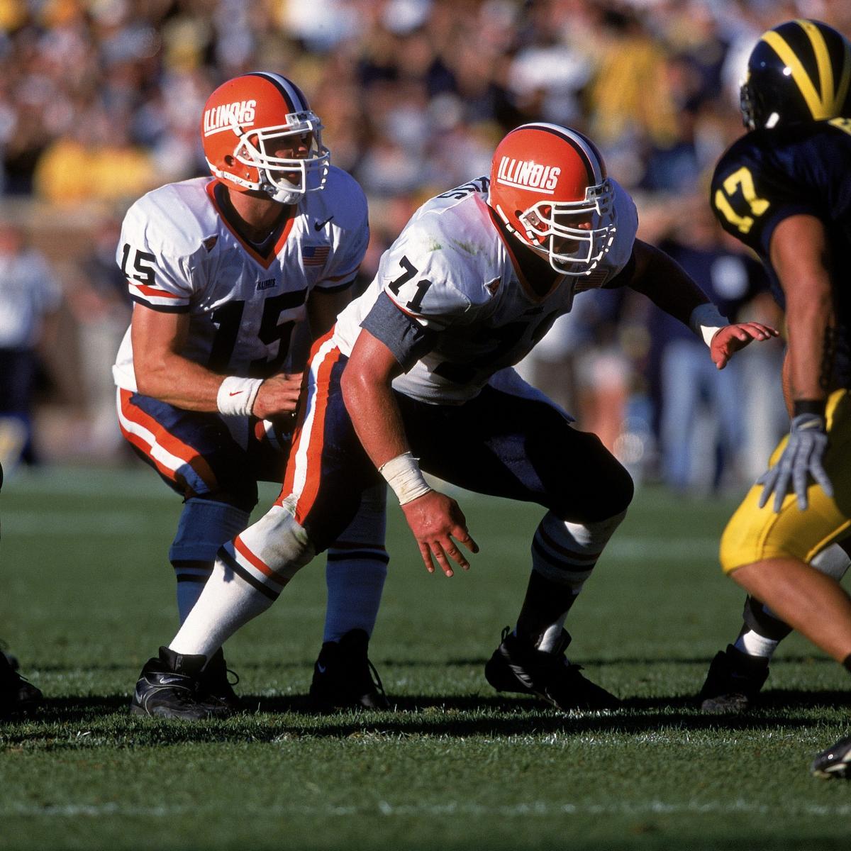
(Pre-2005 Uniform)
For the Zook Era ones, we clearly sort of chased the current trend (look how similar ours is to Mizzou's, lol), even abandoning the orange pants at home. However, every other uniform has been some weird combination of "updating" the uniforms while also trying to keep them relatively simple. I never liked them at the time, but those pre-2005 uniforms just look damn classic now ... funny how that works, huh?? What really works in our favor is that the current trend seems to BE harkening back to the classics. I think it's the perfect time to move into that "Iowa Tier" I described above where everybody knows what Illini football looks like.
That top set isI would generally agree with your list, but I think the second group is huge. I would argue you have these "groups" for uniforms:
1. The truly traditional (practically ancient) ones that will likely never change (e.g., Penn State)
2. The classic ones that might not be quite as old but are now totally associated with that program and likely will never change (e.g., Iowa)
3. The ones that change from time to time but generally keep the same "feel" across multiple eras and are still instantly recognizable (e.g., Florida)
4. The schools who are just updating their uniforms and font to the norm of the current era, with the only consistency being their colors (e.g., Iowa State)
Within those tiers, you might get more iconic vs. less iconic or varying degrees of schools chasing trends. Illinois has been really weird. Just look at how our most default home uniform has evolved in these last several versions, going from most recent to least recent:
(Same basic uniform as the previous one but added the helmet stripe and switched to a white facemask to make it at least a bit more traditional)
(Classic Lovie Era uniform)
(First Shield rebrand or whatever)
(Zook Era uniform)
(Pre-2005 Uniform)
For the Zook Era ones, we clearly sort of chased the current trend (look how similar ours is to Mizzou's, lol), even abandoning the orange pants at home. However, every other uniform has been some weird combination of "updating" the uniforms while also trying to keep them relatively simple. I never liked them at the time, but those pre-2005 uniforms just look damn classic now ... funny how that works, huh?? What really works in our favor is that the current trend seems to BE harkening back to the classics. I think it's the perfect time to move into that "Iowa Tier" I described above where everybody knows what Illini football looks like.
 . I would absolute okay with that being our uniform. Clean and simple.