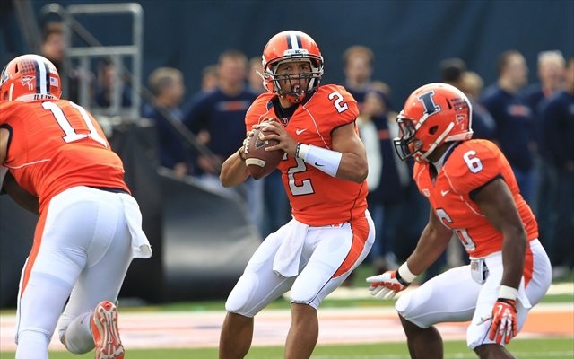
The 2014 Illini Nike Uniforms and Rebrand

Status
Not open for further replies.
#751      

dgcrow

Kelso, WA
Haha, I don't know about faster. But an all white uniform does give the illusion of being bigger. Good intimidation factor!

Agreed. And I've never liked blue pants (or any dark pants for that matter) because to me they make the players look smaller.
 
#752      

JSpence

Evansville, IN
I agree with what you're trying to do, but it's a bit busy. Did you check out the one I posted last night addressing the F problem?

Can we please stop?

I'm sure we all appreciate the enthusiasm, but let's not waste time adding piggybacked fodder to help unravel the new brand in its infancy?
 
#753      

tiburon

Chicago
So it looks to me that on the computer, the block I orange is now more red than before. Correct ? More similar to Auburn now than to Clemson as before.

Or are my eyes deceiving me?

Yeah, it's really noticeable when you look at them side by side. I'm disappointed because I always thought Illinois had one of the best oranges in the country - not a weak pastel like Tennessee or an overbearing blazing orange like Florida, or a more muted red-orange like you said with Auburn. Just a solid bright orange, very honest and appealing.

Ah well, I'm sure the consistency and universal application going forward will more than make up for my niche point of pride. :thumb:
 
#754      

Kams Bathroom

K
Guest
A humble request to all the amazing photoshoppers on this board:

Is there any way we could get some sort of "Team Shield" signature made out of our dual-color font? I feel like it would look awesome if a bunch of people could have the same image down there with an on-brand look.
 
#755      

ivwilsoniv

Aurora, IL
A humble request to all the amazing photoshoppers on this board:

Is there any way we could get some sort of "Team Shield" signature made out of our dual-color font? I feel like it would look awesome if a bunch of people could have the same image down there with an on-brand look.

Let me see if I can work on it tonight. Not sure how good the resolution will be because I'd have to cut and paste the letters from the press release, but it should be good enough for a signature. Unless someone else knows where you can get that font. Is it specific to this Illinois rebranding?
 
#756      

Groundhogday

G
Guest
I was in Gameday and T.I.S. on campus today and both were really busy. I listened to some of the conversations, and it seemed like the students really liked all of the stuff. Everybody was buying up the shield shirts though. I was surprised to hear someone pointing out to a friend how they'd added the curve inside the Block I. Didn't expect people to pick up on that subtle change that weren't designers or hardcore fans.
It shows a lot of foresight to buy up the shield stuff. It will be valuable in a couple of years when the DIA no longer uses that logo. Just make sure to keep it in the original packaging. ;)
 
#757      

Kams Bathroom

K
Guest
I'm pretty confident we just disagree on this being a principal, and that's fine, but my answer is yes, that is acceptable, and no I don't believe that's having it both ways. Because road baseball uniforms are conventionally a base color that isn't part of the rebrand, specifically grey. Like I said, we disagree on that principal, and that's ok.

This idea that gray can be a "base" color in some contexts but not others, or that because baseball has traditionally used gray as a road color, therefore they have carte blanche to use ANYTHING as a road color, is silly.

Which, right back atcha, everyone has their principals and preferences and things, and that's fine. But don't go telling me your feelings on this are somehow Timeless Principals Of Design when they are clearly malleable depending on taste, context, and apparently whether you were alive when something was a transient fad.
 
#758      

Groundhogday

G
Guest
Can we please stop?

I'm sure we all appreciate the enthusiasm, but let's not waste time adding piggybacked fodder to help unravel the new brand in its infancy?
The question is, why does a new brand have such obvious mistakes?

Two F's? Really? Because we have two Fs in Fighting Illini, right? Facing each other because backward letters make so much sense. With no negative space to separate? And funny little knobs out the backside?

Pretty obvious that they started with the idea that the blue part represented the Hallene Gateway with the double pair of columns. Then after it went into production they realized the story was a major fail, so came up with another rationalization.

If Nike screwed up, then by all means let's think about how to salvage this thing and make a somewhat reasonable "badge". Knocking off the knobs and putting a bit of negative space between the two Fs is a start.

Next, someone needs to figure out a solution to the problem of the negative space making the shape of a downward pointing arrow.
 
#759      
It shows a lot of foresight to buy up the shield stuff. It will be valuable in a couple of years when the DIA no longer uses that logo. Just make sure to keep it in the original packaging. ;)

So you are saying you don't think the shield will last?
 
#760      

JSpence

Evansville, IN
Let me see if I can work on it tonight. Not sure how good the resolution will be because I'd have to cut and paste the letters from the press release, but it should be good enough for a signature. Unless someone else knows where you can get that font. Is it specific to this Illinois rebranding?

The best serif typography I've seen is available at:

http://www.fightingillini.com/identity/html/orange/

And also in the 'design elements' screen of the presentation.

The press release at http://www.fightingillini.com/genrel/041614aab.html does NOT have the full primary typography.
 
#761      

Kams Bathroom

K
Guest
So you are saying you don't think the shield will last?

He's saying:
Troll-Face-LOL-I-TROLL-U.jpg
 
#762      

illinicb

Northbrook
The New Illini Nike Uniforms and Rebrand

You don't like this?


scheelhaase-father-arrest.jpg


I know Clemson and others do it too, but that's the other one besides the vintage orange/blue/orange that feels "Illinois" to me.


Nope, but If they win every game in that combo, I'll be the biggest advocate.
 
#763      

Groundhogday

G
Guest
So you are saying you don't think the shield will last?
Hard to say for sure. There have been some god awful logos that have lasted for years. It all depends upon how persistent the DIA is on pushing this and how attached fans become to something awful because "we're loyal to Illinois".

Hopefully the DIA have the sense to make a graceful exit, perhaps turn it into a shield and kind of pretend the whole 2 Fs, dangly lines = columns thing never happened.
 
#764      
Hard to say for sure. There have been some god awful logos that have lasted for years. It all depends upon how persistent the DIA is on pushing this and how attached fans become to something awful because "we're loyal to Illinois".

Hopefully the DIA have the sense to make a graceful exit, perhaps turn it into a shield and kind of pretend the whole 2 Fs, dangly lines = columns thing never happened.

Who said it was awful? You and a few others???
 
#765      

JSpence

Evansville, IN
The question is, why does a new brand have such obvious mistakes?

Two F's? Really? Because we have two Fs in Fighting Illini, right? Facing each other because backward letters make so much sense. With no negative space to separate? And funny little knobs out the backside?

Pretty obvious that they started with the idea that the blue part represented the Hallene Gateway with the double pair of columns. Then after it went into production they realized the story was a major fail, so came up with another rationalization.

If Nike screwed up, then by all means let's think about how to salvage this thing and make a somewhat reasonable "badge". Knocking off the knobs and putting a bit of negative space between the two Fs is a start.

Next, someone needs to figure out a solution to the problem of the negative space making the shape of a downward pointing arrow.

To fix the shield, the tabs need to be radiused on their bottom edges, terminating around the bottom of the top of the I, or just below.

Go do it in paint, it'll take only a second, and you'll see what I mean. I won't post the image here.

Fixing it here won't fix the merchandise, and will probably hurt loyalty to the brand more than help it.

Just my two cents.
 
#766      

Kams Bathroom

K
Guest
Who said it was awful? You and a few others???

Dude, it's clear #TeamShield are nothing but a bunch of management stooges who are never objective about anything. There's no other explanation here.
 
#768      
Dude, it's clear #TeamShield are nothing but a bunch of management stooges who are never objective about anything. There's no other explanation here.

I think the fact that the shield hats are currently sold out speaks for itself that the fans like the logo!

:shield::shield::shield:
 
#770      

Groundhogday

G
Guest
To fix the shield, the tabs need to be radiused on their bottom edges, terminating around the bottom of the top of the I, or just below.

Go do it in paint, it'll take only a second, and you'll see what I mean. I won't post the image here.

Fixing it here won't fix the merchandise, and will probably hurt loyalty to the brand more than help it.

Just my two cents.
I'm not sure that is enough. You really need a rounded bottom outline to the shield in blue to provide a hard outline. Right now the bottom of the badge disappears into the white and orange uniforms. And you want the rounded outline to take away the downward pointing arrow.

I don't think it will hurt the brand that much to tweak it in a year or two and get something reasonable. The attachment is really to the idea of a shield, so if you make a better shield it won't be a hard sell. And let's face it, we really don't have that many rabid fans buying up and getting attached to merchandise right now.

Dude, it's clear #TeamShield are nothing but a bunch of management stooges who are never objective about anything. There's no other explanation here.
No, just group psychology. If that logo had been presented by someone on this forum as an idea last week most on here would have ripped it as idiotic. But once it is OUR logo, then all the emotion swings in and most of the really rabid fans rally behind the team. Most on here would have supported anything Nike came up with. The same thing happens when someone buys a house. When they are looking at houses, there is a ton of criticism and doubt. But once they buy the house, most people develop an incredible emotional bond with their house, are convinced they made a great buy, and can't see the flaws.

Just look at the rationalization for the logo? Straight lines of unequal length are columns? Two F's? Really? C'mon, no one not caught up in an emotional frenzy would buy that.
 
#771      
I'm not sure that is enough. You really need a rounded bottom outline to the shield in blue to provide a hard outline. Right now the bottom of the badge disappears into the white and orange uniforms. And you want the rounded outline to take away the downward pointing arrow.

I don't think it will hurt the brand that much to tweak it in a year or two and get something reasonable. The attachment is really to the idea of a shield, so if you make a better shield it won't be a hard sell. And let's face it, we really don't have that many rabid fans buying up and getting attached to merchandise right now.


No, just group psychology. If that logo had been presented by someone on this forum as an idea last week most on here would have ripped it as idiotic. But once it is OUR logo, then all the emotion swings in and most of the really rabid fans rally behind the team. Most on here would have supported anything Nike came up with.

Just look at the rationalization for the logo? Straight lines of unequal length are columns? Two F's? Really? C'mon, no one not caught up in an emotional frenzy would buy that.

I think you just need to take a break. Just because you have a high post count doesn't mean what you say is the final say. You can't stop people from liking something so quit trying. It's really annoying. Nobody is making you buy it!
 
#772      
I'm not sure that is enough. You really need a rounded bottom outline to the shield in blue to provide a hard outline. Right now the bottom of the badge disappears into the white and orange uniforms. And you want the rounded outline to take away the downward pointing arrow.

I don't think it will hurt the brand that much to tweak it in a year or two and get something reasonable. The attachment is really to the idea of a shield, so if you make a better shield it won't be a hard sell. And let's face it, we really don't have that many rabid fans buying up and getting attached to merchandise right now.


No, just group psychology. If that logo had been presented by someone on this forum as an idea last week most on here would have ripped it as idiotic. But once it is OUR logo, then all the emotion swings in and most of the really rabid fans rally behind the team. Most on here would have supported anything Nike came up with. The same thing happens when someone buys a house. When they are looking at houses, there is a ton of criticism and doubt. But once they buy the house, most people develop an incredible emotional bond with their house, are convinced they made a great buy, and can't see the flaws.

Just look at the rationalization for the logo? Straight lines of unequal length are columns? Two F's? Really? C'mon, no one not caught up in an emotional frenzy would buy that.


Why does it bother you that some people enjoy the new stuff?
 
#774      

Groundhogday

G
Guest
I think the fact that the shield hats are currently sold out speaks for itself that the fans like the logo!

:shield::shield::shield:
They could have put out a new logo designed around the concept of an orange and blue dung pile and fans would have snapped it up. We are that desperate for something new.
 
#775      

Groundhogday

G
Guest
I think you just need to take a break. Just because you have a high post count doesn't mean what you say is the final say. You can't stop people from liking something so quit trying. It's really annoying. Nobody is making you buy it!
How would I possibly make anyone stop liking it? You clearly don't understand group psychology if you think that is possible. Those who are in the throes of love won't see any differently. But obviously there are some on here able to look more objectively. I'm talking to them. Why does that bother you?
 
Status
Not open for further replies.