I don't think the rebrand is a failure necessarily, but it definitely has some ups and downs. Not replacing the logo at Mid-Field of the football stadium is a pretty big snafu, along with not having $$ for blue uniforms etc.
I don't see it as a knock on MT by any means, as he seems more than competent at what he's doing. Just some of the limitations placed on him at Illinois maybe, I really don't know.
People have a right to be upset/question the replacing of logo's at other locations over the mid-field football stadium though.
It's not make or break for me, and I still think the overall rebrand is a success. I'm not a fan of the silver/gray uniforms at all though.
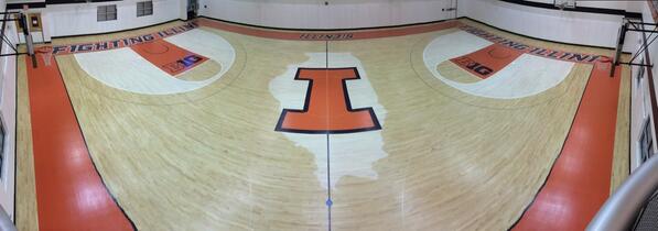
 logo has good symmatry and can be viewed as looking the same no matter where someone sits at a football game, bball game or vball match.
  really would not look right as a midfield/midcourt logo. And I'm not too sure it will be a long-term secondary logo anyways.