lstewart53x3
- Scottsdale, Arizona
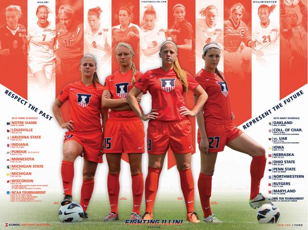
Glad we have Nike.
I don't like all orange unis in general and not super wild about the shield, but I like these soccer uniforms a lot.
 logo in white with a blue border.
Glad we have Nike.
Seriously. I don't know what Adidas' deal is.
I think UCLA has about the only cool 3 stripe jerseys I've noticed. Basketball & Football are pretty cool.
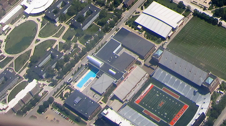
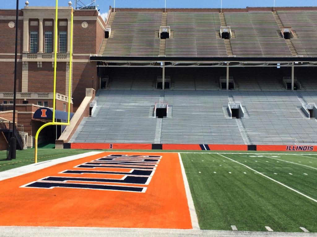
Got an overhead view on my flight this morning. The new orange end zones really pop, while the midfield old orange Block I and sideline orange areas look quite faded.
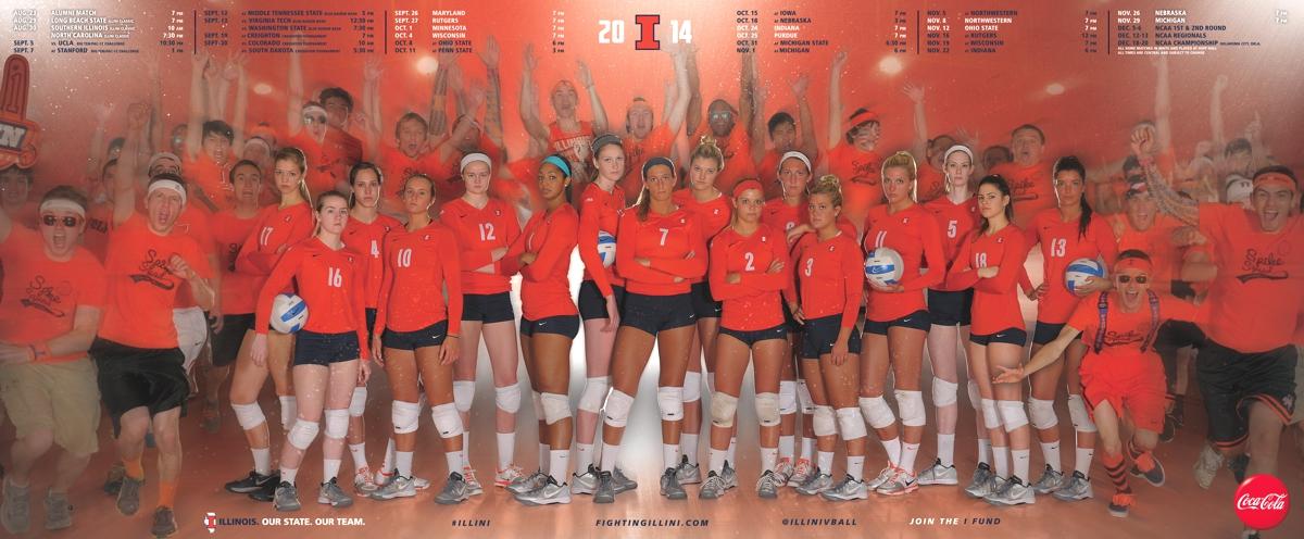
Illinois Soccer @IlliniSoccer 13m
FIRST LOOK: Your 2014 #Illini soccer poster! #RespectThePast #RepresentTheFuture #nike #rebrand #shield pic.twitter.com/o1cMNrB279
Love it how the add the spike squad in there!
I need to get my hands on one of those vball posters.
If they can't get that to match the orange on the rest of the field that's not going to be a good look. Makes you think navy endzones might have been a better call.
When I PM'd one of the guys from the athletic department about getting schedule posters out of state, they sent me this handy little link where you can order them all...
http://www.fightingillini.com/genrel/orderpublications.html
Illinois Athletics @IlliniAthletics 2m
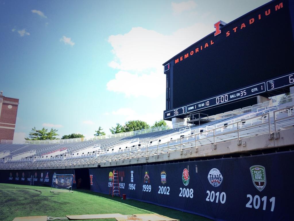
Memorial Stadium end zones & graphics getting a little touchup while @IlliniFootball is at #CampRantoul! #rebrand pic.twitter.com/q3BhVv3gRg
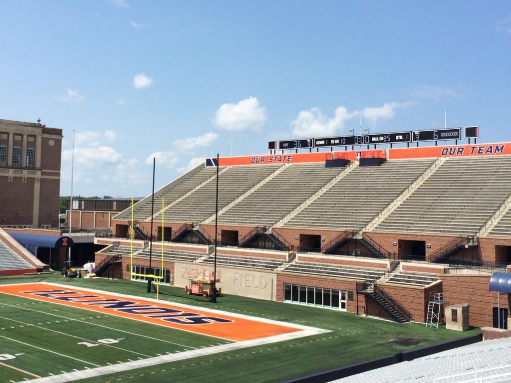
They need to put at least one shield in the end zones.