The 2014 Illini Nike Uniforms and Rebrand

Status
Not open for further replies.
#1,977      

BZuppke

Plainfield
I guess it's one way to get attention - if you can't look good, look outrageous.
 
#1,978      
I don't like all orange unis in general and not super wild about the shield, but I like these soccer uniforms a lot.

I kind of felt the same way when I saw the picture of the soccer team.

For me, the orange color just popped out and looks sharp. I still think the shield looks funny, so I would've preferred the :illinois:logo in white with a blue border.

But the orange really looks good.
 
#1,980      
I liked the uniforms. The chromed mask OTOH is poorly thought out.
 
#1,981      

IlliniByProxy

St. Joseph, IL
Seriously. I don't know what Adidas' deal is.

I'm not sure that I have seen one single uniform from Adidas (basketball or football) that I like. I can say the majority of the nike uniforms appeal to me and about half of the under armour unis are appealing. Adidas uniforms always look like a clip art mess.
 
#1,982      

JHollywood

J
Guest
I think UCLA has about the only cool 3 stripe jerseys I've noticed. Basketball & Football are pretty cool.
 
#1,984      

Dan

Admin
Got an overhead view on my flight this morning. The new orange end zones really pop, while the midfield old orange Block I and sideline orange areas look quite faded.
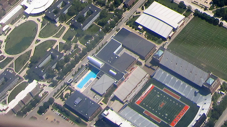
illini-memorial-stadium-overhead.jpg
 
#1,985      

HsvIllini

Alabama
Got an overhead view on my flight this morning. The new orange end zones really pop, while the midfield old orange Block I and sideline orange areas look quite faded.

illini-memorial-stadium-overhead.jpg

Wow that looks really faded compared to the end zones. I imagine the end zones will have the rubber pellets piled on / swept into them like the rest of the field did originally which will take away some of the pop, but still....
 
#1,986      
If they can't get that to match the orange on the rest of the field that's not going to be a good look. Makes you think navy endzones might have been a better call.
 
#1,987      

HsvIllini

Alabama
The soccer poster turned out looking pretty cool, incorporating the shield stripes into it:

Illinois Soccer ‏@IlliniSoccer 13m

FIRST LOOK: Your 2014 #Illini soccer poster! #RespectThePast #RepresentTheFuture #nike #rebrand #shield pic.twitter.com/o1cMNrB279
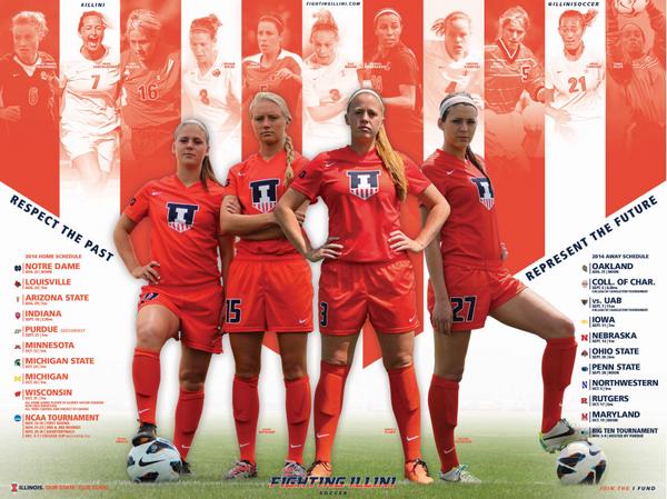
Bu9Io-eIgAA18mD.jpg
 
#1,991      

danielb927

Orange Krush Class of 2013
Rochester, MN
I need to get my hands on one of those vball posters.
 
#1,993      
If they can't get that to match the orange on the rest of the field that's not going to be a good look. Makes you think navy endzones might have been a better call.

I think they need to sprinkle in the recycled rubber material that softens the turf. That should darken the orange we see now.
 
#1,994      

danielb927

Orange Krush Class of 2013
Rochester, MN
When I PM'd one of the guys from the athletic department about getting schedule posters out of state, they sent me this handy little link where you can order them all...

http://www.fightingillini.com/genrel/orderpublications.html

Cool! Thanks for the link. They usually have free ones sitting out in Bielfeldt too, so I'll probably try to snag one the next time I'm home, but I'll definitely order one up if I don't get around to that.
 
#1,995      

Insider

I
Guest
holy cow the six pack looks a lot different
 
#1,996      

HsvIllini

Alabama
Illinois Athletics ‏@IlliniAthletics 2m

Memorial Stadium end zones & graphics getting a little touchup while @IlliniFootball is at #CampRantoul! #rebrand pic.twitter.com/q3BhVv3gRg
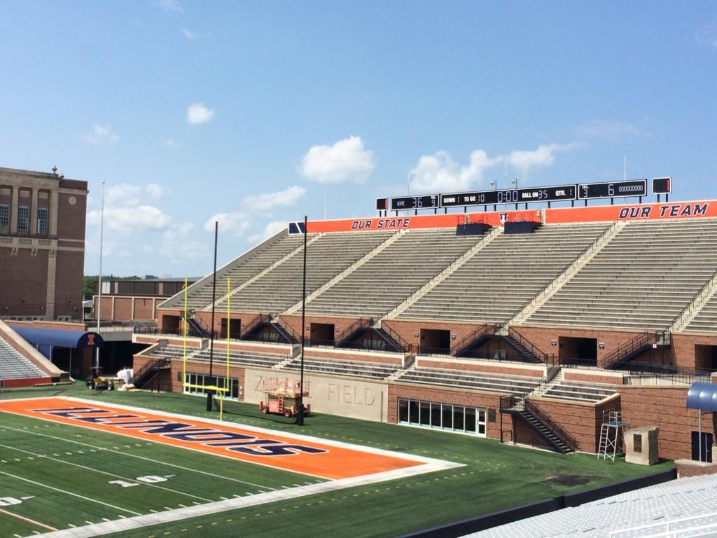
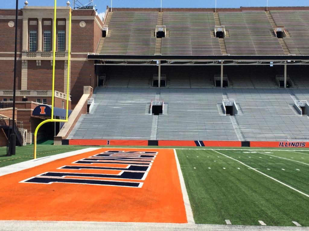
BvBUnisCIAAYFj4.jpg:large

BvBUng4CEAAa_AU.jpg:large

BvBUnjCCAAAHWSG.jpg:large

BvBUnkwCIAEOFjx.jpg:large
 
#1,997      

CardsIllinifan8

C
Guest
They need to put at least one shield in the end zones.
 
#1,999      

CardsIllinifan8

C
Guest
I would prefer that over everything.

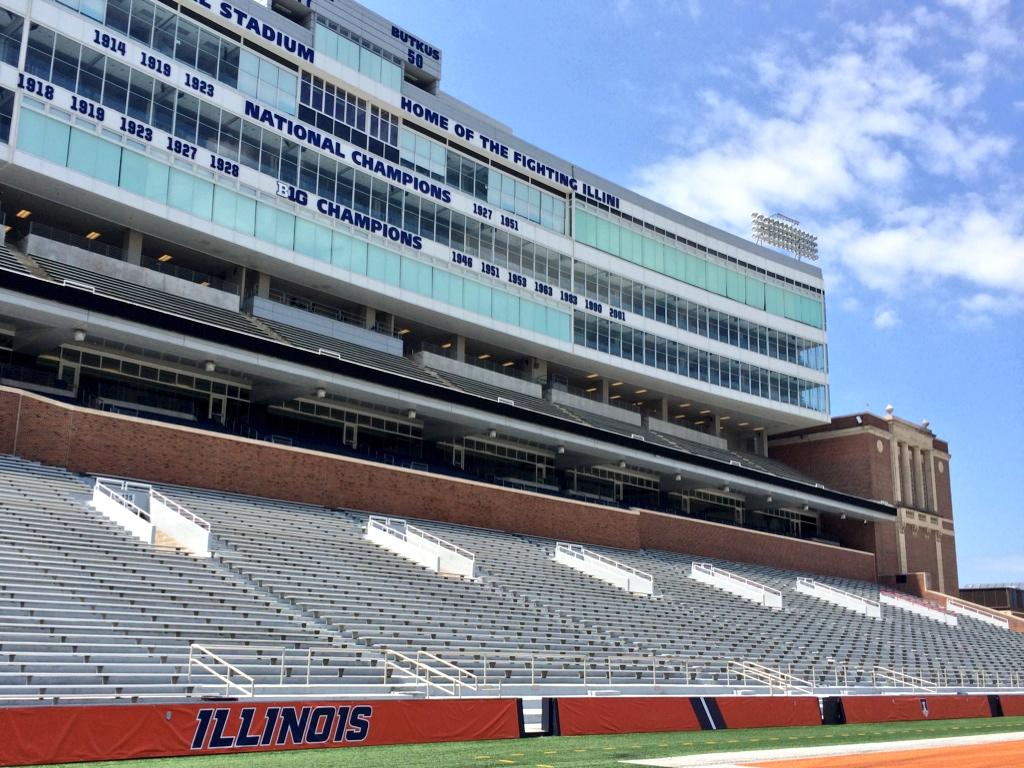
It doesn't look like Fighting Illini isn't anywhere on the stadium.
 
#2,000      

KJKobs

Chicago, IL
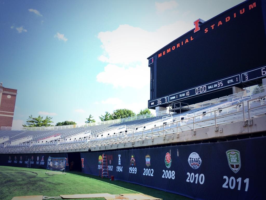
I like the bowl game logos they added to the horseshoe
 
Status
Not open for further replies.