I'll echo what others have said with regard to the outline ... if you want to go no outline and just go full-on "simple classic" or whatever, our font needs to match that:
I think the reason our current set looks so jarring, at least to me, is we take this SUPER simple (dare I say boring) color scheme with no outlines or stripes ... and we combine it with these weird, kind of futuristic, "try-hard" trendy numbers on the front. It looks disjointed and just kind of plain combining those two types of styles.
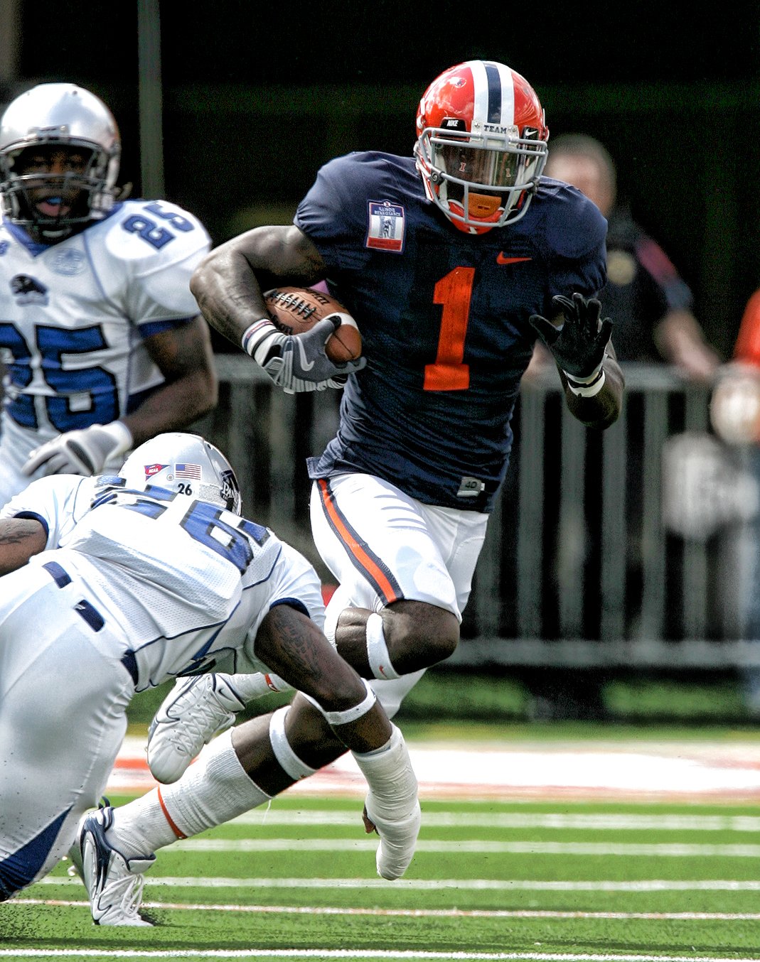
I don't even care about the white pants (I NEVER complained about this during the Zook Era unlike some other posters, I liked them!), what I would give to have the throwbacks above with the following changes:
- Block I on the helmet
- Switch blue/white stripe pattern on the helmet
- Very faint white outline on the number
I actually think white pants look great for us when we have only blue and orange above that. That B/O/B stripe on the white pants looks REAL nice.