The 2014 Illini Nike Uniforms and Rebrand

Status
Not open for further replies.
#1,076      

Redfoxdogs

Gurnee, IL
Brooklyn Nets mascot...he's the BrooklynKnight and even has a shield.

That wasn't the one I was thinking of, the guy I saw was in a green bodysuit, but I can't find it. Maybe it was a HS team.
 
#1,077      

classof2016

C
Guest
The numbers on our jerseys are very similar to the numbers on the Indiana Pacers' jerseys
 
#1,078      

Jonah Puls

J
Guest
All the fans I've talked to around my hometown love the new uniforms. Of course, the favorite is the white football uniforms. But all of them do something for me.
 
#1,079      
If the DIA changes the logo to fix the obvious design problems, almost everyone who loves the stonehenge victory logo will quickly decide they like the new version better.

So obvious that only you and a select few of the lunatic fringe can spot them?

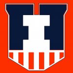
If half of your logo vanishes against and orange or white background and you have orange or white uniforms then you have a serious design problem. If your logo looks like a down arrow from a distance then you have a design problem. If every one thinks your logo is a shield but can't figure out why your shield has ears, then you have a design problem.

99% of shields come to a point at the bottom. Are they all down arrows?

The fact that they changed the rationale for.the logo after going into production, and even the day of the release suggests that they did see a problem.

Thats a fact, huh? Is that because it's your hypothesis based on speculation and conjecture so it must be true?

This whole thread took a right hand turn onto the loony expressway straight to crazyville. The badge looks good, most people agree. It's OK if you don't like it, but the target demographic seems to like the way it looks, and that is what is important. It's not going to change. If everybody hated it you would probably see Nike and the DIA reneg on their design and change or do away with it, but the majority like it, so that's not happening.

but what the hell do I know? I can't even think for myself!
 
#1,083      
Just for those who don't like the uniforms, there's an Illinois football game on from '96. Kinda bland if you ask me. But if in a few years they throwback uniforms to ILLINOIS one day I think that would be pretty sweet.
 
#1,084      

Ransom Stoddard

Ordained Dudeist Priest
Bloomington, IL
The good news is that if the shield/badge/coat of arms/whatever is what's getting all the heat, this was a pretty good rollout. Personally, I like the badge as a small element on the uniform. When limited to that it doesn't require any explanation or backstory.

132 days until football. Happy 4/20 everyone!
 
#1,085      

Kams Bathroom

K
Guest
Just for those who don't like the uniforms, there's an Illinois football game on from '96. Kinda bland if you ask me. But if in a few years they throwback uniforms to ILLINOIS one day I think that would be pretty sweet.

Haha, yeah, the slant Illinois is officially retro.
 
#1,086      

goillini75

G
Guest
Neither the description on the website nor the one given by the Nike guy at the rollout included any explanation of the odd protrusions at the top of the VB. They can't represent the tops of the columns, because there are no similar protrusions representing the bottom of the columns. The columns have frustums (?) on both the top and bottom.

columns.jpg


thumb.jpg

I was thinking about this and i think the honest answer should be is they are two opposing F's and we are using the new font then that pretty much explains it. I would think. :chief::illinois:
 
#1,087      

AngryOrange

Chicago, IL
Thats a fact, huh? Is that because it's your hypothesis based on speculation and conjecture so it must be true?

This whole thread took a right hand turn onto the loony expressway straight to crazyville. The badge looks good, most people agree. It's OK if you don't like it, but the target demographic seems to like the way it looks, and that is what is important. It's not going to change. If everybody hated it you would probably see Nike and the DIA reneg on their design and change or do away with it, but the majority like it, so that's not happening.

but what the hell do I know? I can't even think for myself!

I have no proof either, but an acquaintance who saw some of the proposal gave me the columns, etc speech for why the shield. The presentation surprised him when they changed the rationale. Definitely not proof, but I think there is smoke on this one.
 
#1,090      

tiburon

Chicago
I was thinking about this and i think the honest answer should be is they are two opposing F's and we are using the new font then that pretty much explains it. I would think. :chief::illinois:

I accept this explanation :thumb:
 
#1,092      

Shiloh

Tampa, FL
That snark would be funny if it was even remotely true.

I like the shield. I like it the least of the redo but I still like it. Wife hates it and doesn't notice it when it's a tiny badge on a uniform. Doesn't get why Illinois should be associated with columns when every university more than 100 years old is littered with columns and other pseudo-Hellenic architecture.

It's not a celebration of columns, it specifically represents the Memorial Stadium columns, which hold Fighting Illini significance.
 
#1,094      

BZuppke

Plainfield
Can't read through all of this and I'm probably repeating others but the victory badge looks cool to me. I think the various variations are good too but the university isn't going to redo the badge just because a few here think they can do better. It's good and I like it.
 
#1,098      
rebranding

look guys, everyone who has some design sense would do this or that different and the rebranding is no different. i personally have some issues with the sloped font and using the I as a #1. anyway, they did a great job overall and our teams will benefit from a consistency across all uniforms and graphics. there are no errors or use of poor judgement. We got rid of some bad helmets (the state and some stars along with that italicized illini) and the metallic helmets are a big hit.
The shield is a historic reference that works and will make a nice, unmistakable t-shirt and golf shirt symbol. i cant wait to get my gear!

please stop redesigning Nike's quality effort with your amateurish work. it's silly.
 
#1,099      

HsvIllini

Alabama
look guys, everyone who has some design sense would do this or that different and the rebranding is no different. i personally have some issues with the sloped font and using the I as a #1. anyway, they did a great job overall and our teams will benefit from a consistency across all uniforms and graphics. there are no errors or use of poor judgement. We got rid of some bad helmets (the state and some stars along with that italicized illini) and the metallic helmets are a big hit.
The shield is a historic reference that works and will make a nice, unmistakable t-shirt and golf shirt symbol. i cant wait to get my gear!

please stop redesigning Nike's quality effort with your amateurish work. it's silly.

Quick question on the helmets - are they all metallic, or just the orange one? It's hard to tell just from pictures (except the white one that looks glossy).
 
#1,100      
My new merch was sitting at the door when I got home today. The orange really looks good and much brighter than it appeared during the live unveiling or even in this pic.

Also, the orange on the t shirt and shorts match perfectly although it doesn't show that very well in a cell phone pic.
 

Attachments

  • 20140421_161625.jpg
    20140421_161625.jpg
    2.3 MB · Views: 383
Status
Not open for further replies.